E D I T O R I A L . 1 0
H A L E P A R K
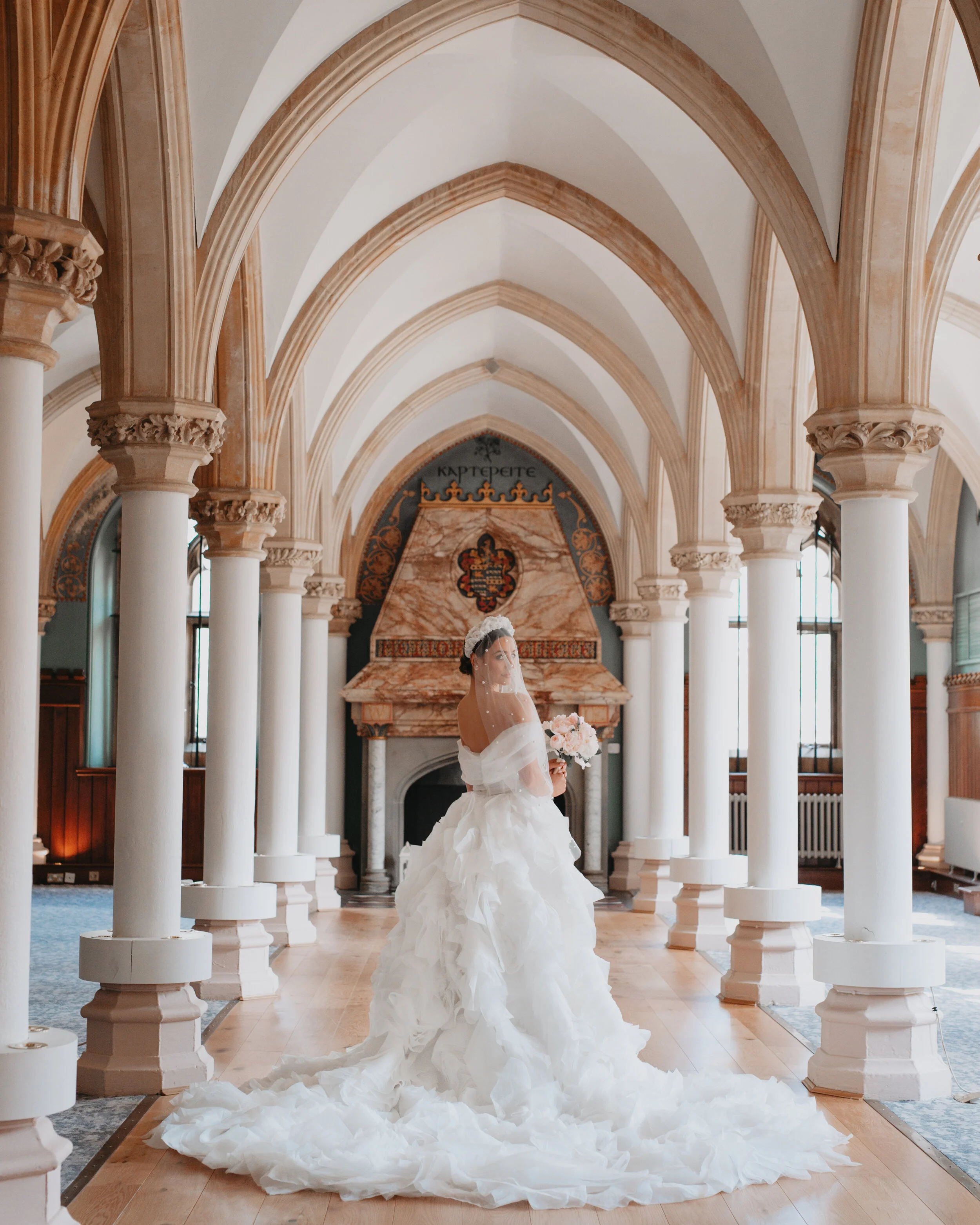
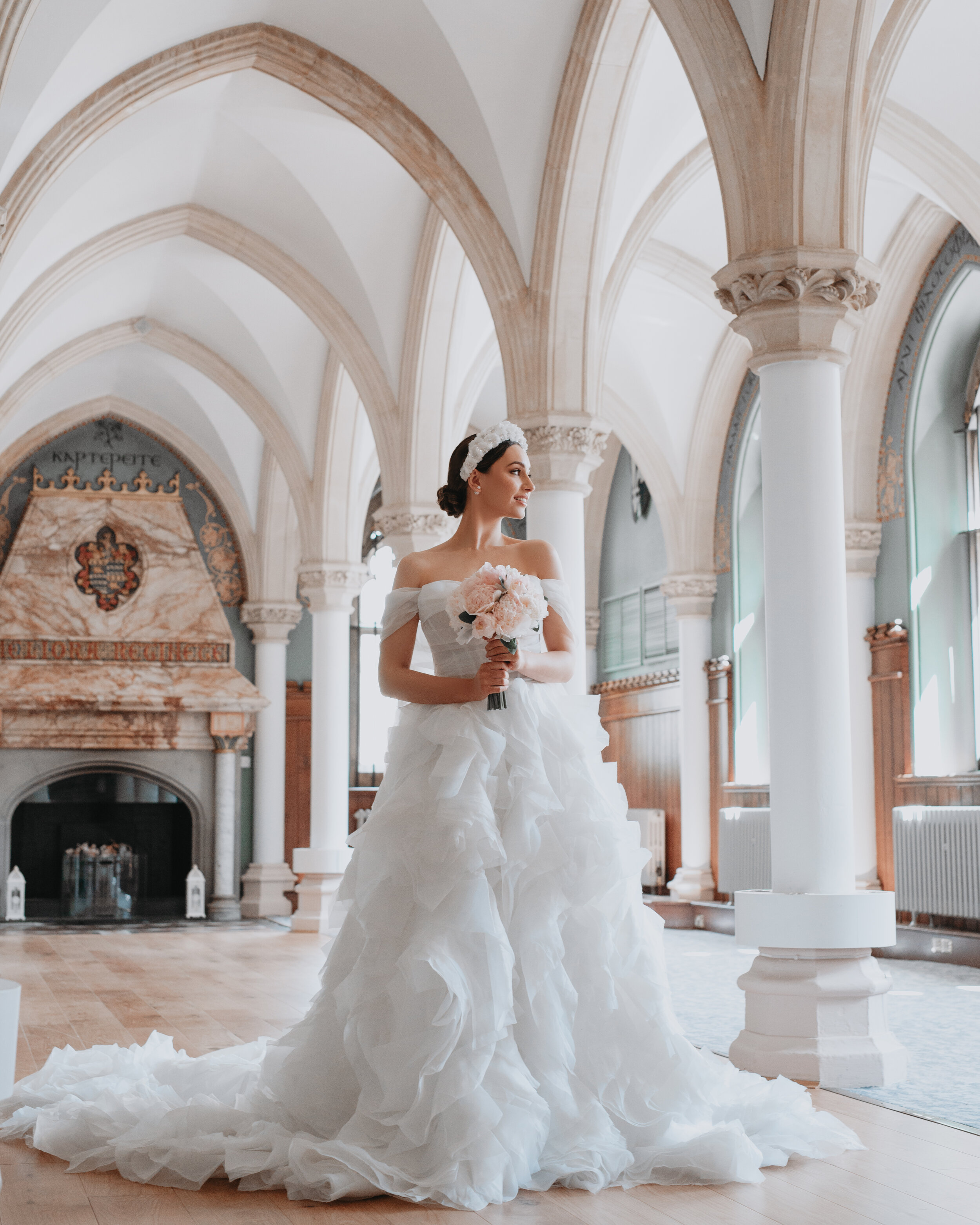
The very talented Charlotte Wise Photography captured this stunning editorial - let me tell you a secret - she did such an amazing job that I could actually share with you hundreds of images!! In fact choosing the ones to show case has been the hardest part of this post. So if this look inspires you please do go seek out the other suppliers involved and see their favourite images from this editorial - hopefully between us all we may be able to do Charlotte’s talent justice!
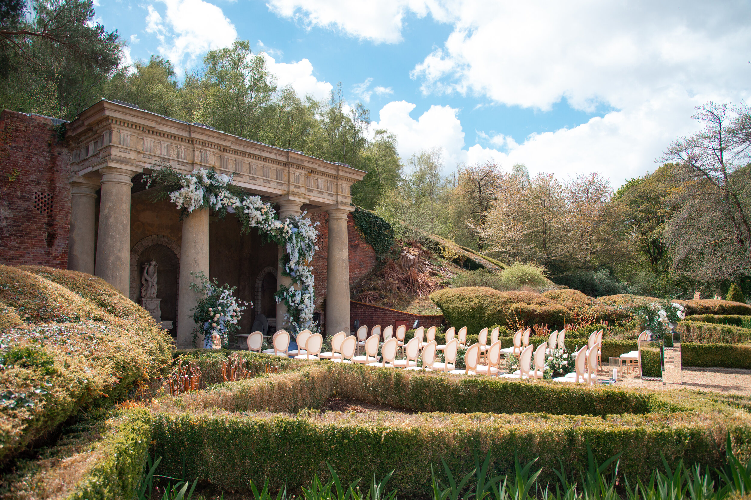
Inspired by Parisian details, and a wysteria colour palette, this editorial proves you can create a dreamy French aesthetic in the English countryside.
Set in Hale Park , a stunning wedding venue that sits on the top of a hill in a quiet, hidden corner of the New Forest. It’s stunning architectural details and landscaped gardens are as stunning as any French chateau.
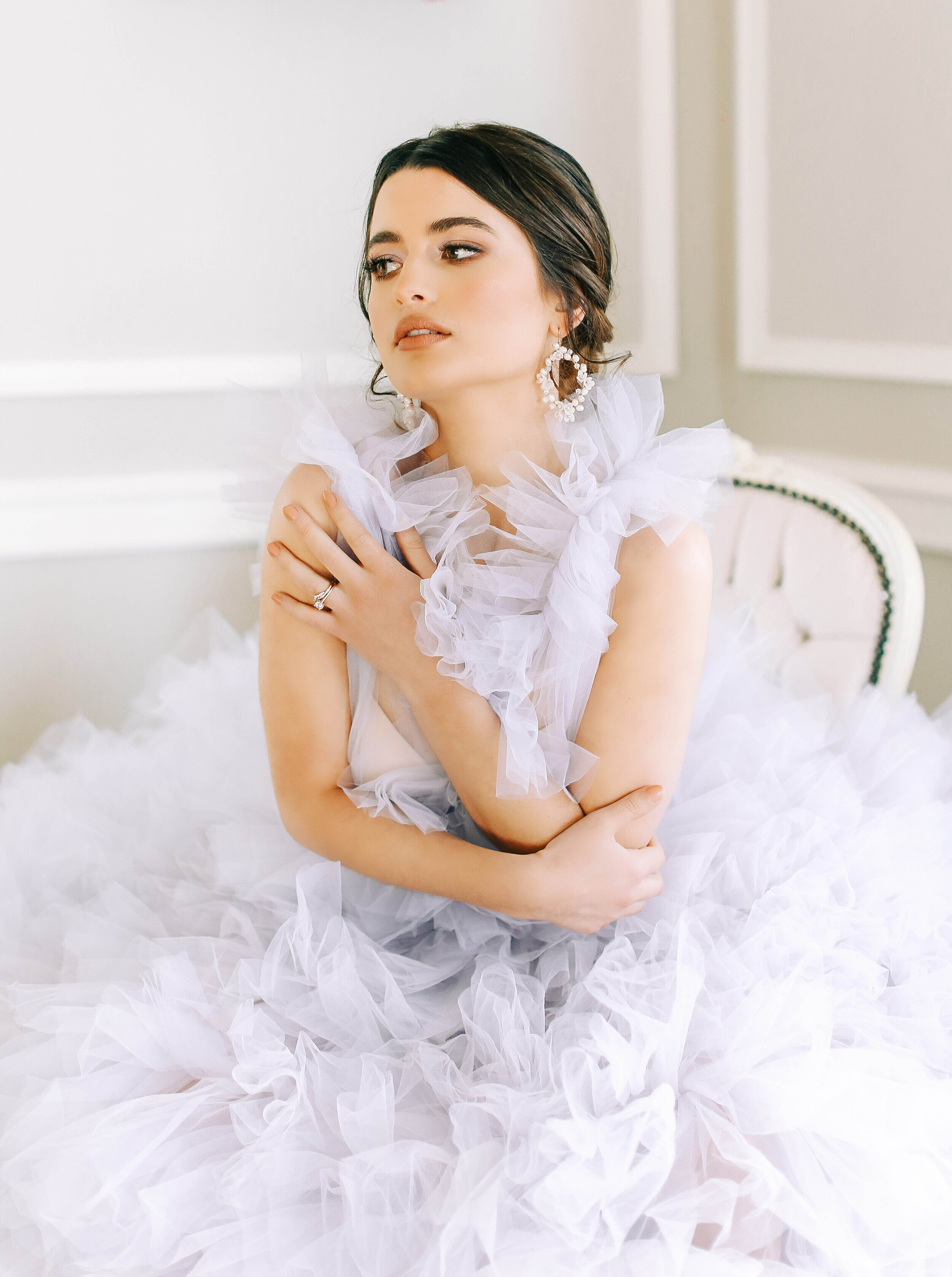
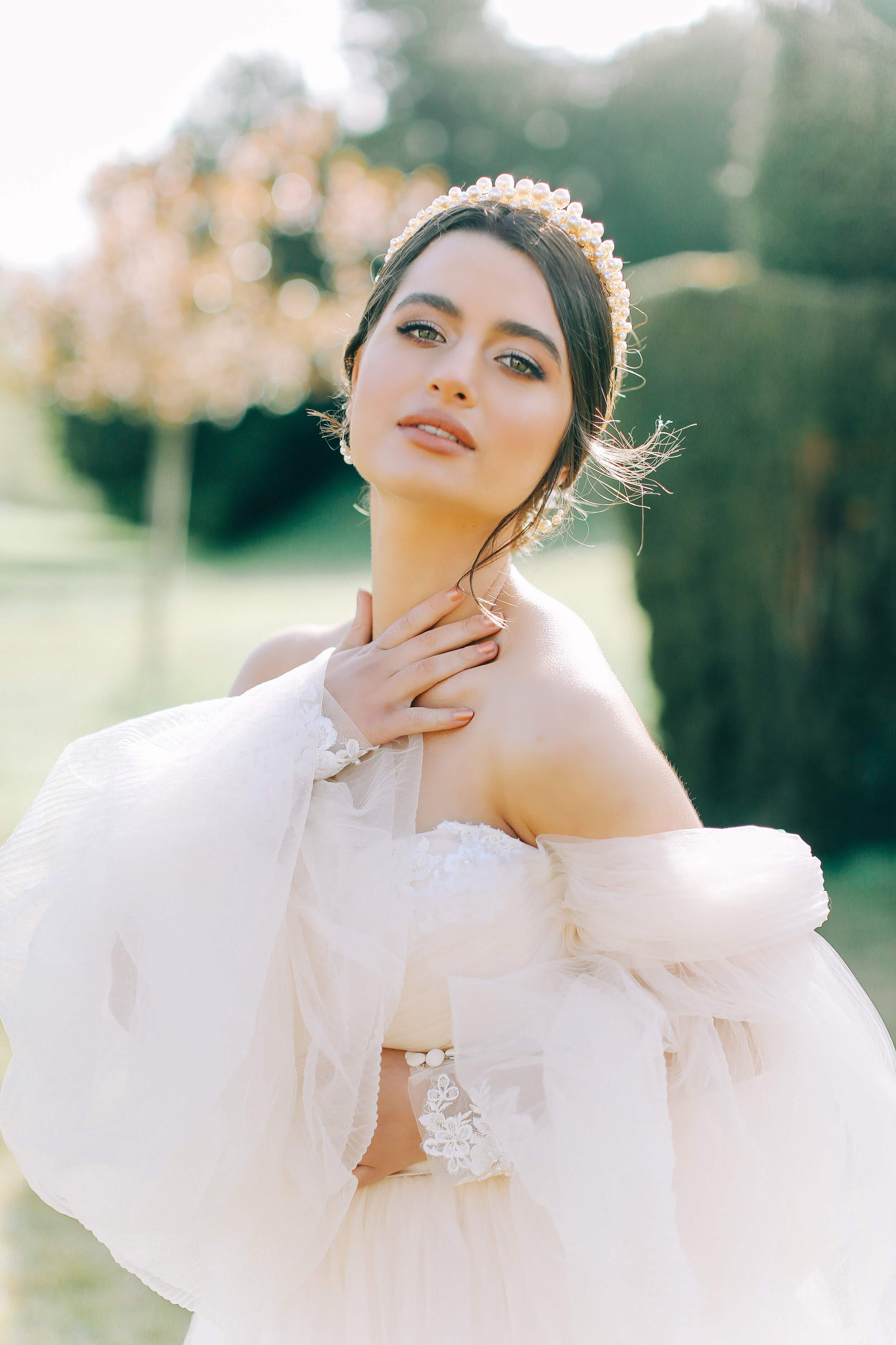
Our story begins with these gorgeous couple images, where the star of the show has to be the pale lilac ruffle dress by Millia.London. These colours completely depictive of the wisteria inspiration.
The stunning make up by Laura Carroll Make Up Artistry and hair by Samantha Stevenson Hair on bride Leyla Ucarx are definitely deserved of attention and are obvious in these beautiful bridal portraits!
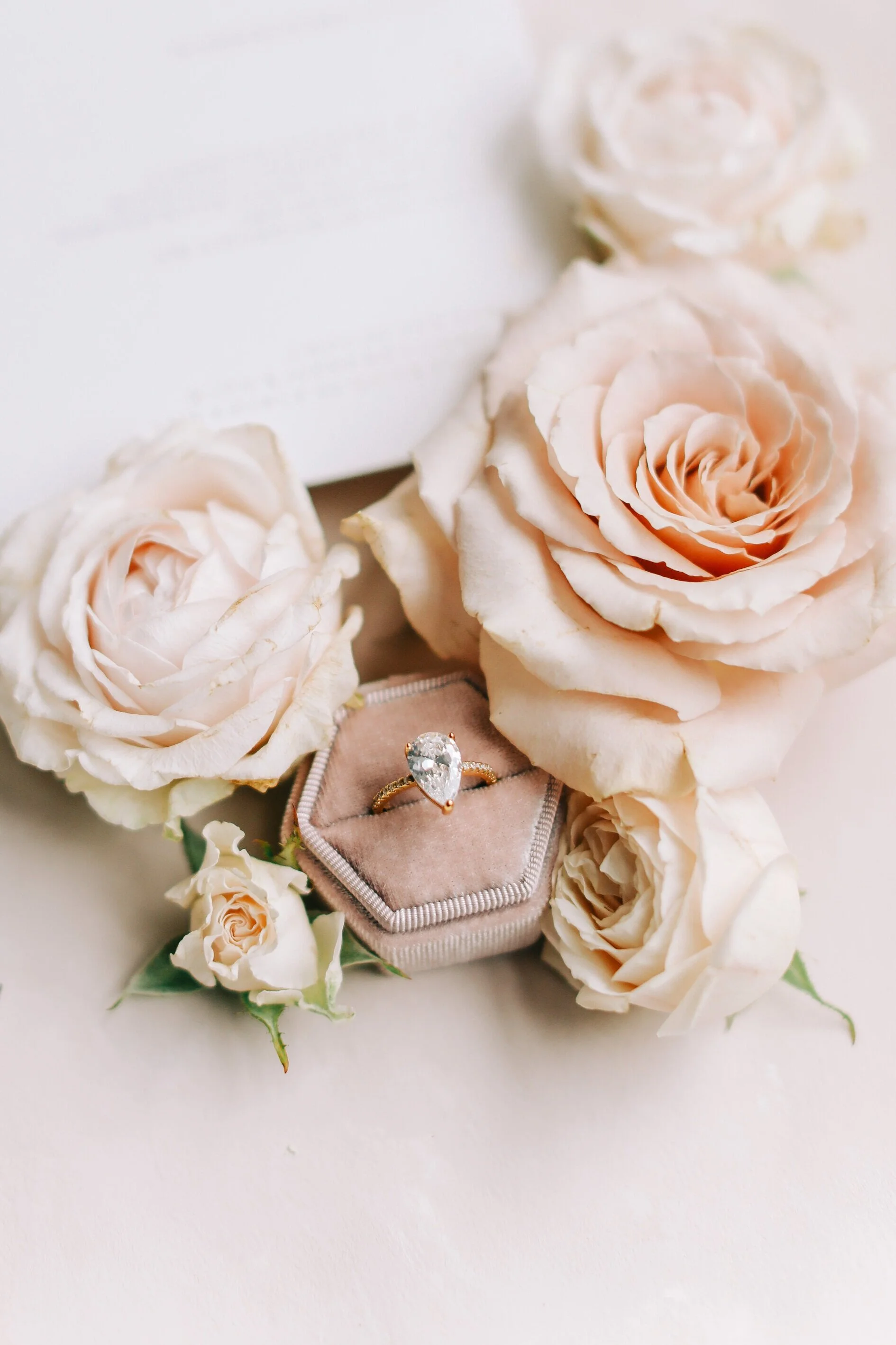
The bridal accessories from Rachel Sokhal Bridal are stunning throughout this shoot! The jewellery and the hair accessories help elevate our bride’s modern look. I love that the details and feminine touches are truly celebrated in these images! The palette is unashamedly girlie and this is especially portrayed through the delicate blush tones of the beautiful roses from Blush & Bloom Floral Design.
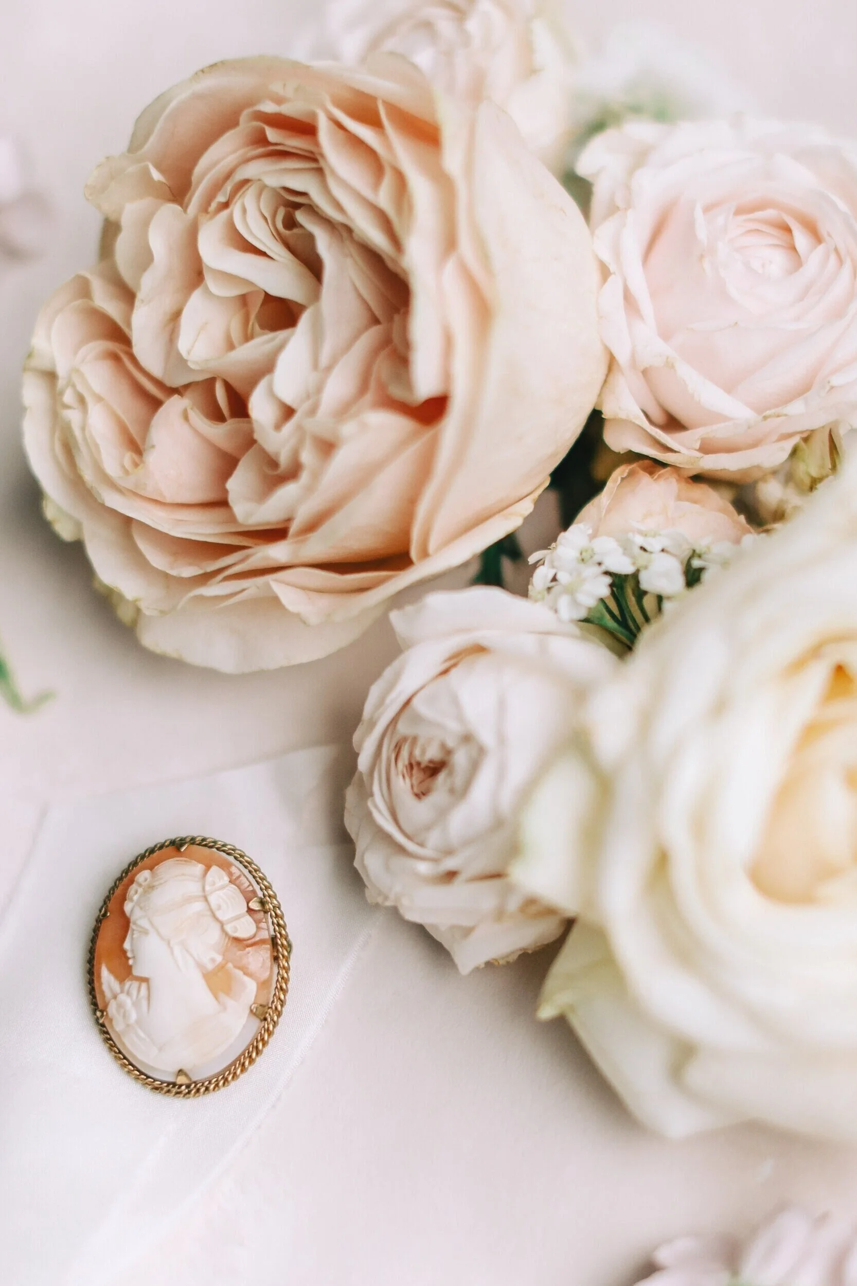
Lucy Ann Events and Charlotte Wise Photography have used gorgeous heirloom pieces that fit the theme perfectly. Ornate gold trays, mirrors and decorative pieces echo the Parisian feel.
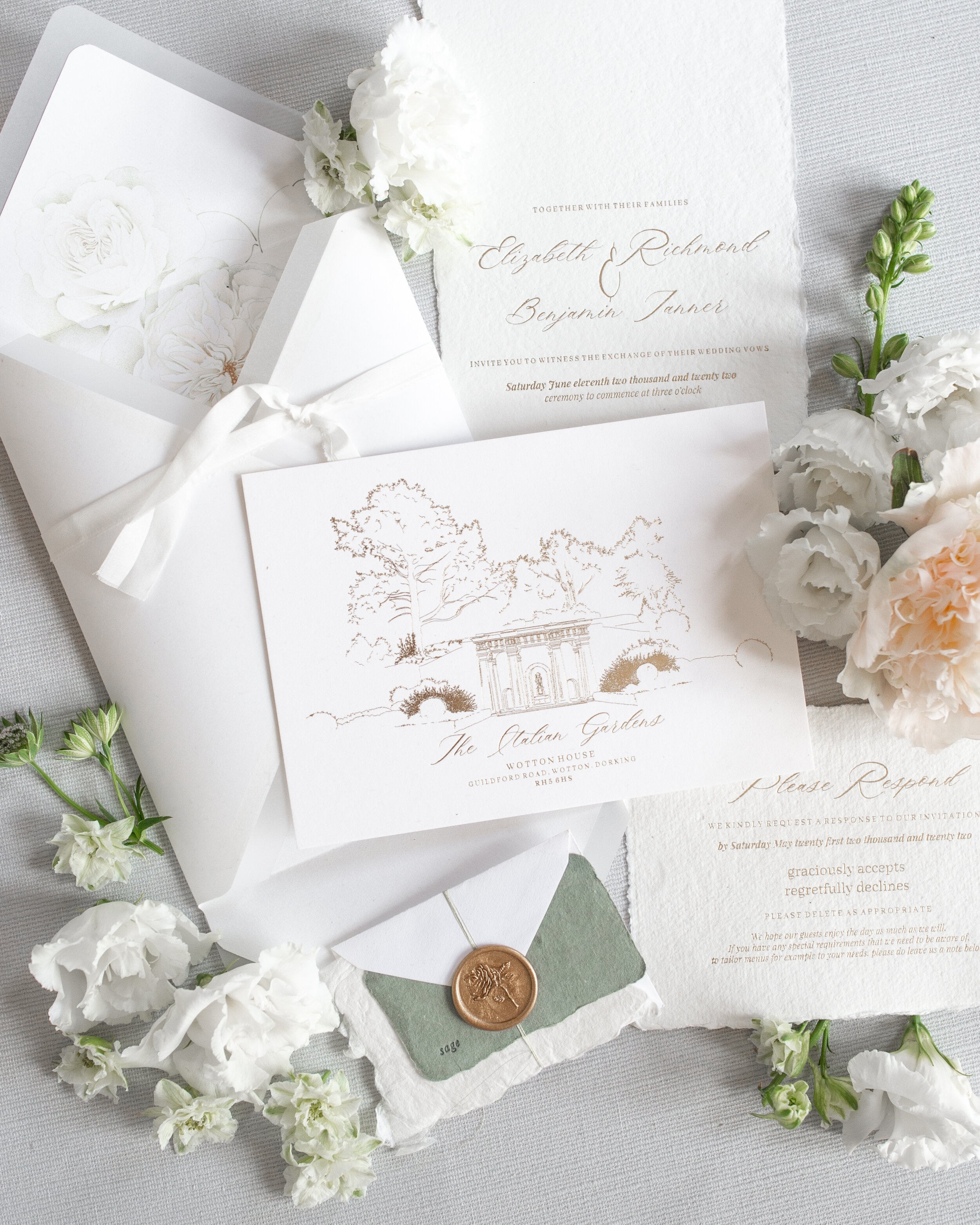
For the stationery I choose to use hand drawn elements throughout, decorative architectural sketches - all inspired from Versailles details. The hand made paper and gold hot foil pressed text creates a classic suite with small floral accents in addition, that are delicate but not detracting from the classic aesthetic.
My favourite pieces were the antique frames I used as place names. These floral discs were each gold hot foil pressed with guest names and then threaded with a blush tassel. They truly are so very beautiful and can so easily be adapted to suit any palette/design. It was such a pleasure to see them with these beautiful tones!
The second bridal look features a blush Aurelia Rose London gown. It’s fabric detail seems to be replicated in the artistry of this amazing cake by Hayley Elizabeth Cake Design! Both such a perfect pairing and very elegant!
The billowing sleeves of this dress get me every time! Such a dreamy feel for the bride and as photogenic as can be - a princess dress if ever there was one!!
H A L E P A R K
Editorial shoot team
Photography - @Charlottewisephotography
Planner & stylist - @Lucyannevents
Floral Design - @blushandbloom.floraldesign
Venue - @haleparkweddings
Models - @tomfowlie95 @leyla_ucarx
Bridalwear - @millia.london & @aureliaroselondon
Menswear - @charlestyrwhitt
Accessories - @rachelsokhalbridal
Stationery - @peoniesandpaperclips.uk
MUA - @lauracarrollmakeupartistry
Hair - @samantha.stevenson.hair
Cake - @hayleyelizabethcakedesign
Furniture hire - @academyfurniturehire
Chandeliers - @crescent_moon_events
Candle holders - @luxemywedding
Ribbon - @silkandpurl
E D I T O R I A L . 9
S K Y G A R D E N S L O N D O N
M O D E R N , C H I C L O N D O N W E D D I N G I N S P I R A T I O N
The ‘Fine Art Wedding’ trend is typically associated with country estate weddings, dreamy coastal settings, or even stunning Tuscan elopements etc; but that doesn’t mean it cannot be achieved in a modern city centre environment!
Fine Art is about highlighting the bespoke artistry of each supplier, and the journey taken to create each element of your day and this editorial is a true celebration of fine art design celebrated in the modern central London venue Sky Gardens.
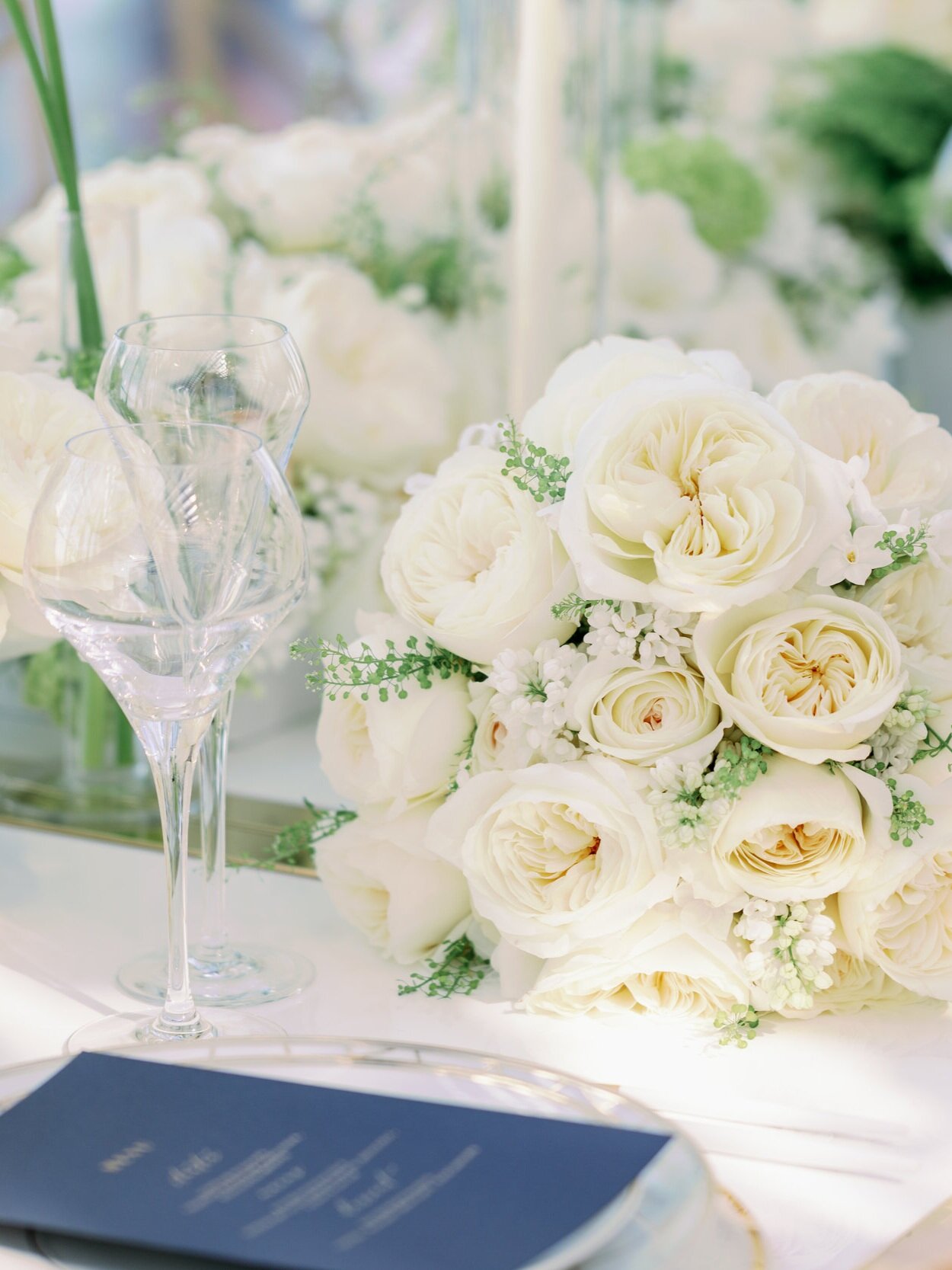
This editorial was the second that I have been fortunate to work on for David Austin Wedding Roses. The iconic wedding rose leading this story is the gorgeous Leonora rose. A rose abundant with petals, but so very understated. Clusters of these open white blooms produce such an elegant bouquet and when mixed with it’s smaller buds that show glimpses of blush and yellow, large floral installations create depth and interest in very subtle ways.
Mary Jane Vaughan Designs showed the Leonora roses at their absolute best in pieces ranging from a tight, abundant bouquet, long table centre arrangements for the sensational tablescape and large opulent urns that are certainly the most attention seeking element of this decor design - in totally the right way!!
The details in this editorial are careful and considered. Minimal pieces that are reflective of a bride with elegant understated taste. This bride loves pieces that have been made with great love, time and attention to detail, the quality speaks for itself.
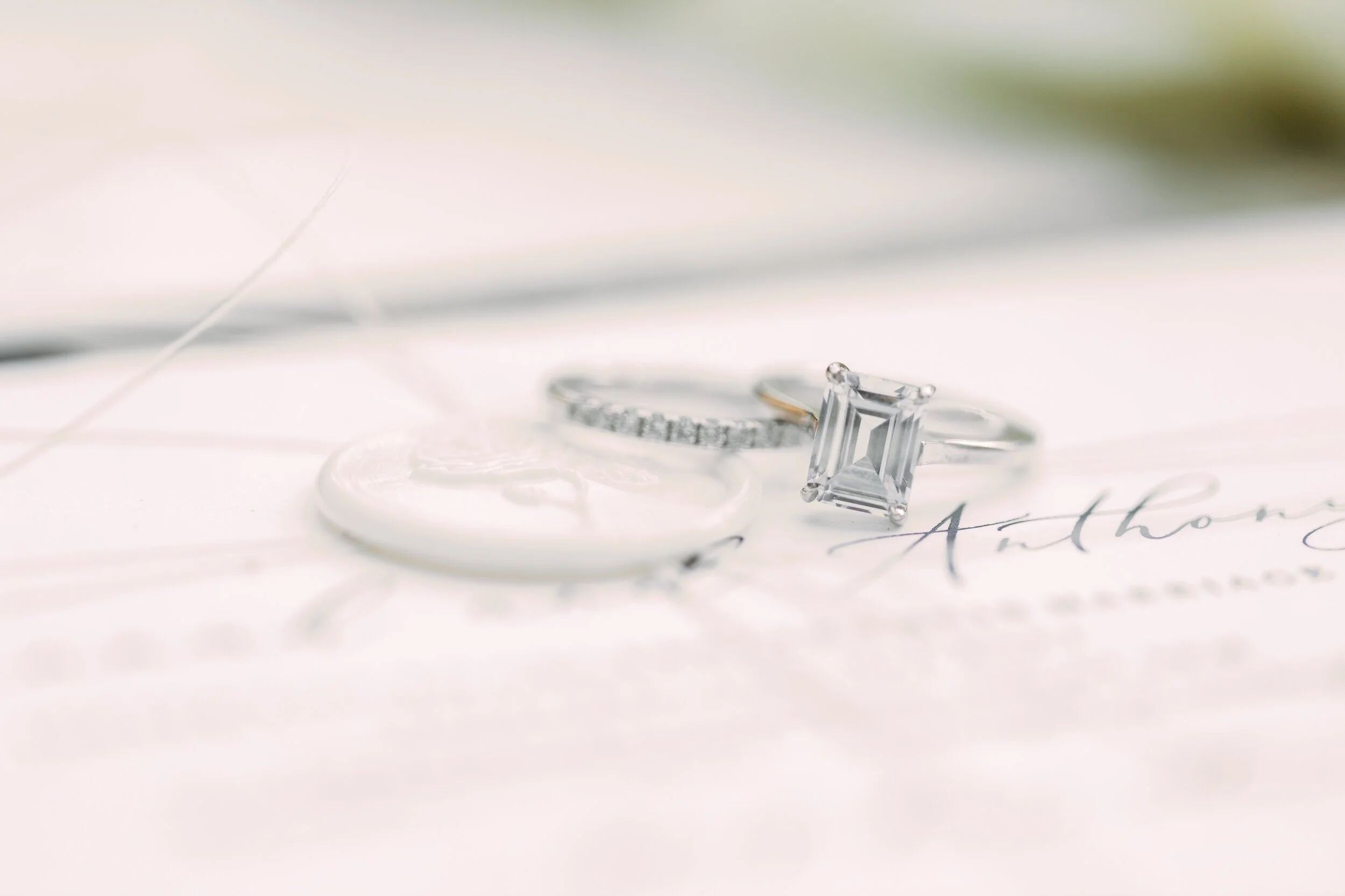
This is not a story with everything known to weddings chucked in for good measure! Instead a beautiful example of how less can definitely be more! A stunning example of this is the bridal jewellery by Nevill Argyle The two rings stack beautifully and each has a timeless design, creating a classic combination any bride would love to wear!
With so many areas of London known for their architectural details, as backdrops for portraits, this city spoils you! Whether neutral pillars and stonework, or monochromatic statues and bridge details there is a look for all tastes here.
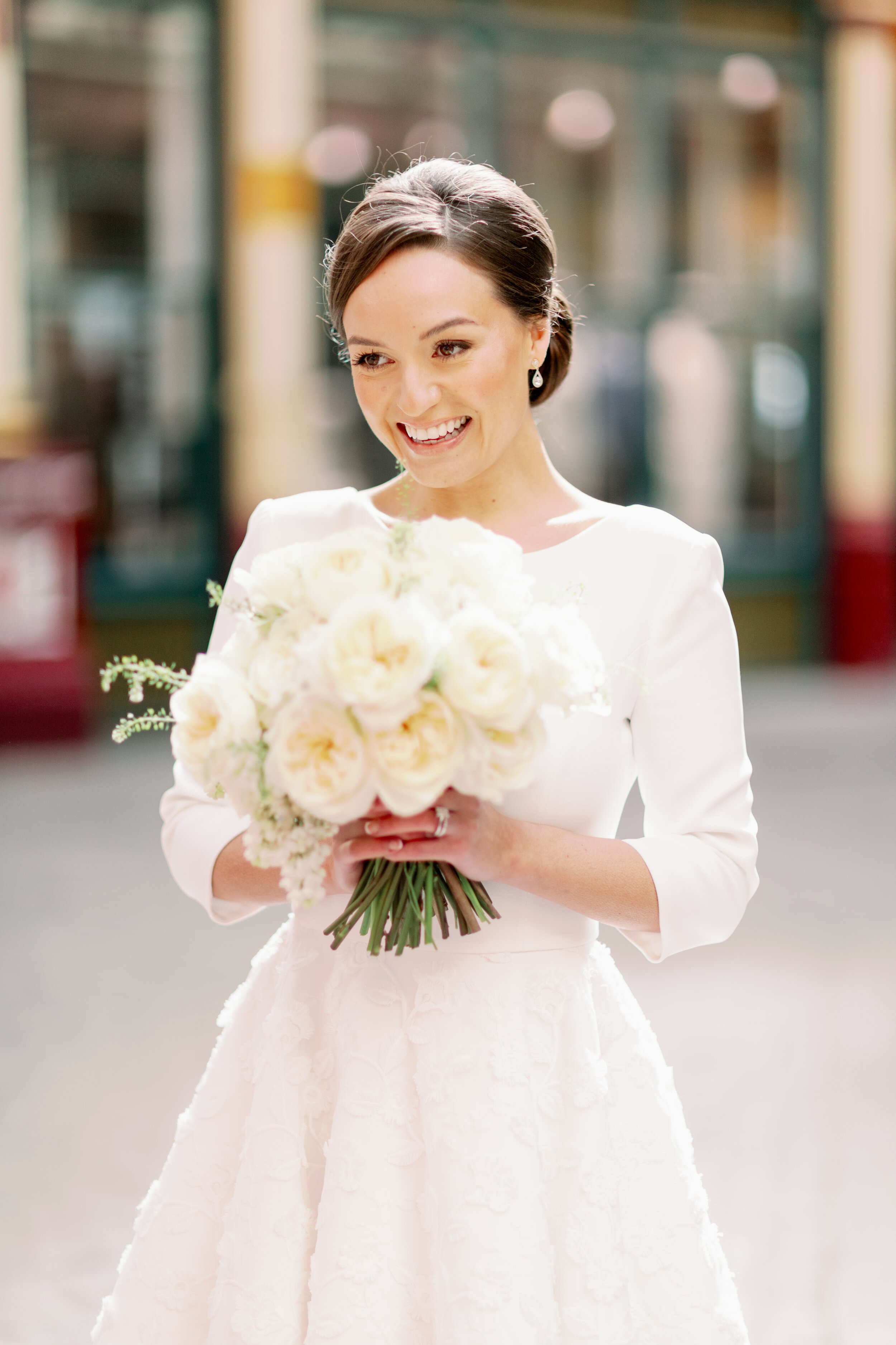
Leadenhall Market, just a few minutes walk from Sky Gardens, is the backdrop for these modern bridal portraits, captured by Camilla J Hards Photography. I just love the pop of red these images bring to the editorial, with the main colours of red white and blue very evident in this gallery it’s a very fitting scheme to celebrate a fine art English heritage feel.
I just love this Suzanne Neville dress - so sleek and fitted at the top, the drama is all in the skirt! High at the front gives a modern, cheeky feel to our bridal look and yet the train at the back creates such an elegant, chic silhouette. It truly is a modern beauty for any fine art bride. The skirt has great movement in images and the stunning brocade detail of the fabric has a tactile, luxurious feel.
The high skirt allows the shoes to be a key seen finishing touch. For brides that are all about the shoes this dress was made for you!! Look how beautifully it displays the beautiful satin bow heels from Emmy London.
When designing the stationery for this look it was vital to keep the feel of the suite minimal, light and modern. The star was definitely the illustrated venue card within the suite. I refuse to use ‘stock images’ in my work, so I spent days drawing famous London landmarks that would create the skyline feature. Some artistic license regarding scale etc was definitely used to produce an aesthetically pleasing result; but I was so pleased to produce a piece that features London so obviously and yet so elegantly.
The stationery was to match the wedding palette of blue and white. Each piece hot foil pressed with a midnight blue pigment foil, on 100% cotton paper. It’s a tactile beauty that guests will love. Further interest was added with a Leonora Rose illustration printed in to the envelope, and finishing touches such as twine, wax seals and silk ribbon all add to the look without detracting from the design.
Any metallic finishes were in gold and this was echoed with the hot foiled address on the envelope’s reverse flap. Vellum was also introduced, echoing the transparent feel of the venue with all those windows overlooking London. It’s a suite full of so many little details that as a whole compliment each other.
The blue and gold stationery combination was carried through to the wedding table decor. Each place setting presented with a midnight blue menu with gold hot foil pressed text and name cards with blind embossed borders.
There is something so very classic about a dark blue and gold pairing, when the table also features a decadent abundance of gorgeous white roses this is a timeless tablescape bound to wow!!
Which leads me to the show stopping part of the shoot! The wedding reception at Sky Gardens - overlooking an idyllic London skyline. The Sky Garden is already a greenery oasis in the middle of concrete land, but when you add hundreds of stunning Leonora roses to the scene it is next level stunning!
S K Y G A R D E N S
Editorial shoot team
Produced for - David Austin Wedding Roses @davidaustinweddingroses
Photography - @camillajhardsphotography
Floral Design - @maryjanevaughan
Creative Direction - @kellysparkeswp
Bridal Gown - @suzanneneville
Hair & MUA - @botiashairandmakeup
Wedding Stationery - @peoniesandpaperclips.uk
Bridal Shoes - @emmylondonofficial
Wedding Jewellery - @nevillargylejewellery
Events rentals - @optionsgreathire
Bride - @alanawallaceofficial
F E A T U R E D W I T H
E D I T O R I A L . 8
C A M E H O U S E W E D D I N G I N S P I R A T I O N
When the vision for this editorial landed in my email it immediately conjured up such a classic, elegant, fine art story. A concept by Amy ‘thetimelessstylist’ to produce imagery celebrating the iconic David Austin Wedding Roses.
To me the actual outcome produced two stunning stories and I want to highlight to you the one that tugged at my heart strings the most….
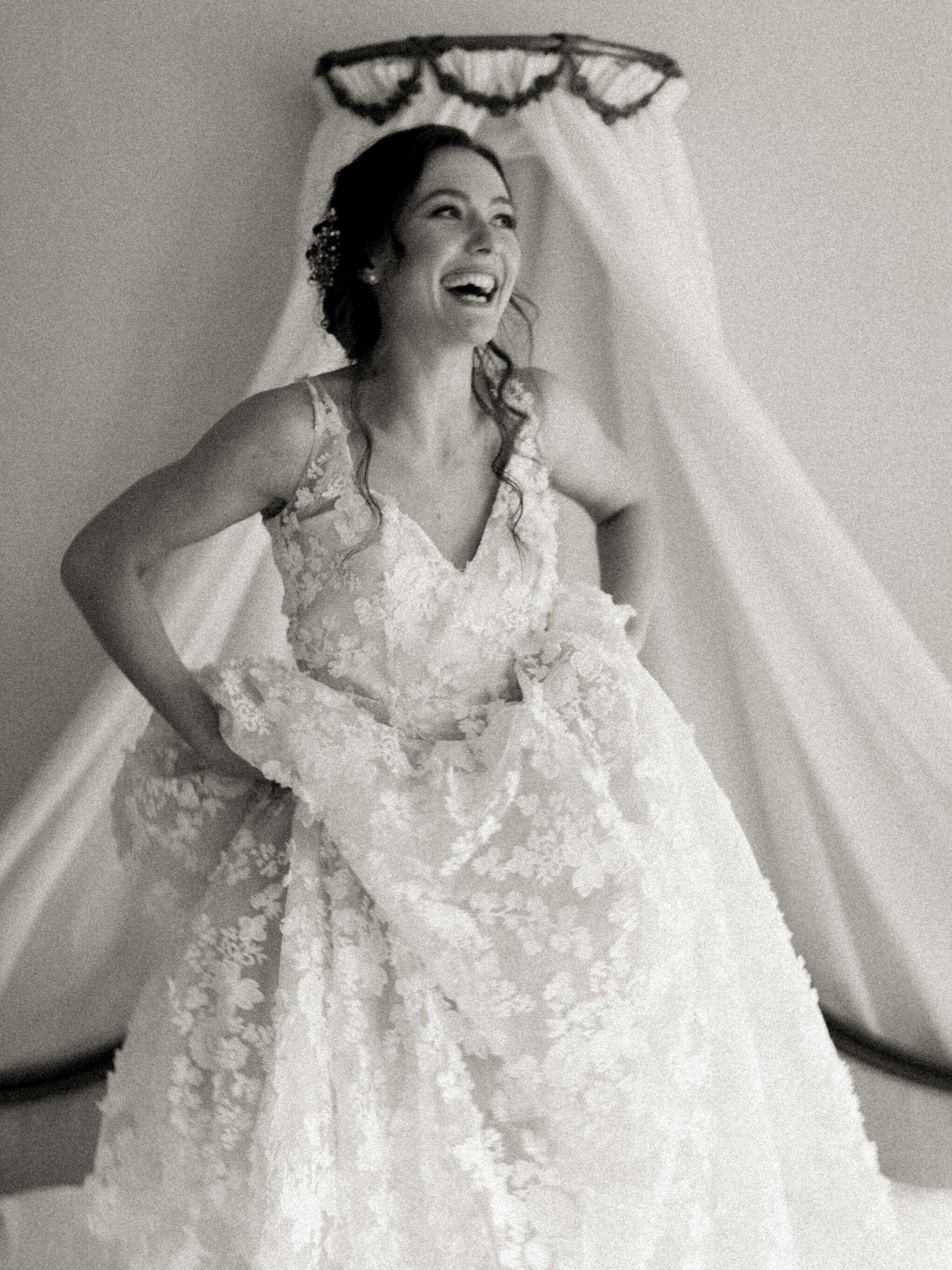
Let me share with you the truly intimate images of a bride before her wedding! Captured so beautifully by Imogen of Imogen Xiana Photography. These light, ethereal images show so much more than pretty imagery; the precious details and more importantly the raw emotion has been immortalised in these precious stills, each one it’s own mini fine art print.
Each and every detail shown so beautifully in such a classic way. Not just the pieces chosen by the bride just as these gorgeous pieces by Rachel Sokhal Bridal, but the stunning details of the venue.
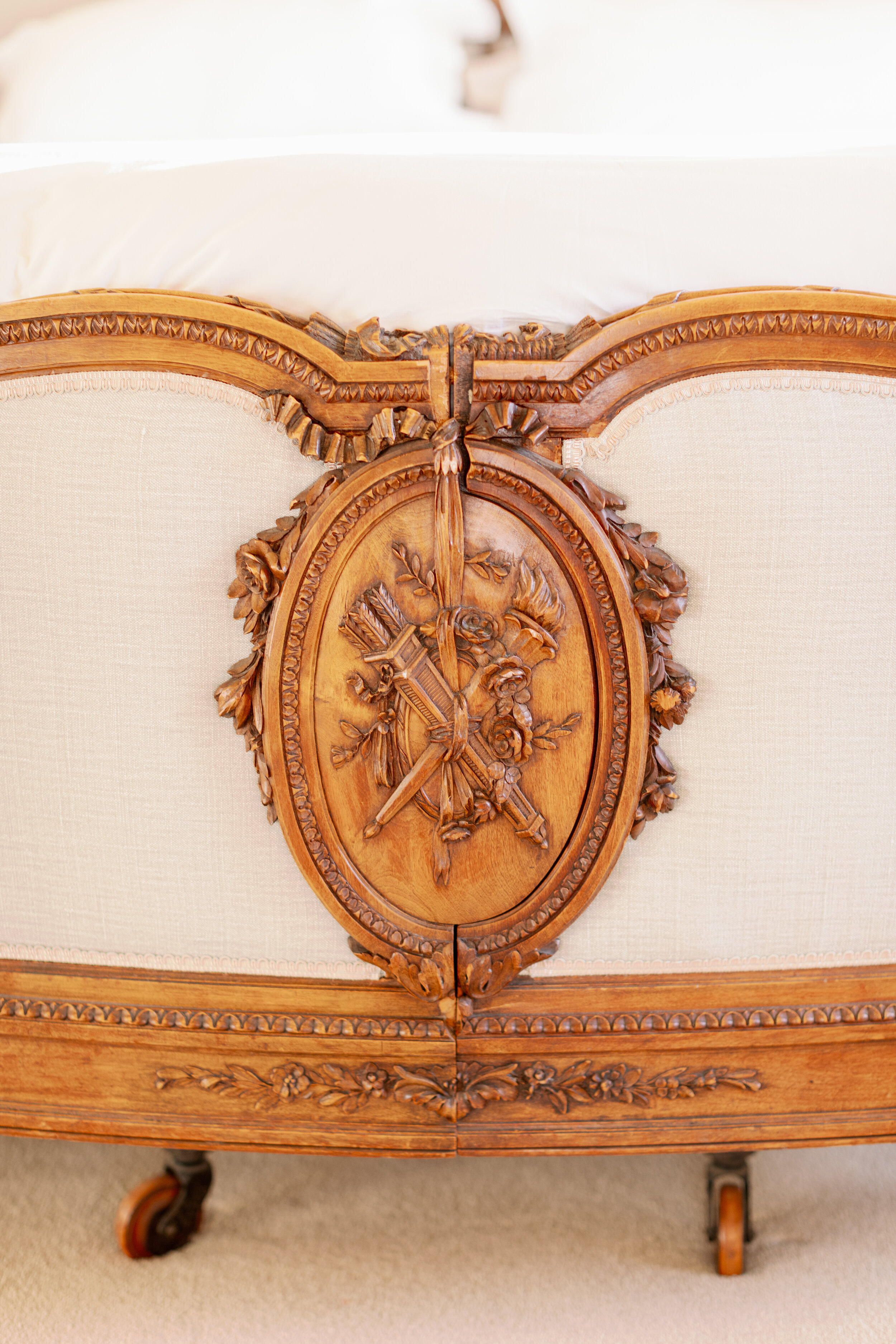
CAME House is a beautiful historic building based in Dorset, England. Its neutral tones help the stunning architectural details shine naturally. The bridal suite is such an elegant space, it’s large windows flood the room with natural light and highlight the exquisite antique details within the room’s decor.
Here in this bridal suite we see our bride to be for the first time. Her excitement and elation is obvious to see and I simply adore these images of sheer joy!!
I’m actually jealous and it makes me want to go back and do it all again! Some of us are too full of nerves, or the room (those in it) don’t always allow us to fully open up. Maybe a beautiful consequence of the past year’s micro weddings is that we have simply seen what the couple deem to be important! The things they cannot be without, the feelings and love between them and not the stress of pleasing everyone else.
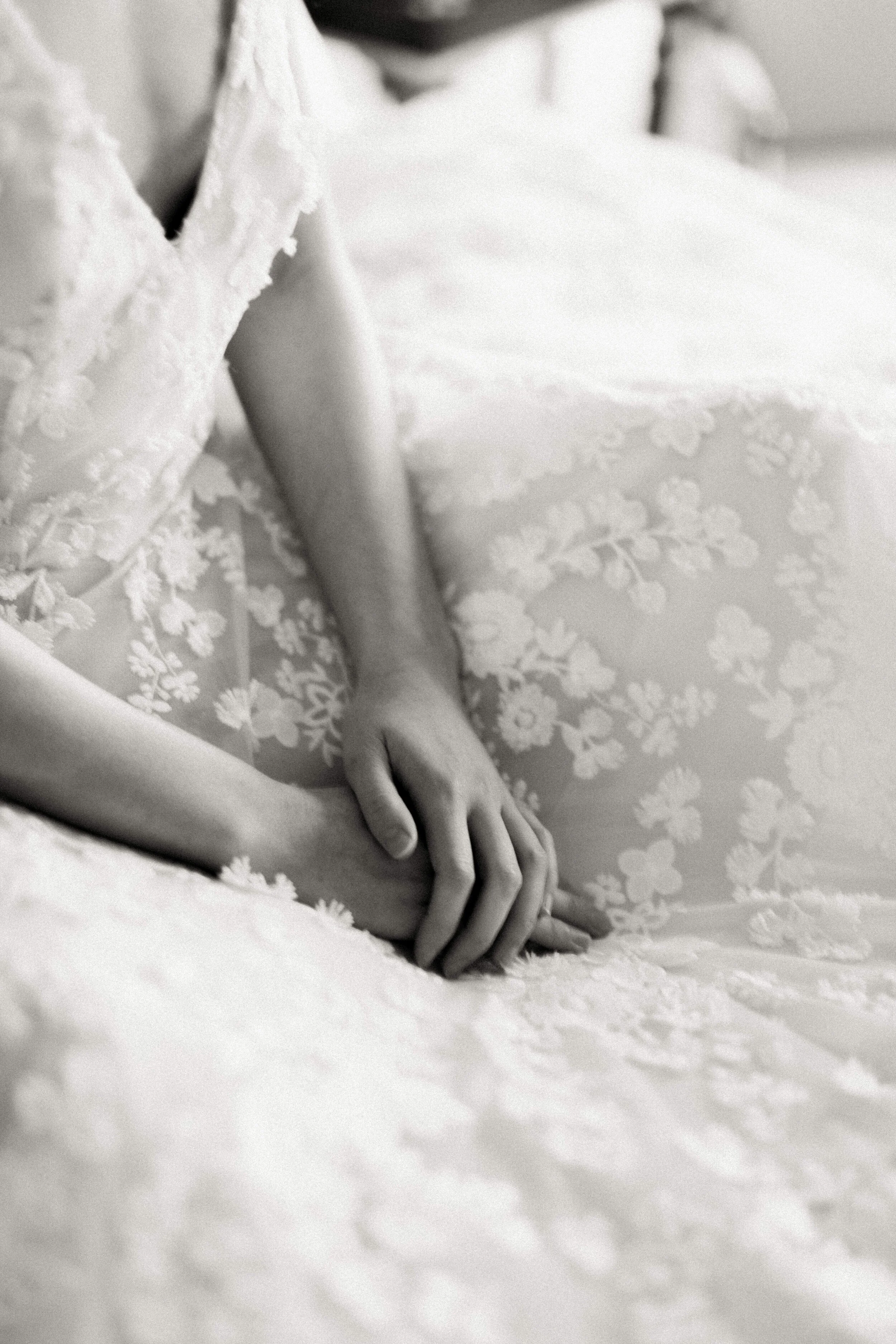
These images show some nerves there’s no denying - the tender rubbing of the hands is something we can all identify with when nervous, but how lovely to just be able to be excited! To be childlike with it, to enjoy every moment!
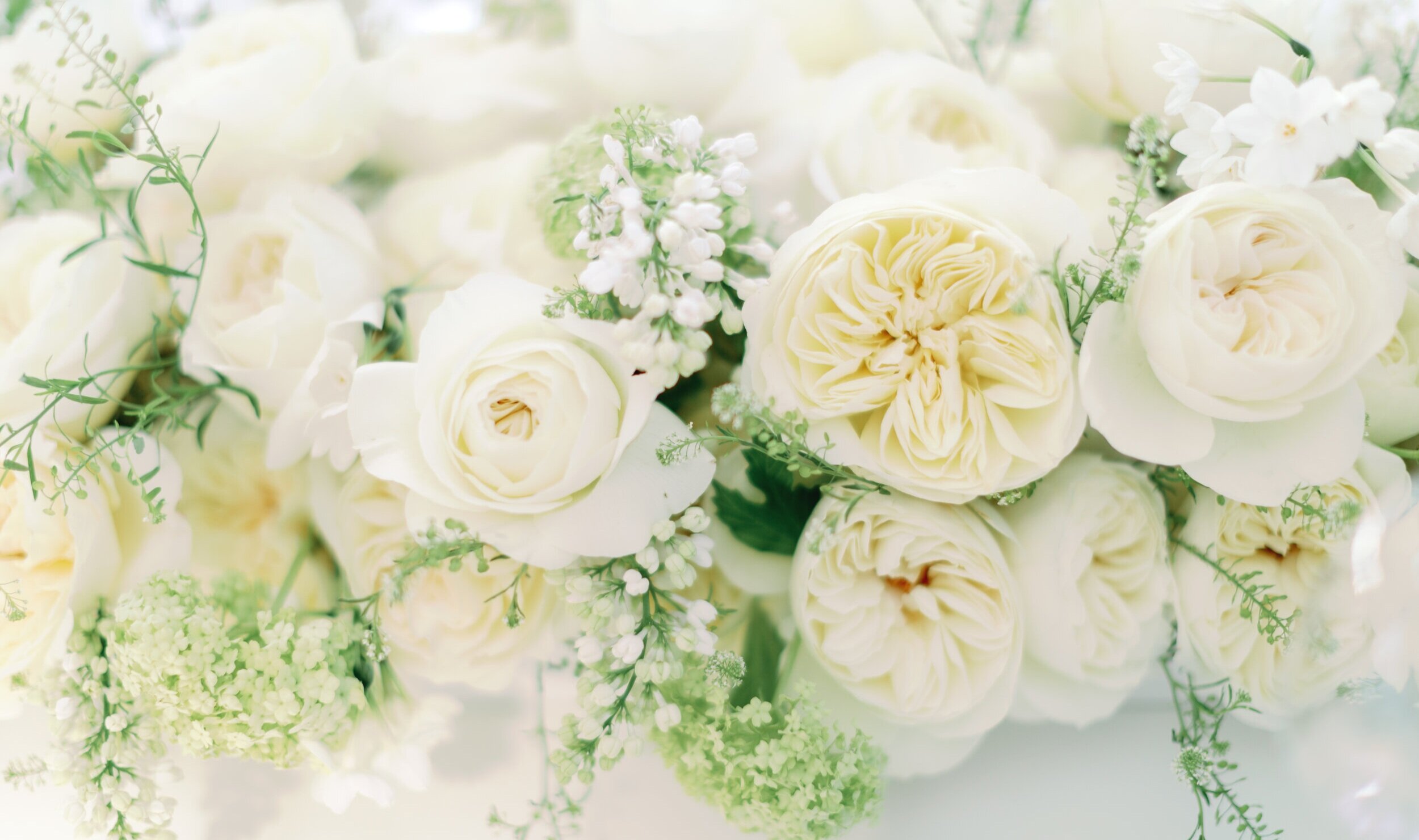
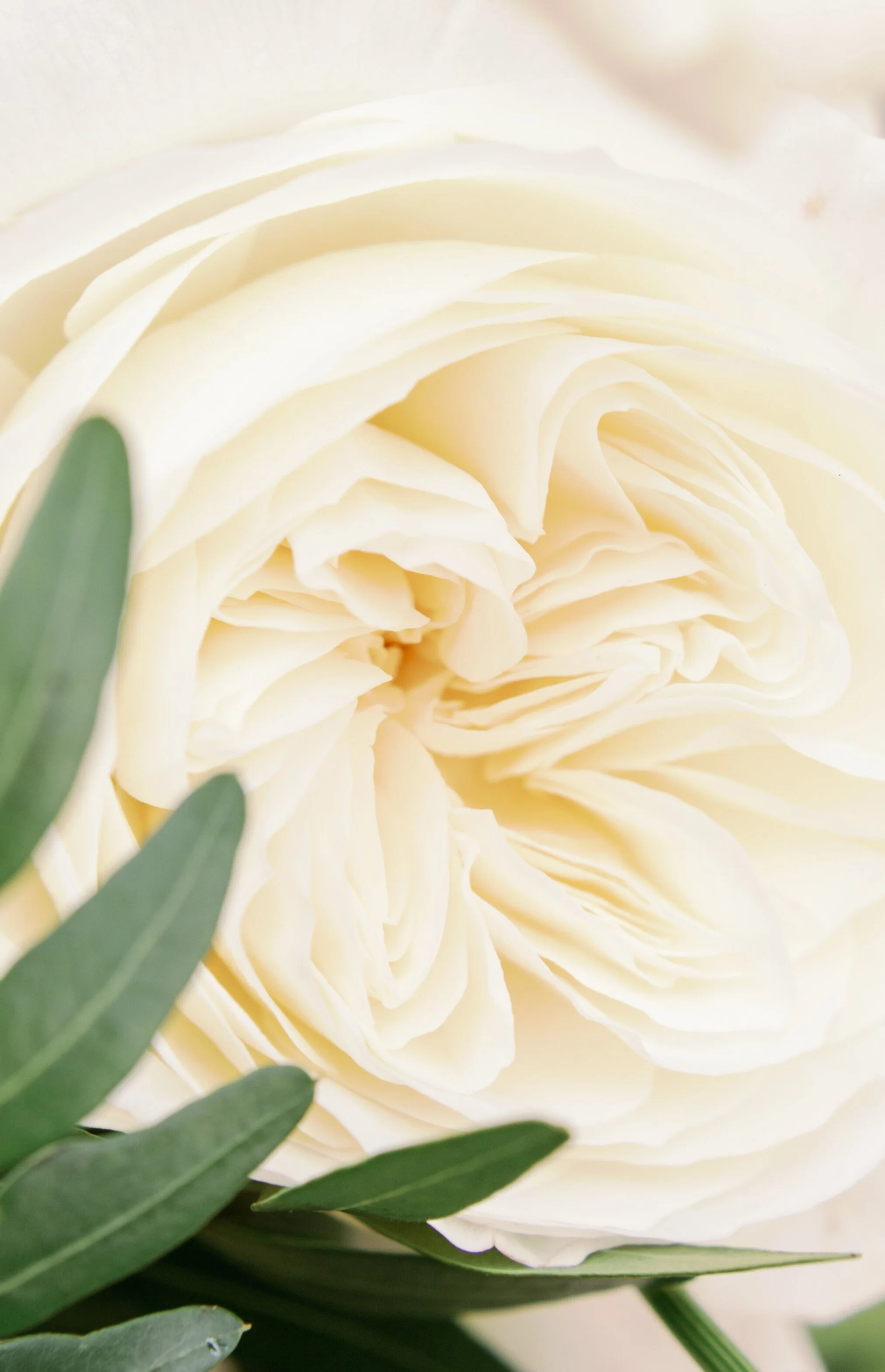
The absolute star of the editorial has to be the gorgeous David Austin Wedding Roses used throughout.
Amy deliberately kept the styling minimal, a vision of understated luxury and pared back elegance allowing the true beauty of the roses to headline. The floral design created by Joanne Truby Floral Design with assistance from Clementine Moon Floral Design included Keira, Leonora and Purity roses.
The bouquet designs show these showstopper roses mixed with white ranunculus, white lilacs, anemone, green hellebore and beautiful trailing foliage.
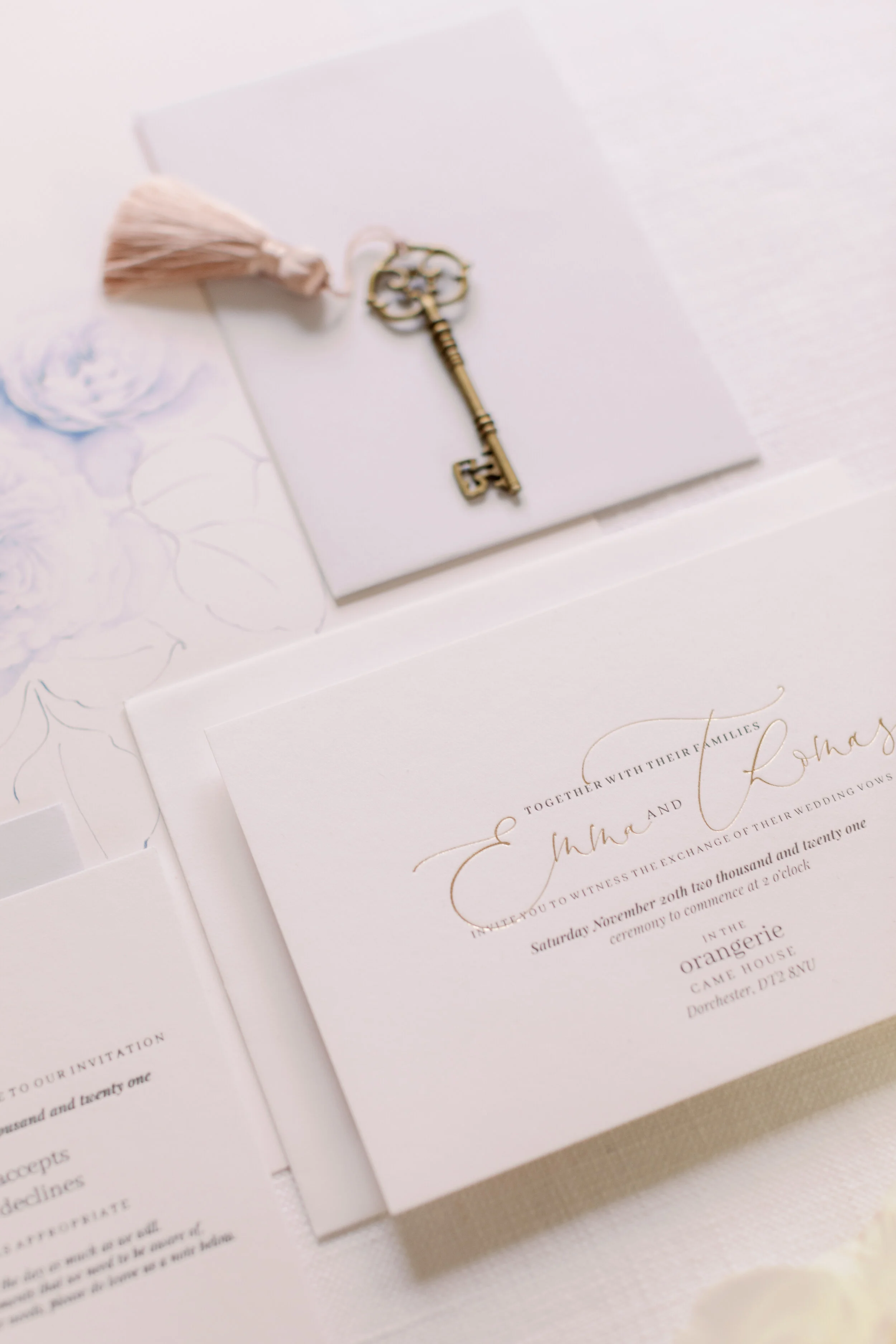
The roses were to be the absolute stars of the stationery suite too, but not in the usual way - The wedding suite was minimal and classic. Soft white, recycled cotton paper stock was the canvas for the palest of grey and luxury pressed gold text. The neutral tones were mixed in ever such a subtle way, adding more depth than simply all white only, but still keeping a very minimal outcome.
Detailed rose illustrations can be seen alongside the suite. The all blue piece a bespoke illustration showing in greater detail the Leonora roses. Inclusions like this are such a special keepsake of your day and such a beautiful, subtle every day reminder when framed and proudly displayed in your home.
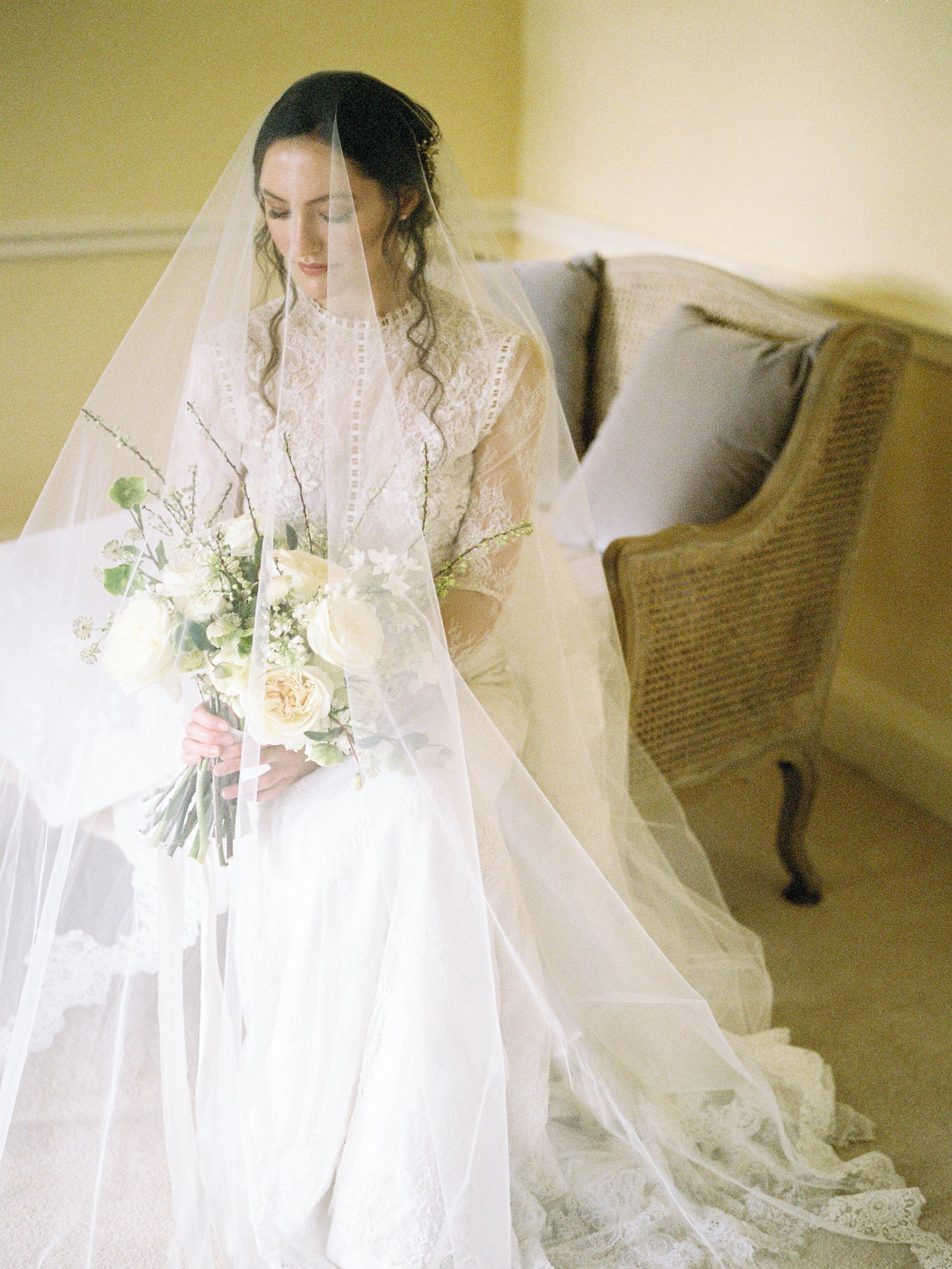
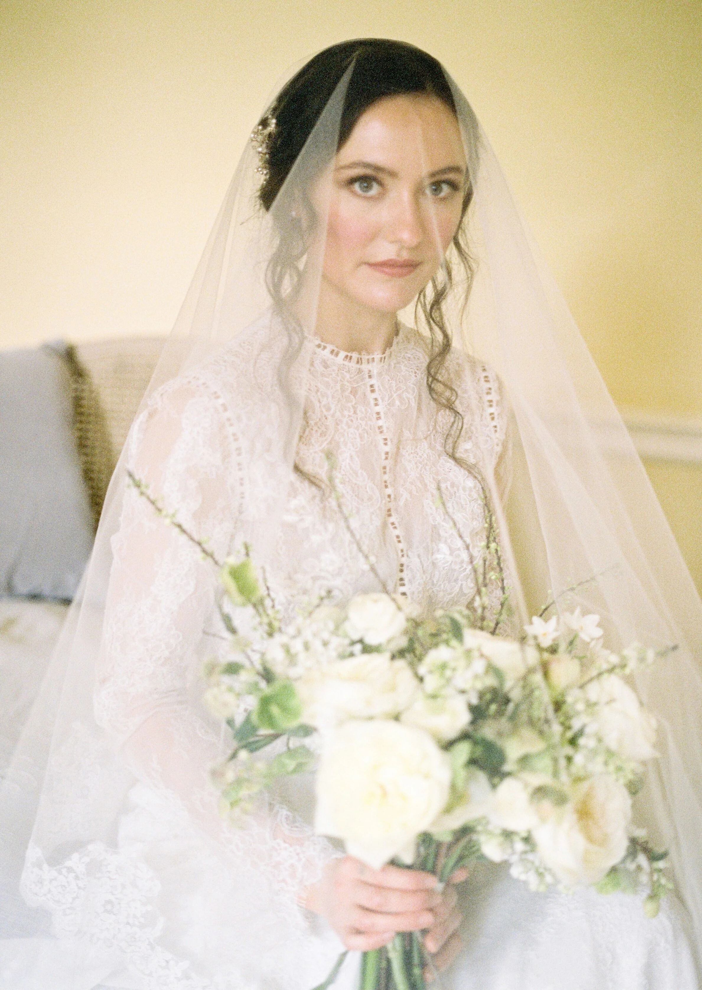
The bridal gowns provided by Morgan Davies Bridal are both so soft and feminine, but each in their own way. This second gown by Anna Georgina is more demure. A refined elegance with stunning lace details. The high neck and those all lace fitted sleeves showing the intricate lace details beautifully. The tight fitting body and that delicate lace train gives such a classic silhouette - A truly timeless fine art bride look.
If any bride is ever deliberating ‘a veil, or no veil?’… I urge them to look at the artistry of these next portraits for proof of a definite yes, do it!! This stunning veil by Ami Elisah Bridal. There is something so traditional, so classic and expected about a veil on a bride and whilst it doesn’t symbolise what it used to, it still remains a beautiful accessory. Maybe it’s the Marmite of bridal fashion, but for those that have dreamt of their Princess moment since childhood and a veil has been part of that I say embrace it confidently, with all the pride you would have as a child!
I find the movement in a veil mesmerising! I love layering sheer fabrics and in my case papers, to see glimpses of what is below softer, unfocused and it’s this effect that is almost magical!
C A M E H O U S E
Editorial shoot team
Produced for - David Austin Wedding Roses - @davidaustinweddingorses
Concept, Planning and Styling - @thetimelessstylist
Photography - @imogenxiana
Floral Design - @Joannetrubyfloraldesign
Floral Assistance - @clementinemoon_floraldesign
Bridal Gown One - Stephanie Allin by @morgan_davies_bridal
Bridal Gown Two - Anna Georgina by @morgan_davies_bridal
Hair and Make Up - @hollieadanby_makeup
Stationery - @Peoniesandpaperclips.uk
Bridal Accessories - @Rachelsokhalbridal
Bridal Veil -@amielisahbridal
Napkins - @theembroiderednapkincompany
