R E A L W E D D I N G - C L E O & T H O M A S
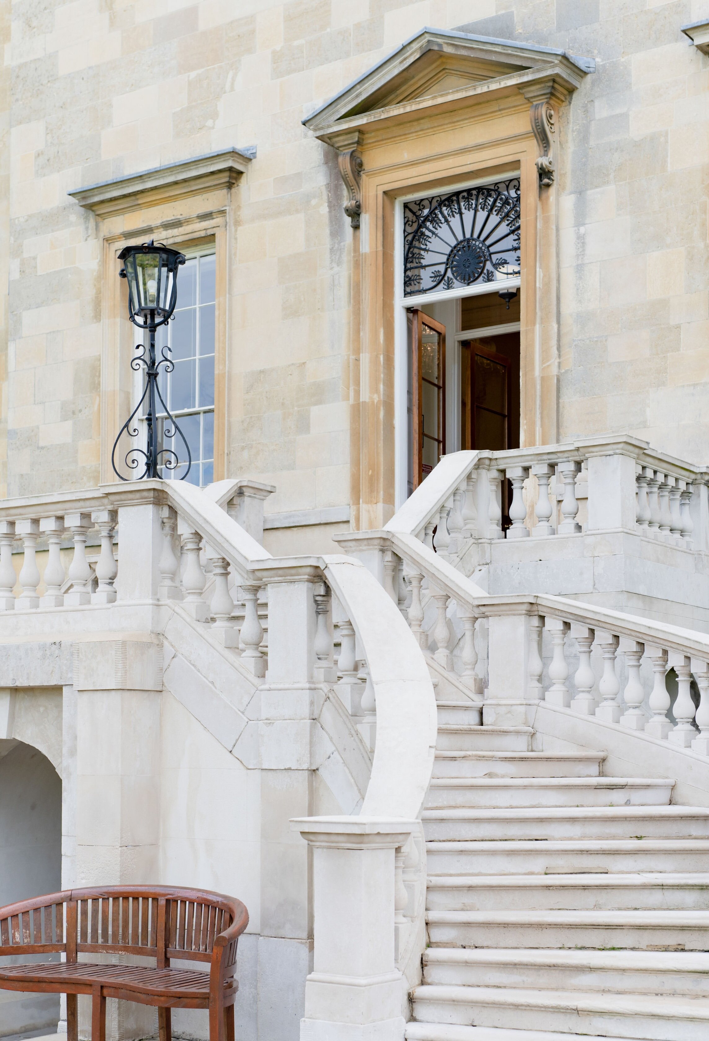
S O M E R L E Y H O U S E
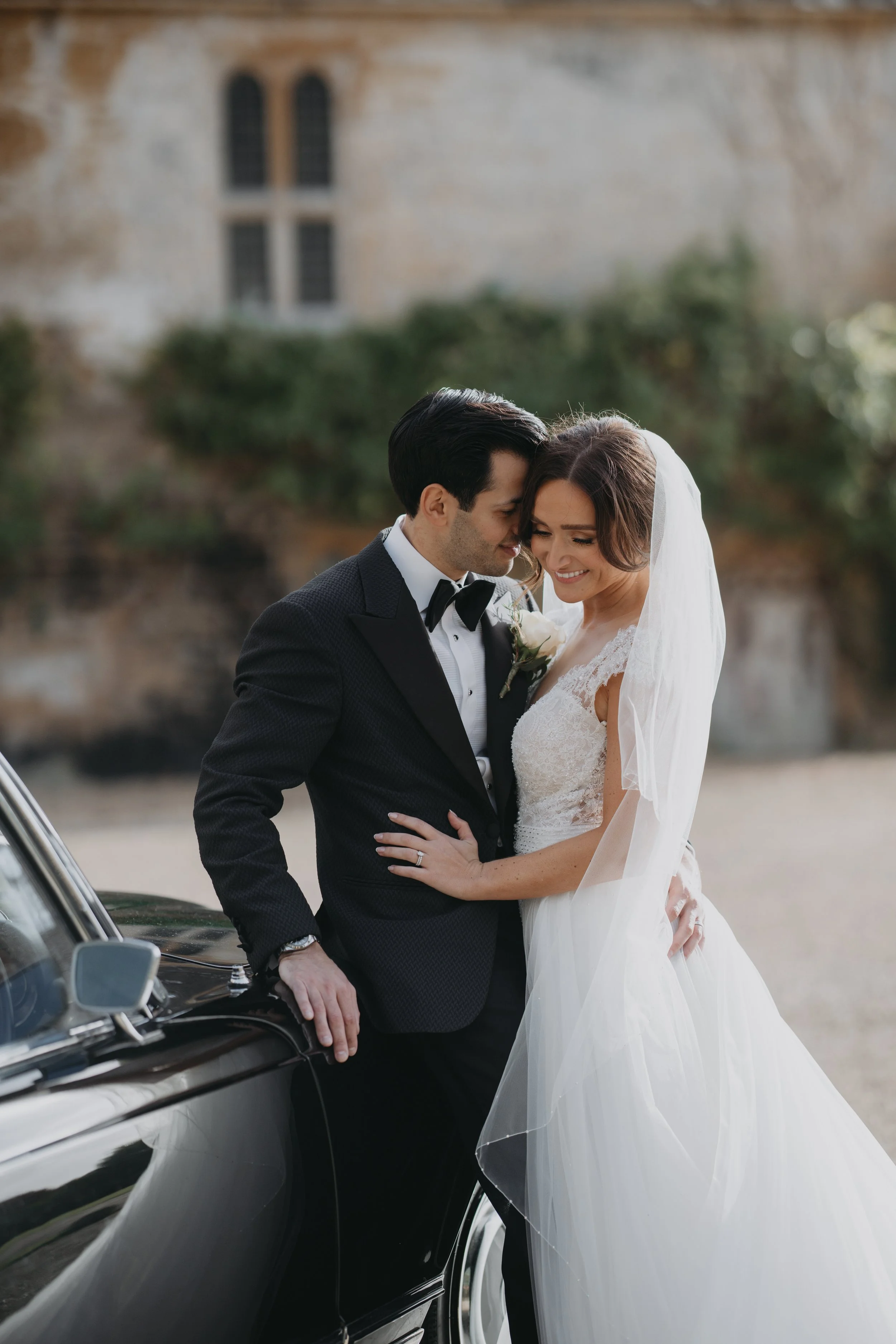
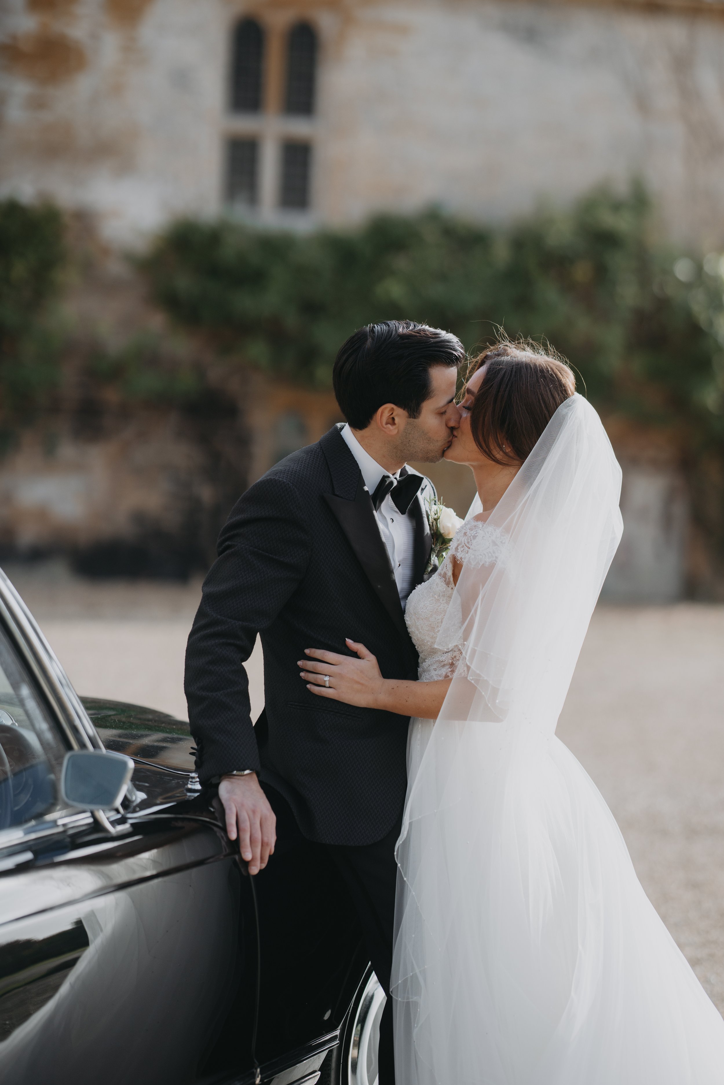
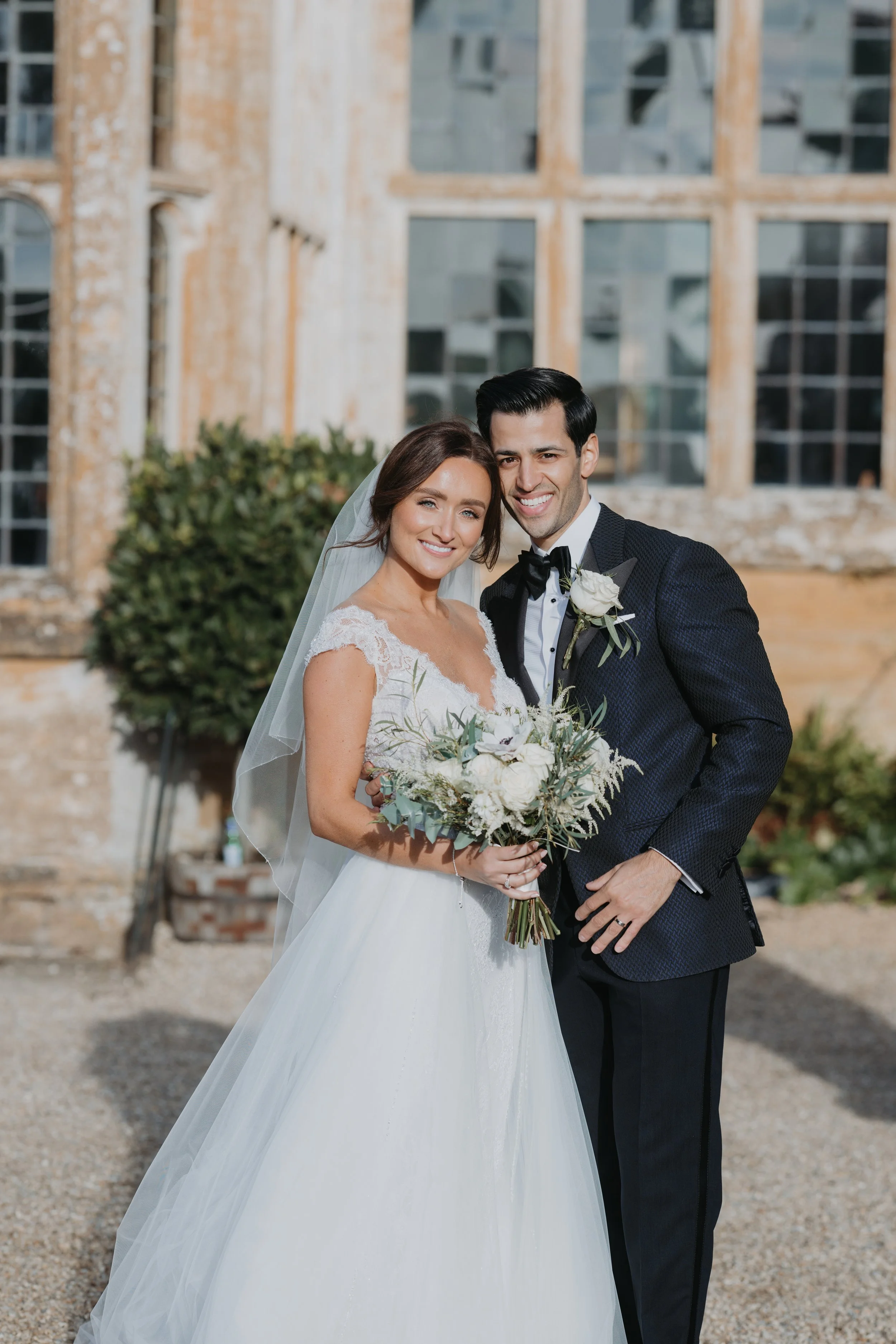
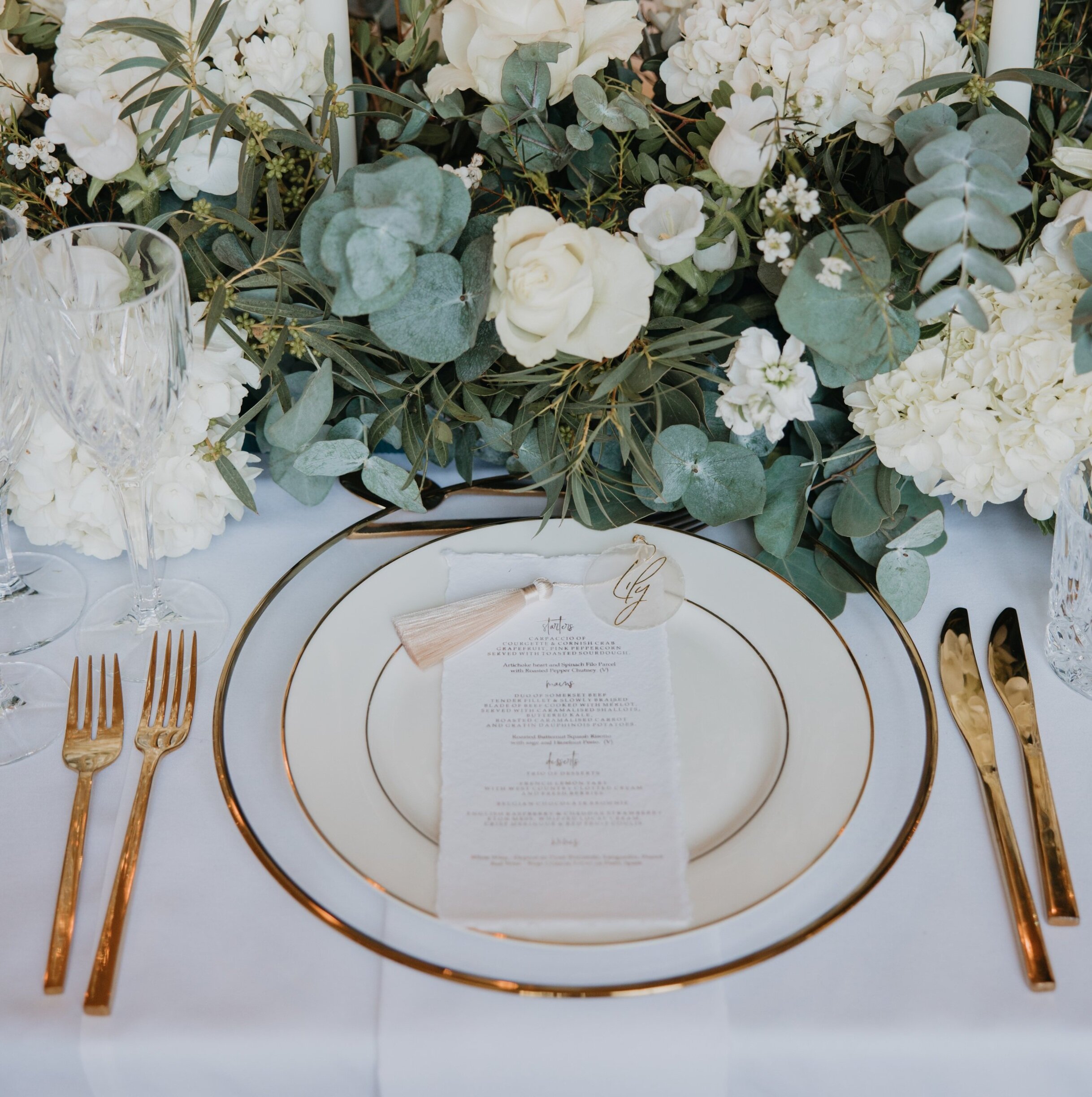
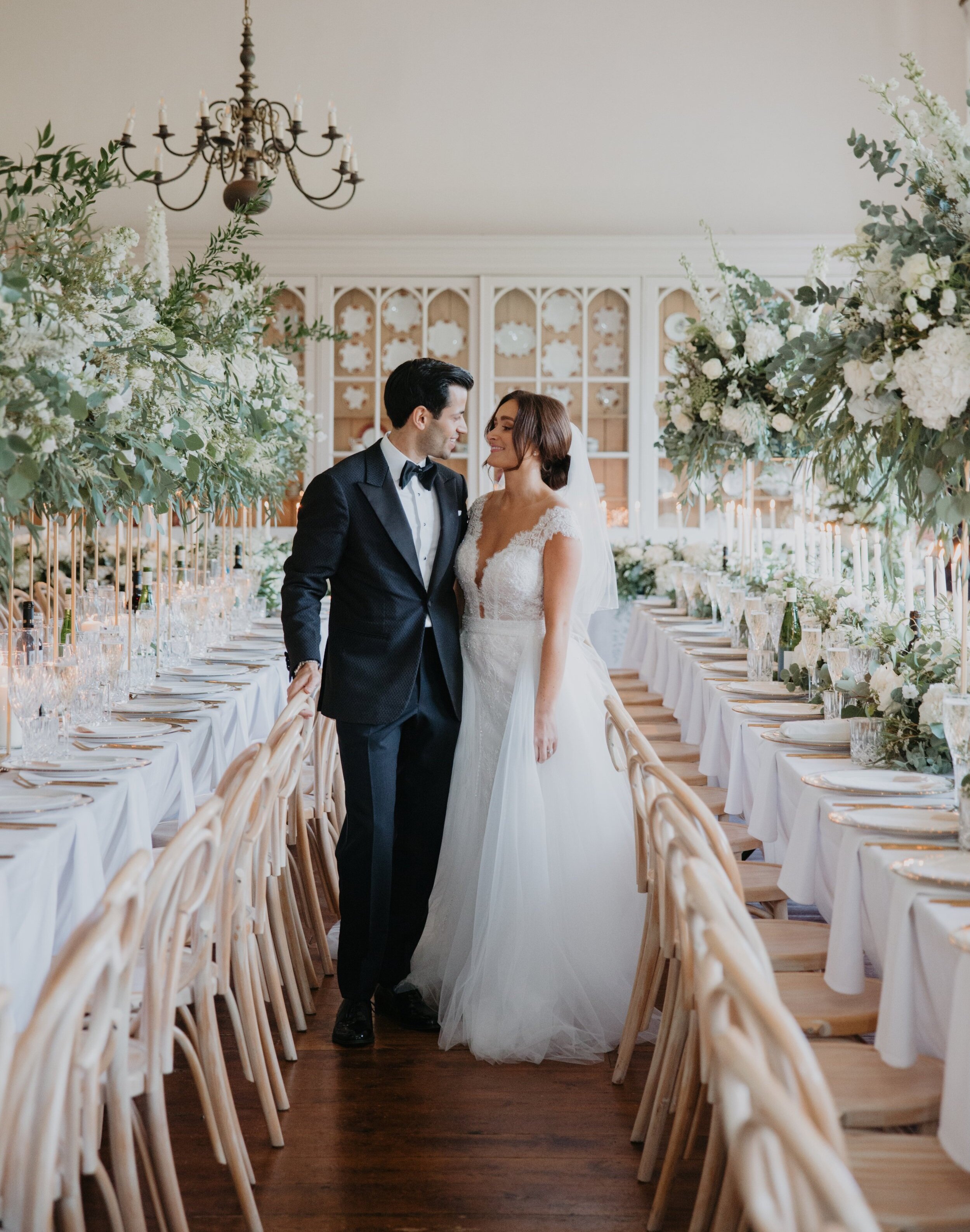
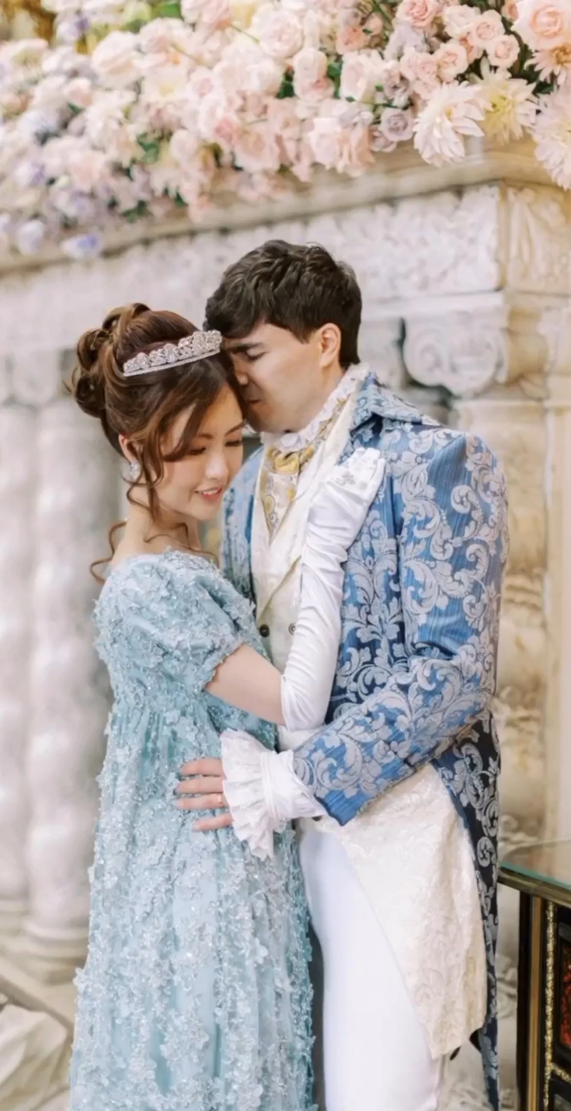
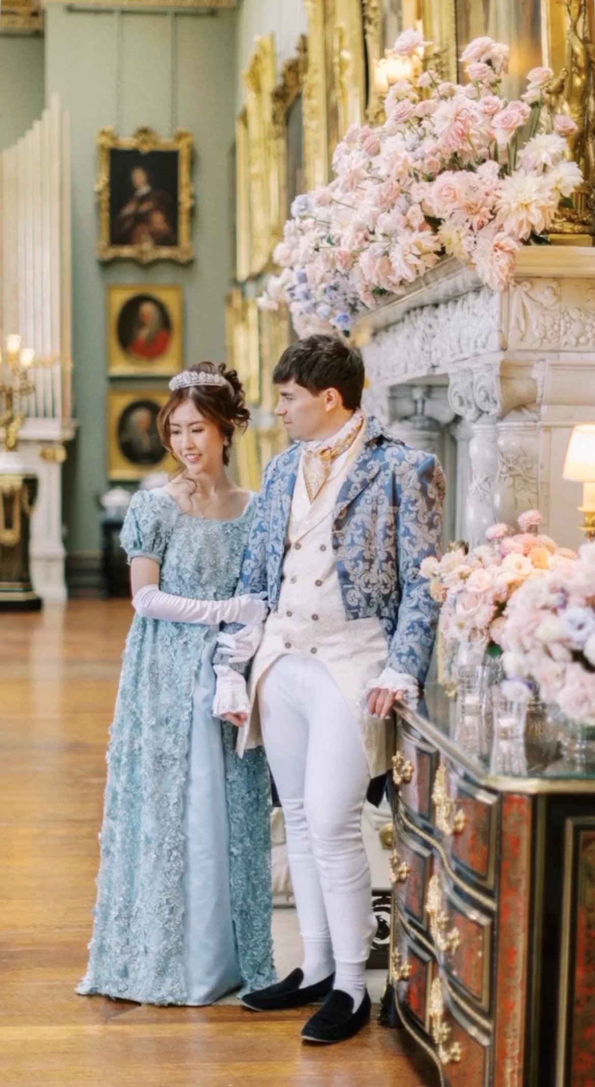
You may immediately think that this journal post is an editorial. The result of a team of suppliers brought together by their love of Bridgerton and a longing for the fantasy of the social events and the formality and whimsy of it all. But no, this amazingness is honestly part of the real wedding of Cleo & Thomas. Based at the stunning Somerley House and planned by the lovely Melinda of Luxus Events, this was a truly decadent event. If you are fantasising about a Bridgerton look for your day there are lots of inspirational touches to be seen here…enjoy!
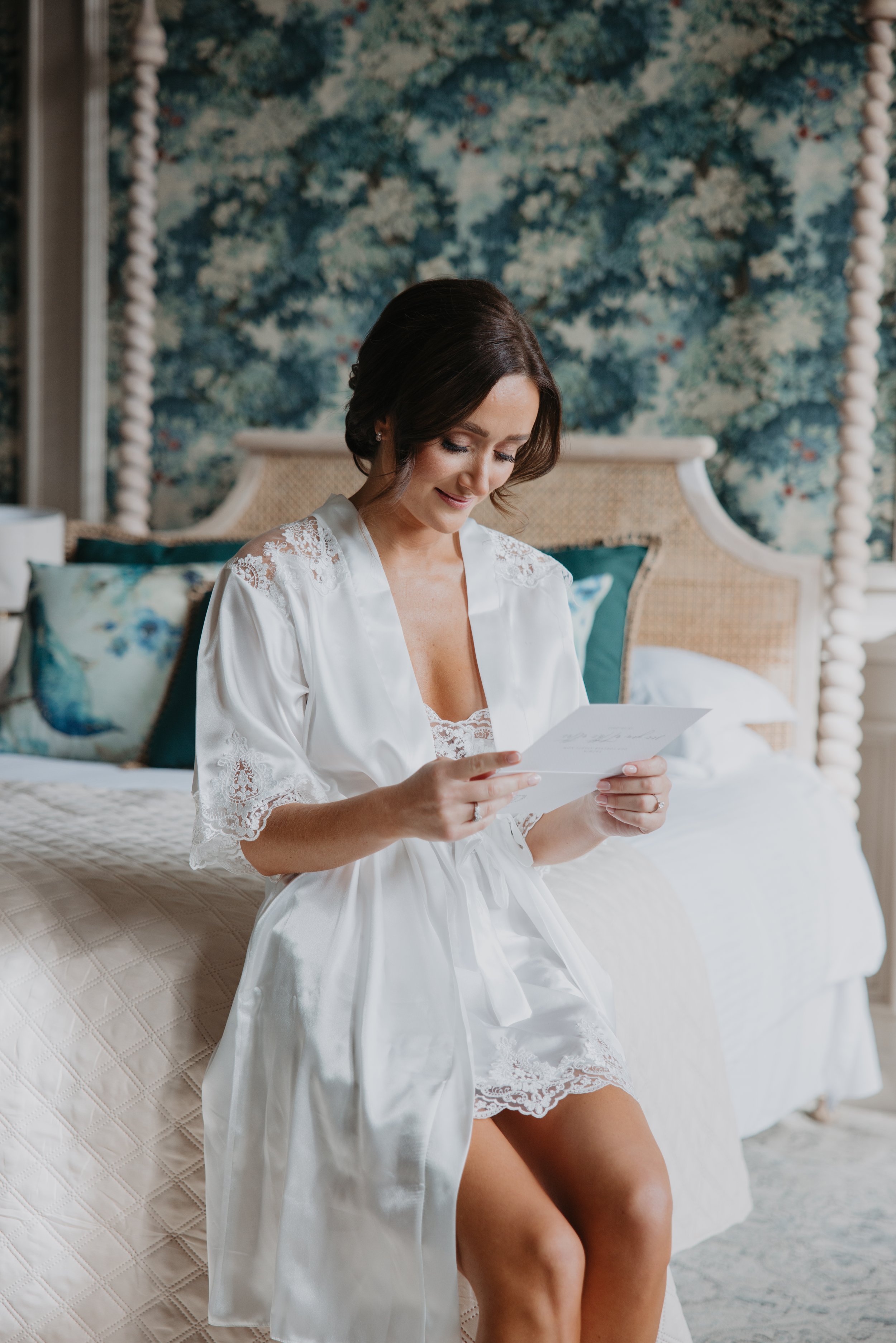
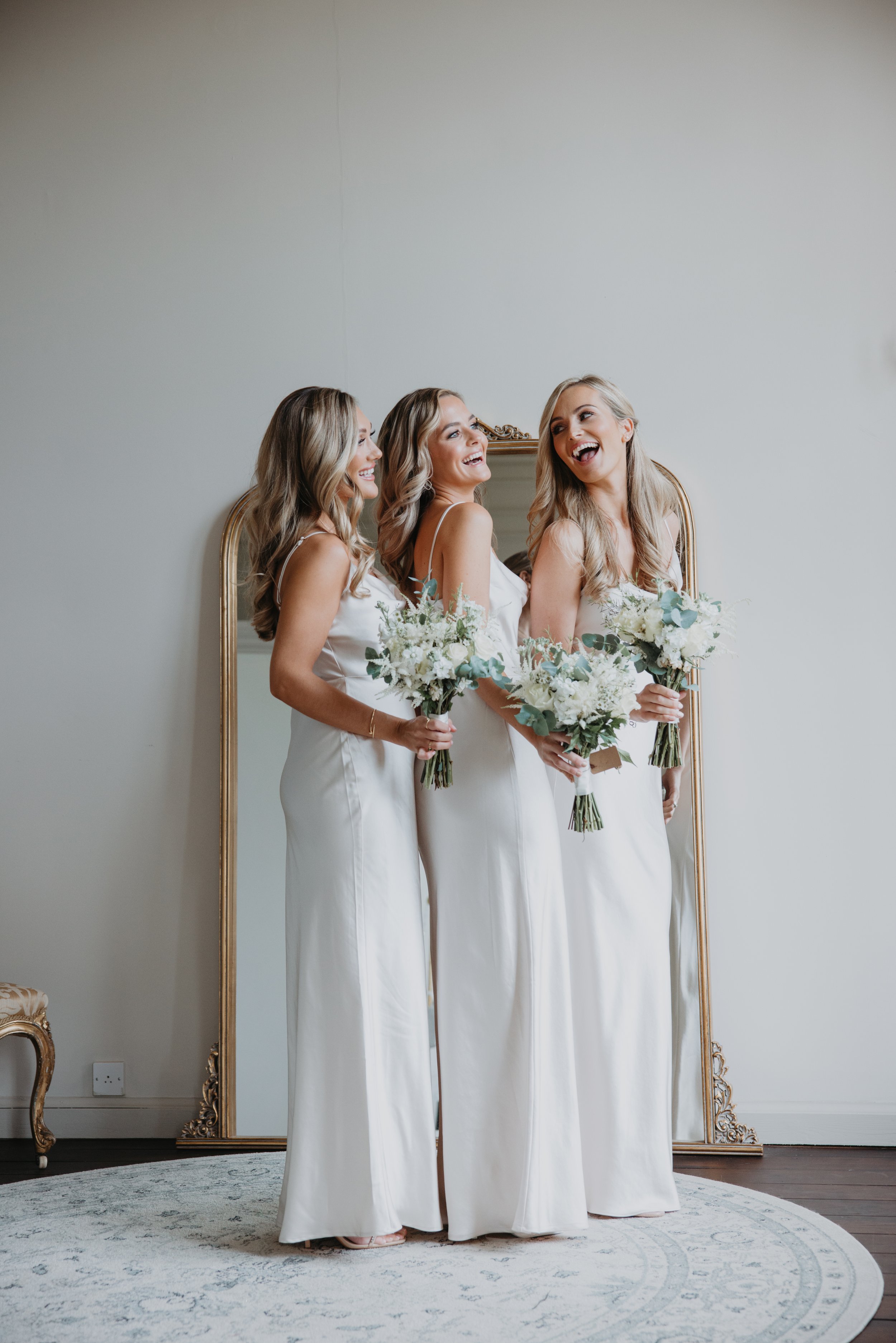
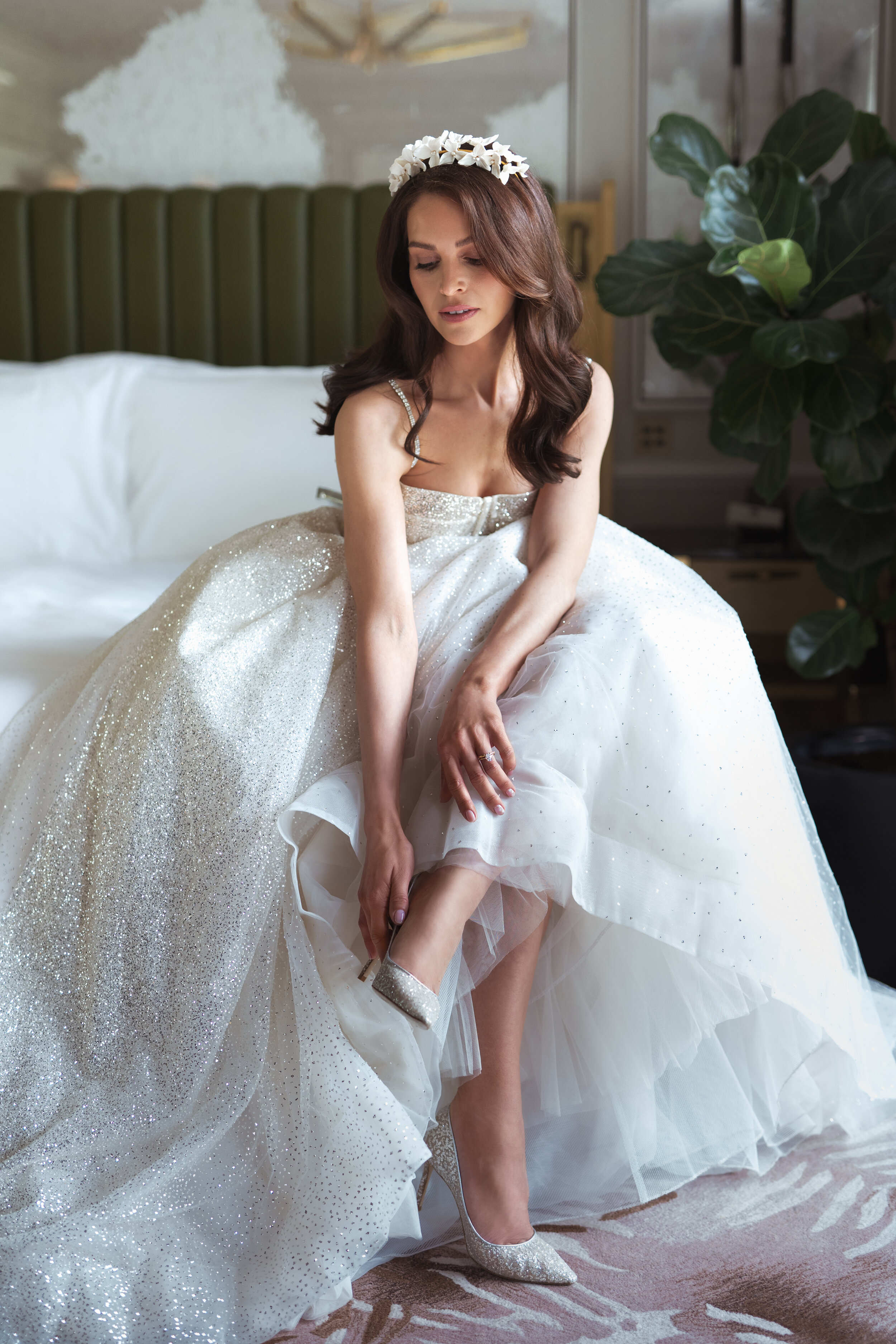
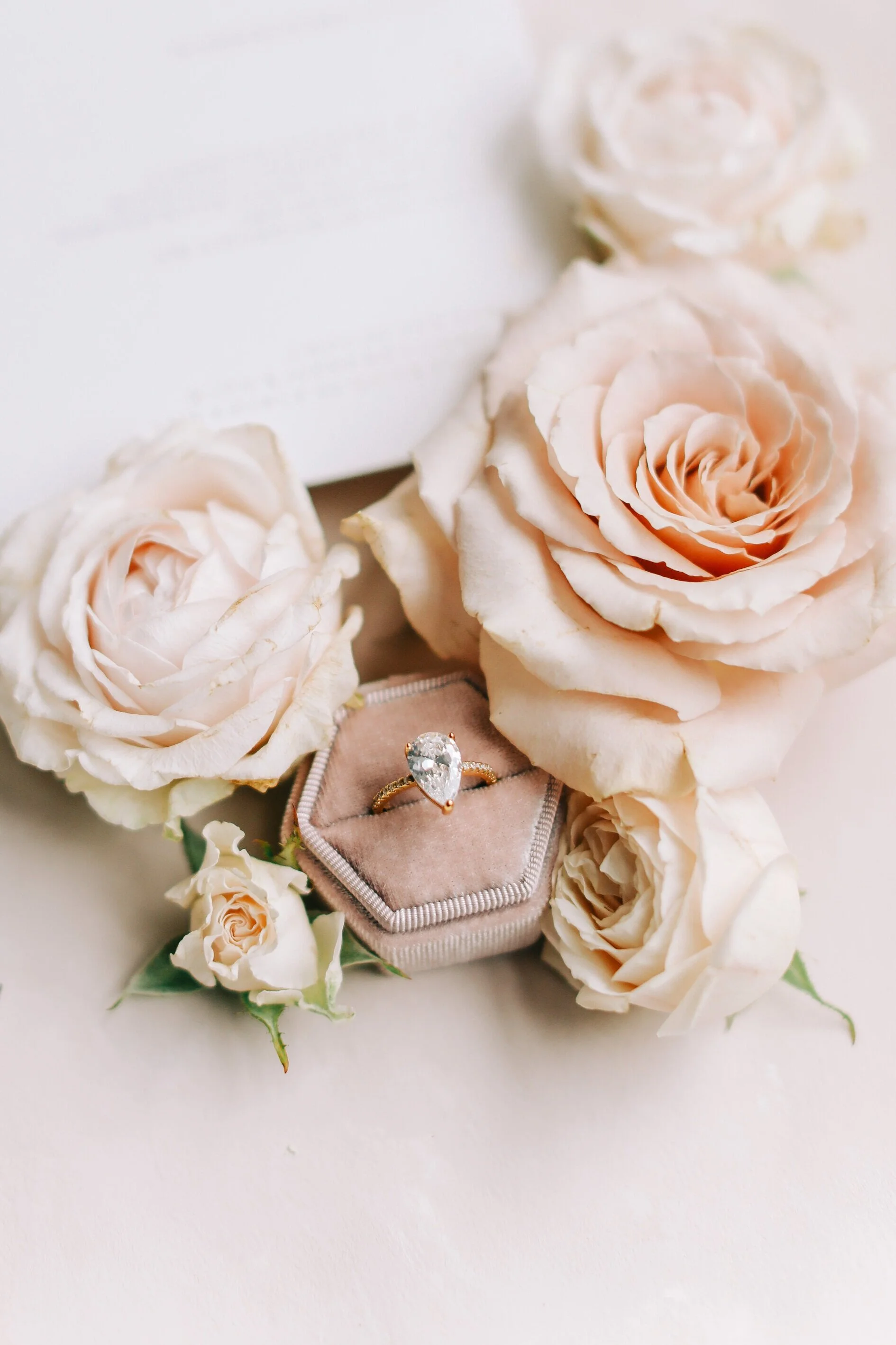
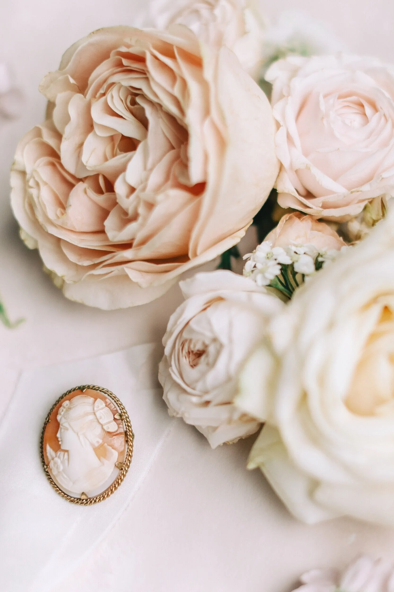
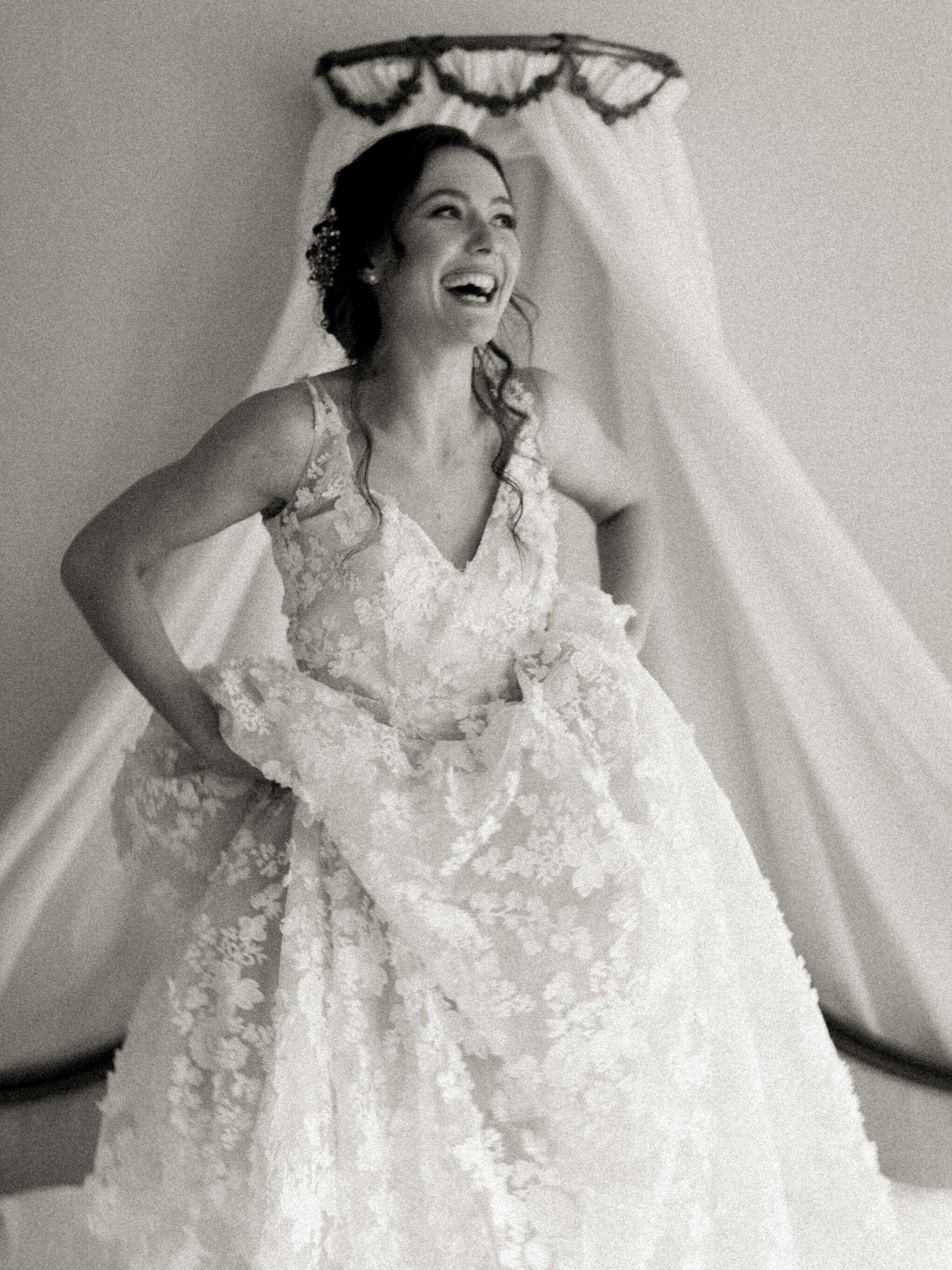
Cleo’s bridal prep images look as demure as any female lead of a Regency drama. The beautiful decor of Somerley House perfectly suited to this too. The vintage inspired under garments the perfect foundations for a regency inspired evening dress, with long satin gloves and finished with a tiara. All nodding to princess vibes, which in anyone else’s hands may have lacked the class these images have, but Melinda as always delivering a fantastical and yet elegant environment, which has all been captured perfectly by Jacob & Pauline. Thomas’s outfit here has to be applauded, every attention to detail ensuring that the outfit perfectly suited Cleo’s, this is a man proving he will be his beloved’s Prince Charming right from the start.
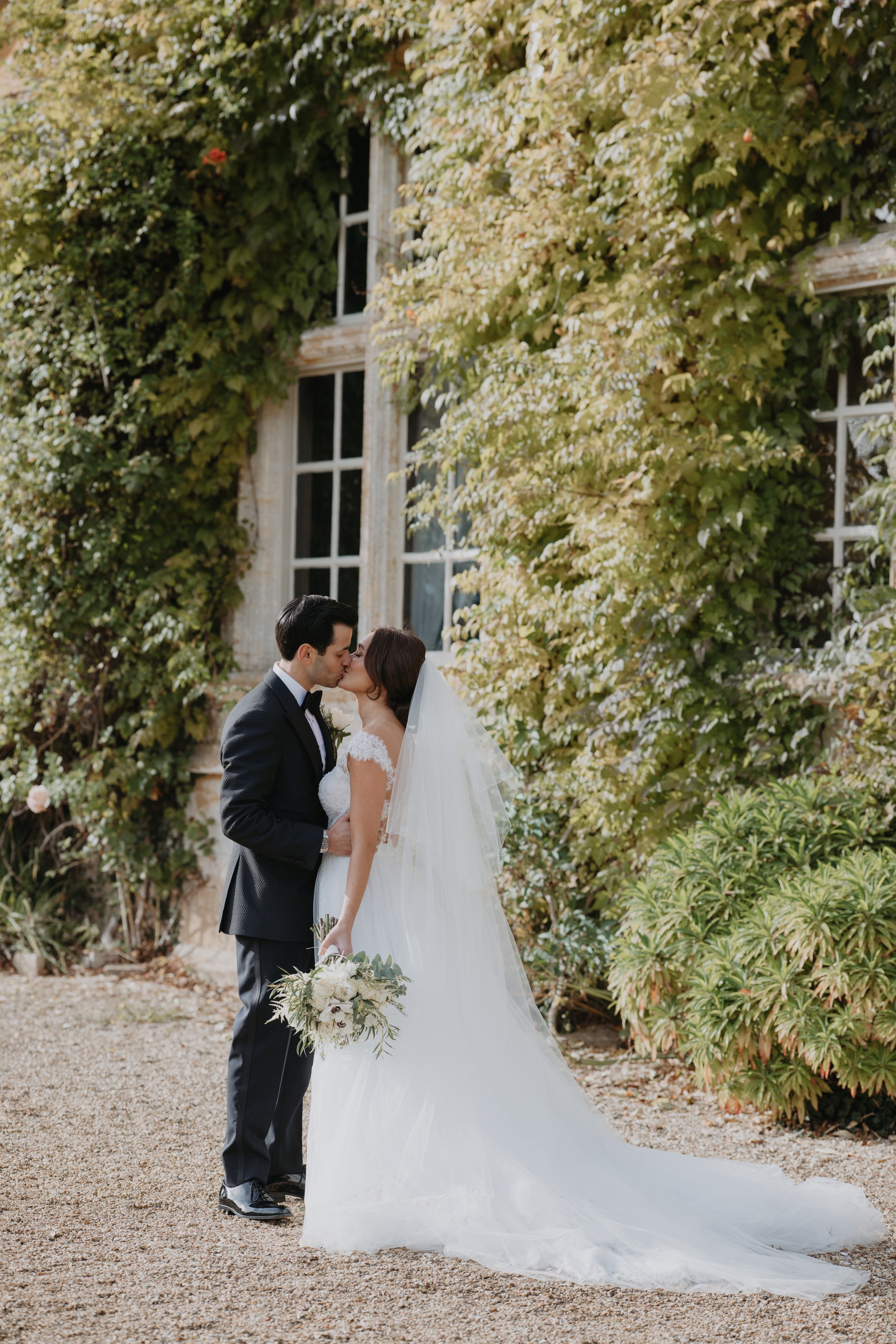
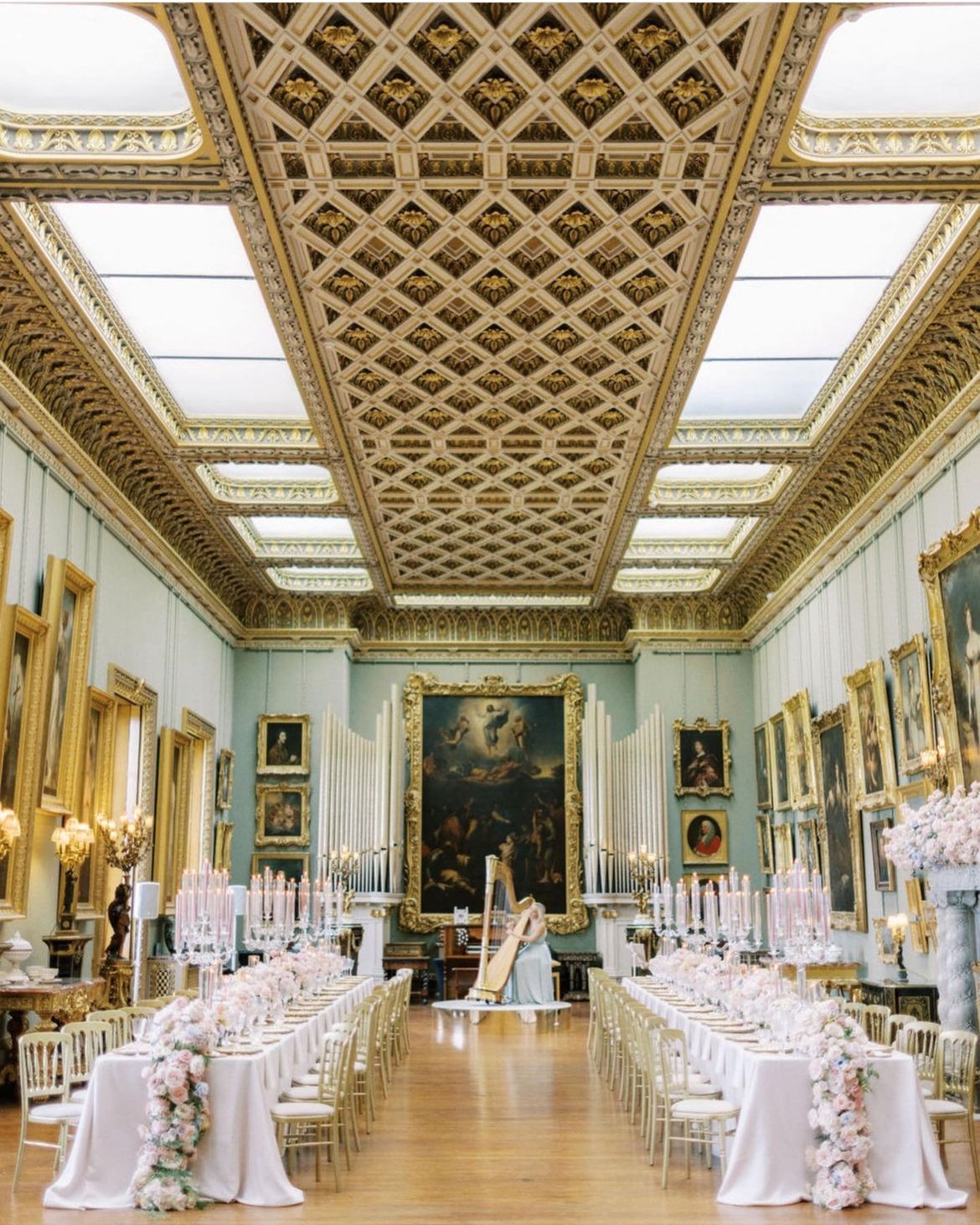
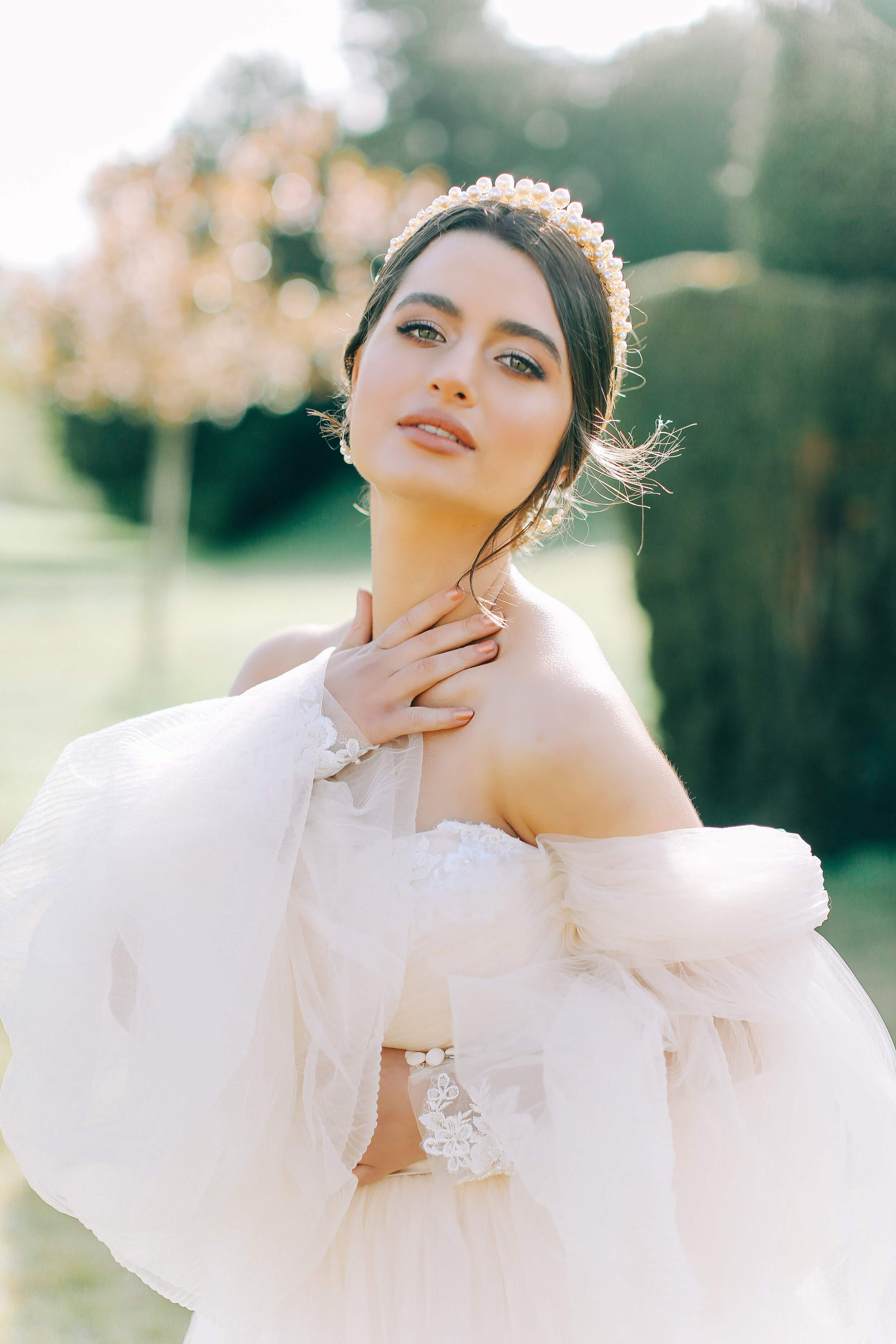
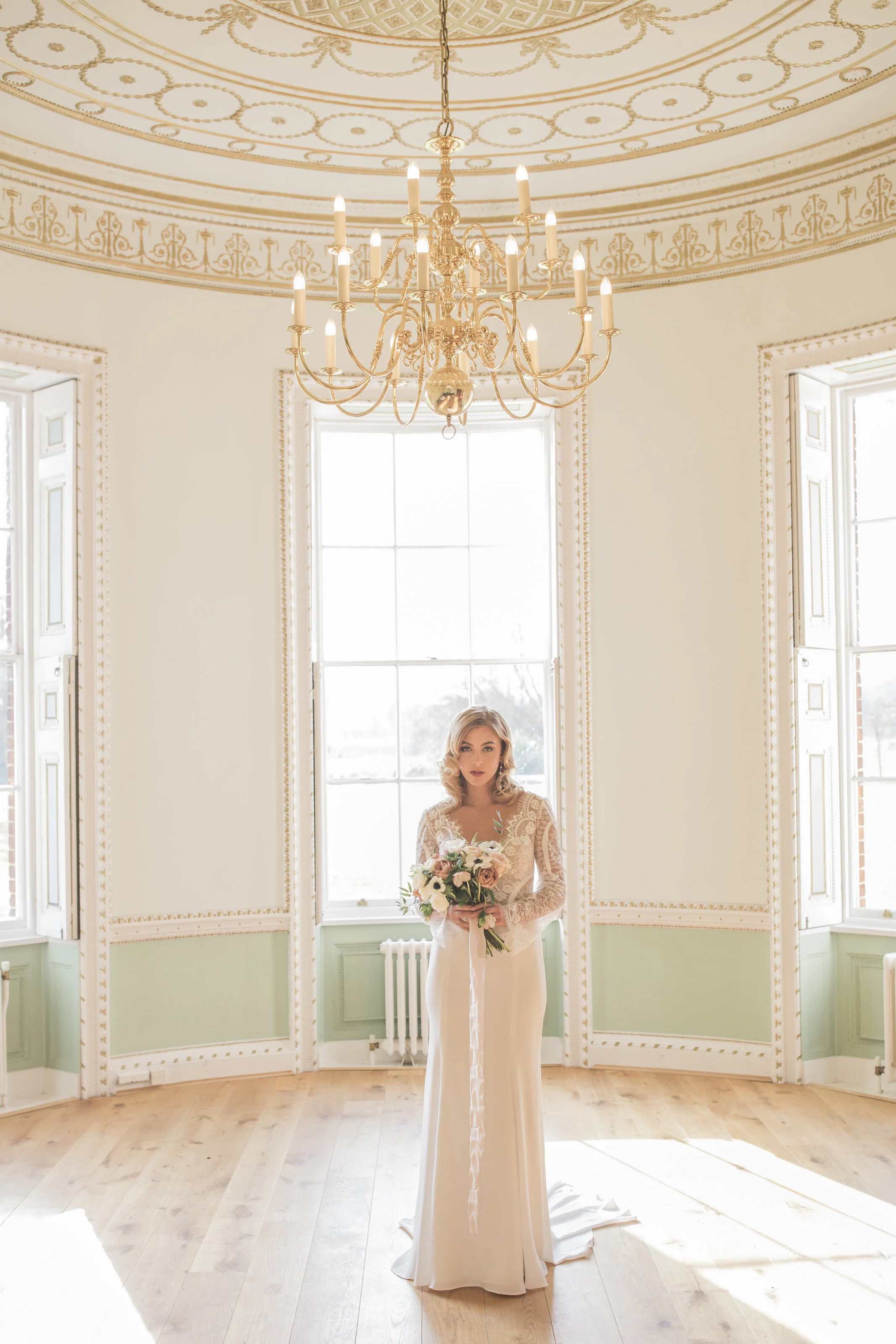
A quick preview of the reception room here, which is just phenomenal! Lots more images to follow, but first in the image below we can see Cleo’s bespoke sally bean couture wedding dress. Which was worn for the ceremony held at Exeter College, Oxford. The church also adorned with decadent floral arrangements by bloominghaus - this really was an event wanting to wow at every aspect. It truly must have been a dreamy day to have experienced.
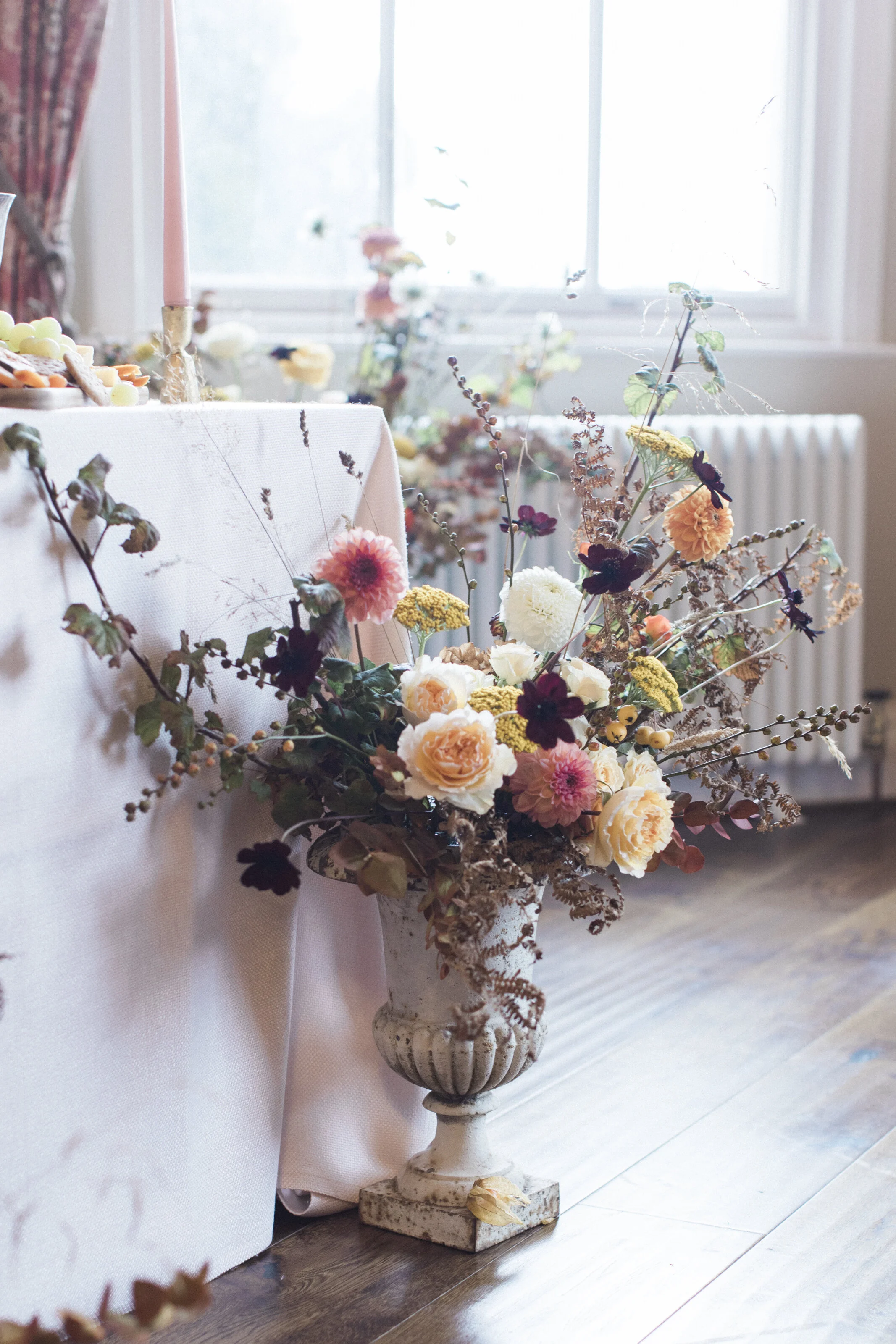
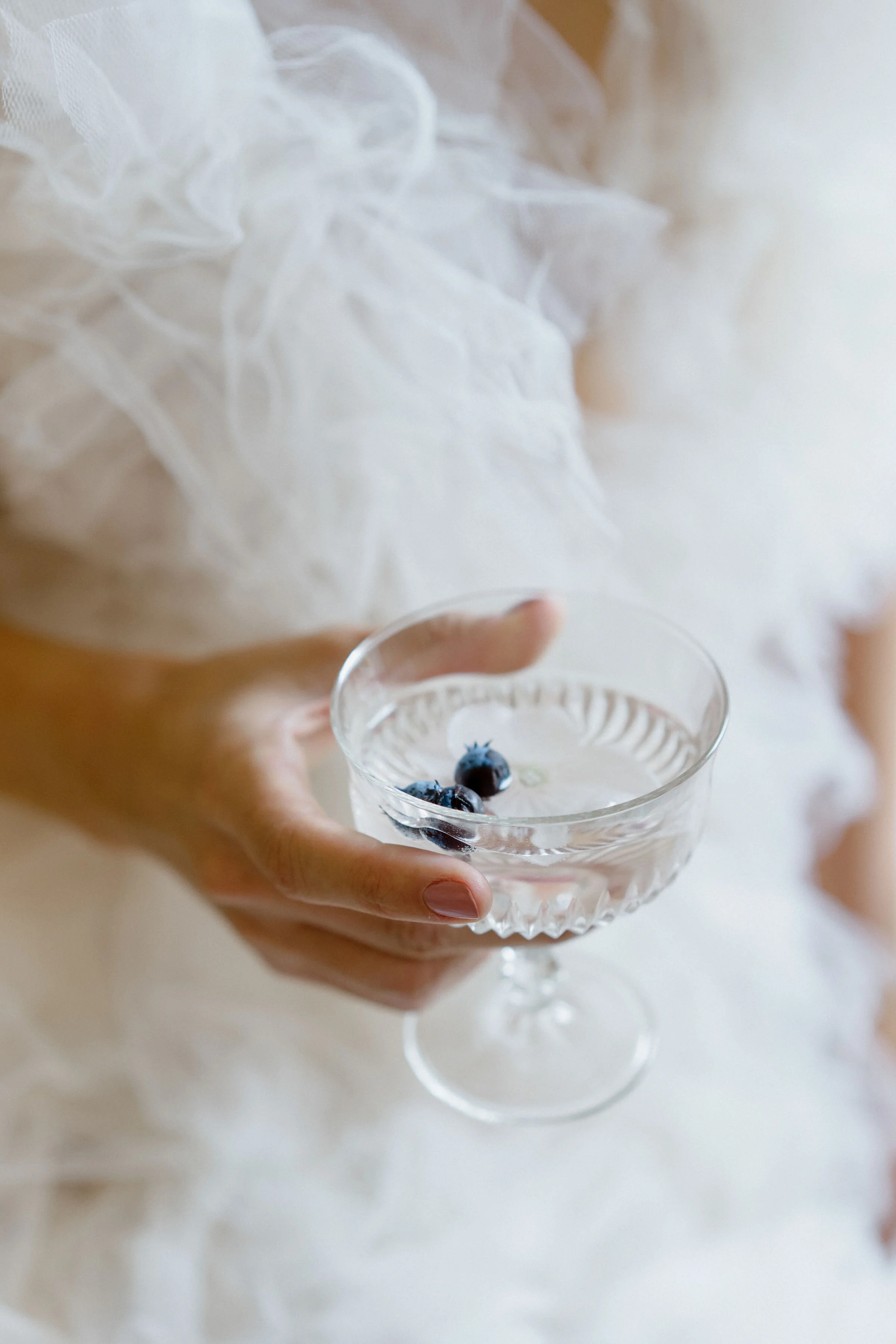
Adding further to the atmosphere of the reception was a harpist, perfectly positioned on a mini stage at the centre of the room. It must have been quite breathtaking to enter the room to the stunning candlelight, the masses of stunning florals throughout and gentle notes from the harp. All the luxurious touches of gold within the room and table decor, and the beautiful artwork and statues surrounding the tables would have made this a truly romantic scene to never forget.
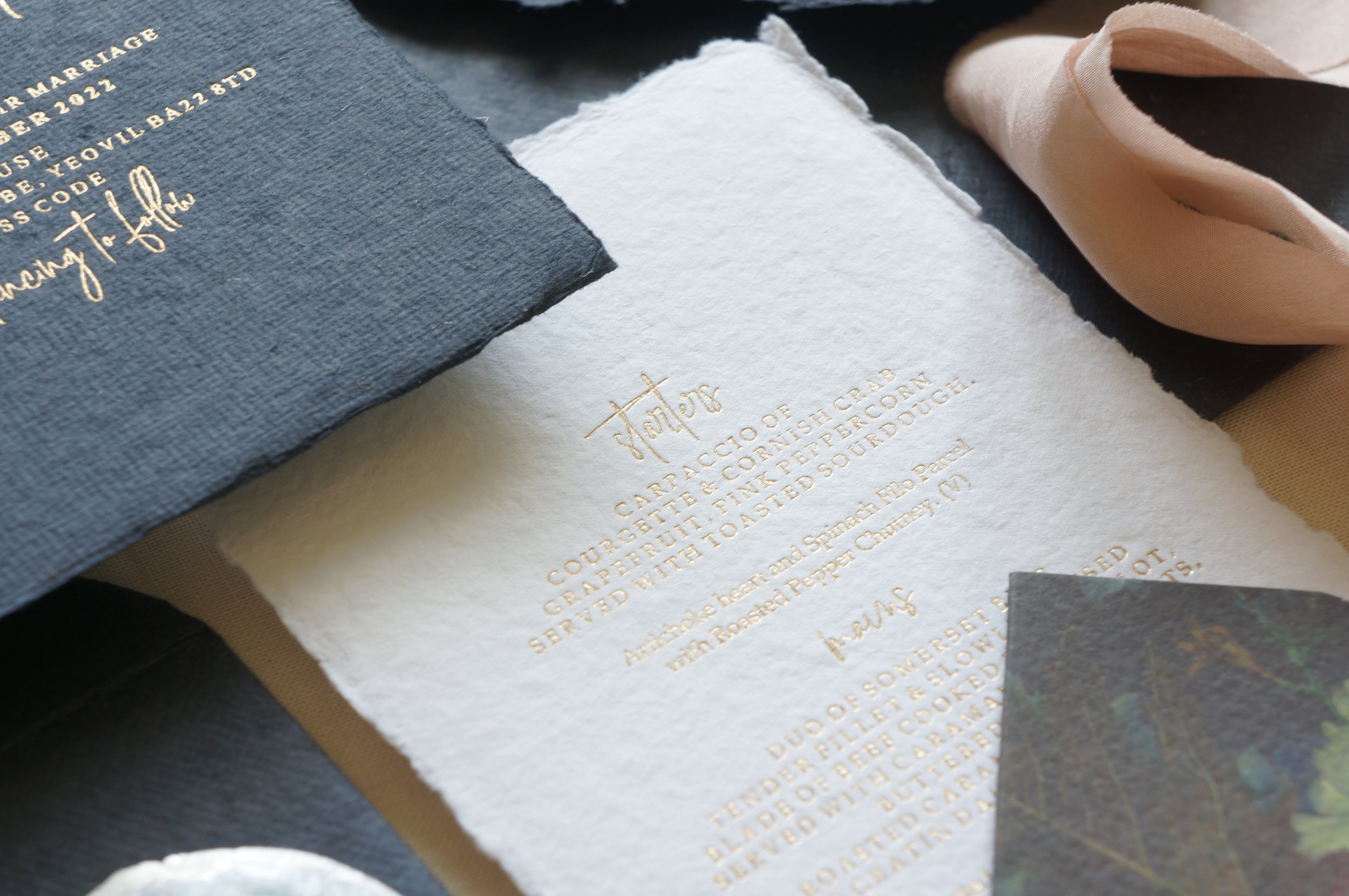
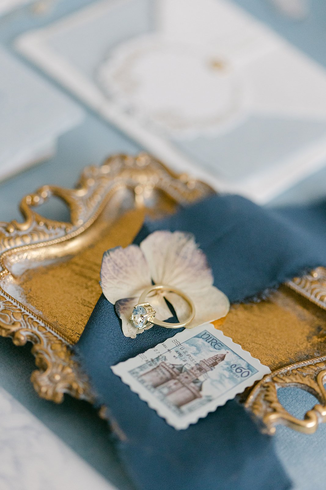
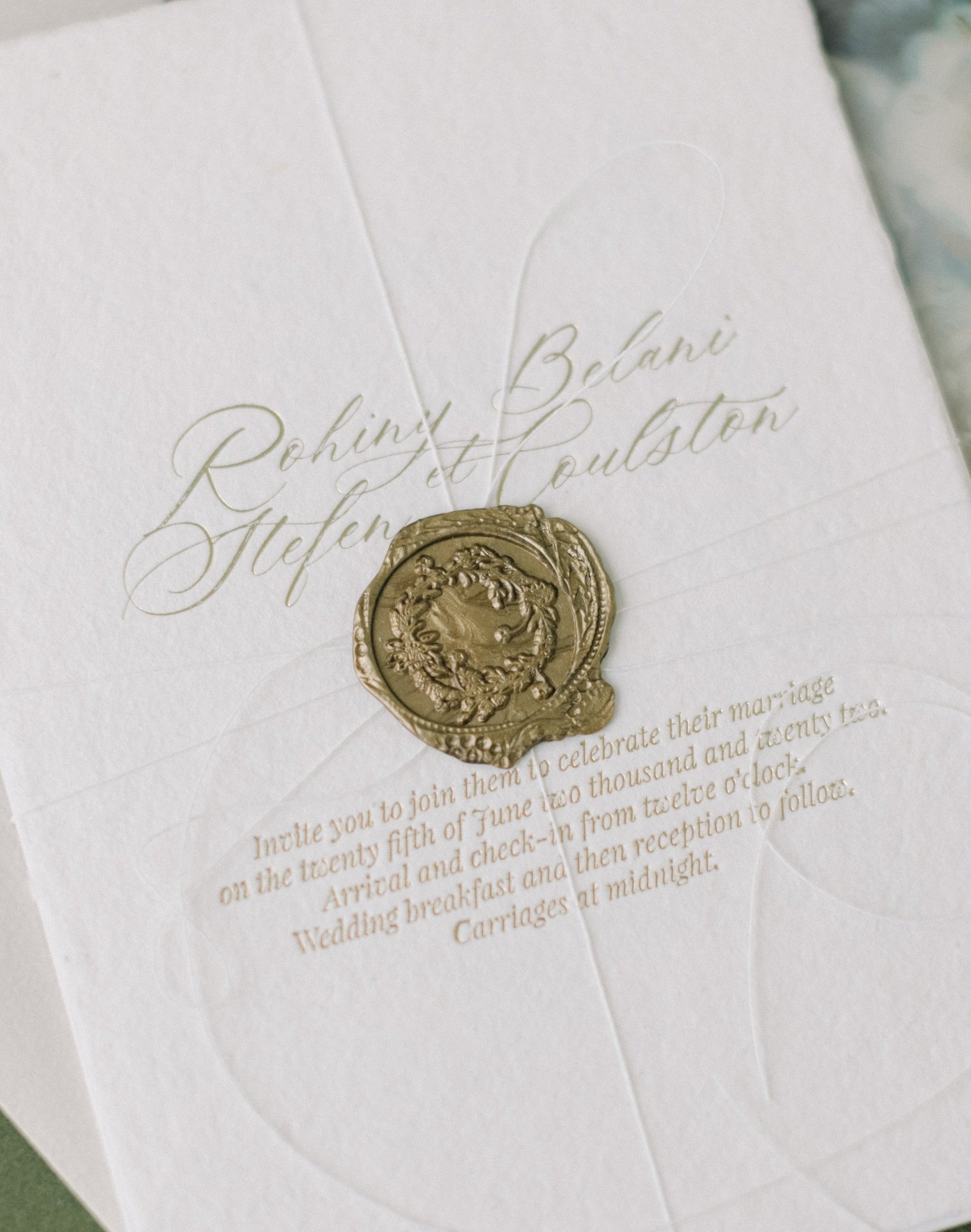
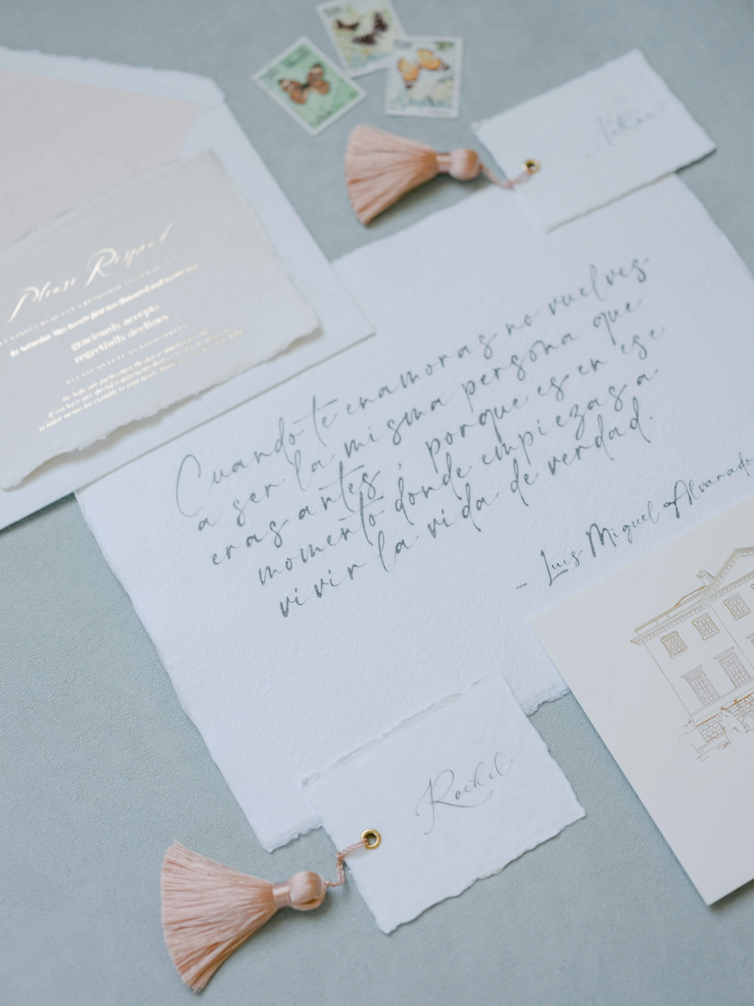
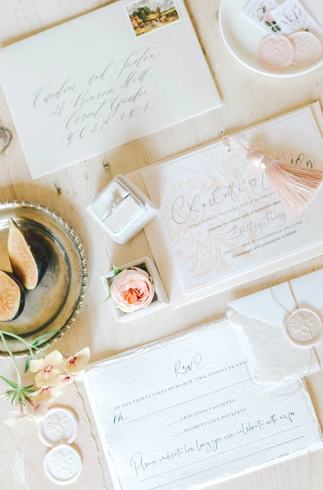
The stationery produced for Cleo & Thomas was also following a classic aesthetic. Handmade paper was a must for the invitation card. This was alongside a full foil map card, featuring two venue illustrations and then an information card with gold hot foil pressed illustration and details on the palest of blush cards. Each piece different in size to produce a wonderful layered effect in it’s presentation. Then bound together with twine and finished with a bespoke initial wax seal each invitation set was presented to guests in a matching blush envelope, with gold hot foil pressed details to reverse flap and a printed photograph envelope liner of the happy couple. This was the first time I had produced a photo liner before, my other suggestion for a venue as decadent as this one would be to echo the artwork found on the walls. An image in keeping with the age and style of your venue truly achieves a fine art look.
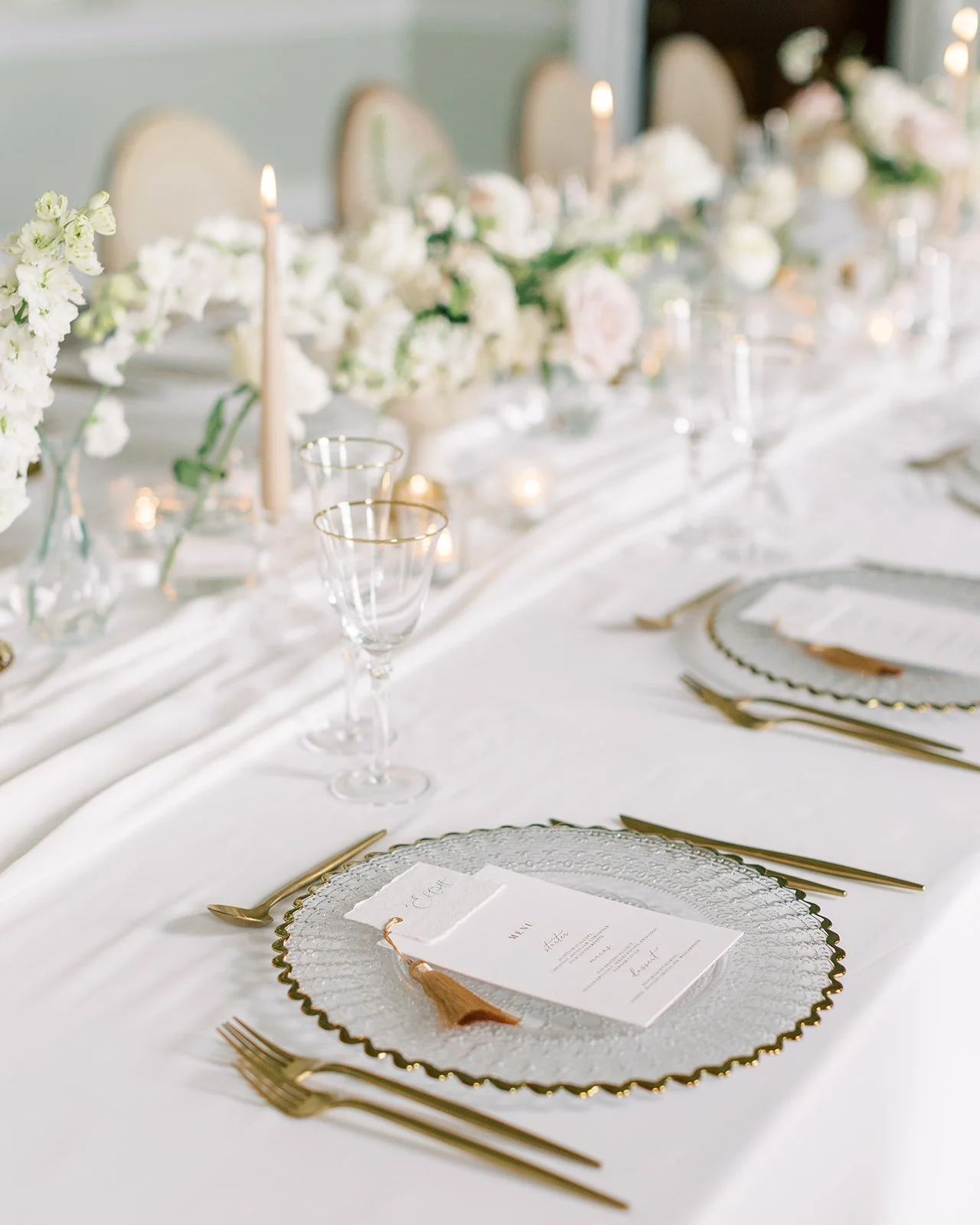
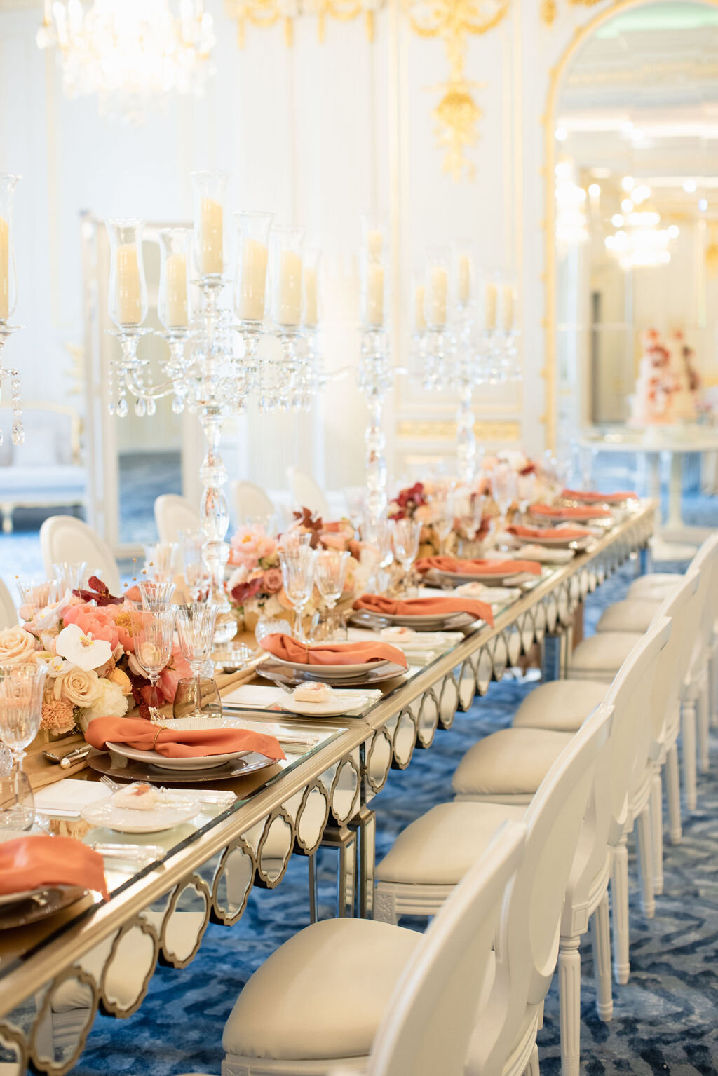
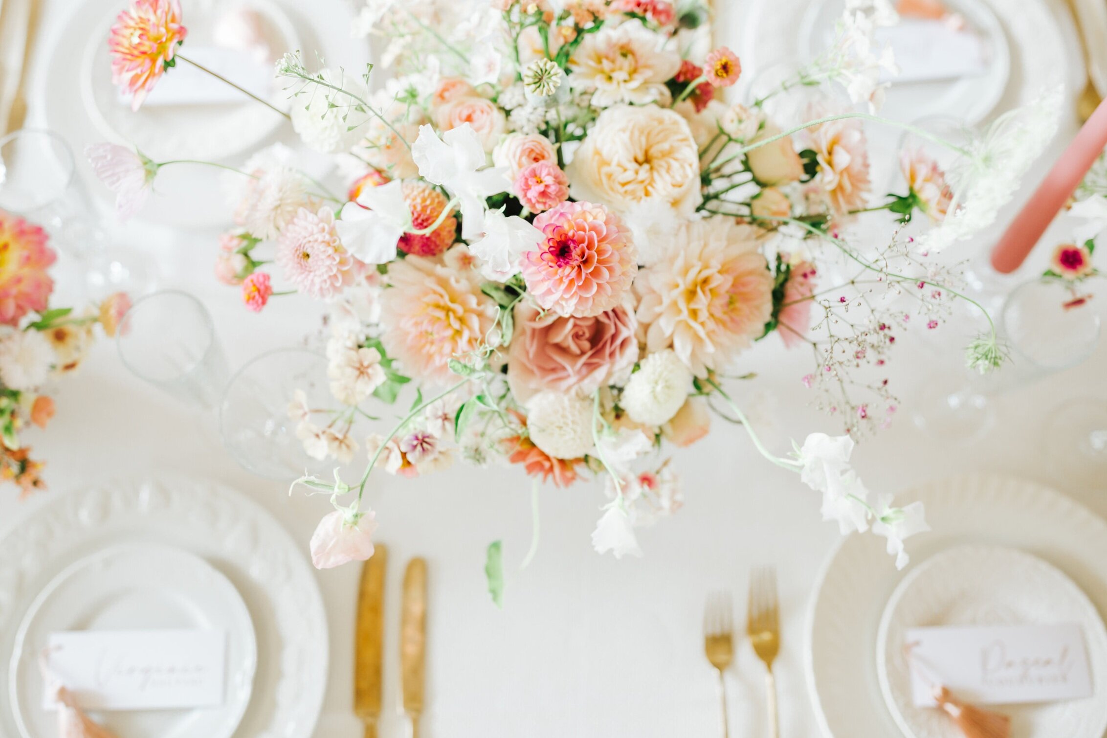
Entering this room would have been mesmerising for me…For two reasons, firstly the obvious - isn’t this just a dreamy tablescape!! Everything about it suits the brief of the wedding and the era perfectly. The presentation of the table and each place setting done with military precision, this shows the true skill and expertise Melinda has gained with these events. Secondly, the artworks are just sensational. What a gorgeous collection to grace the backdrop of your day. I haven’t seen anything quite like the theatre or grandeur of this wedding. I find it really inspirational and my imagination is racing with other ideas and possibilities. I’d love to know if you find this look aspirational, or if it is a tad too niche?! Whatever your thoughts, I think we can all agree the workmanship throughout is exceptional!!
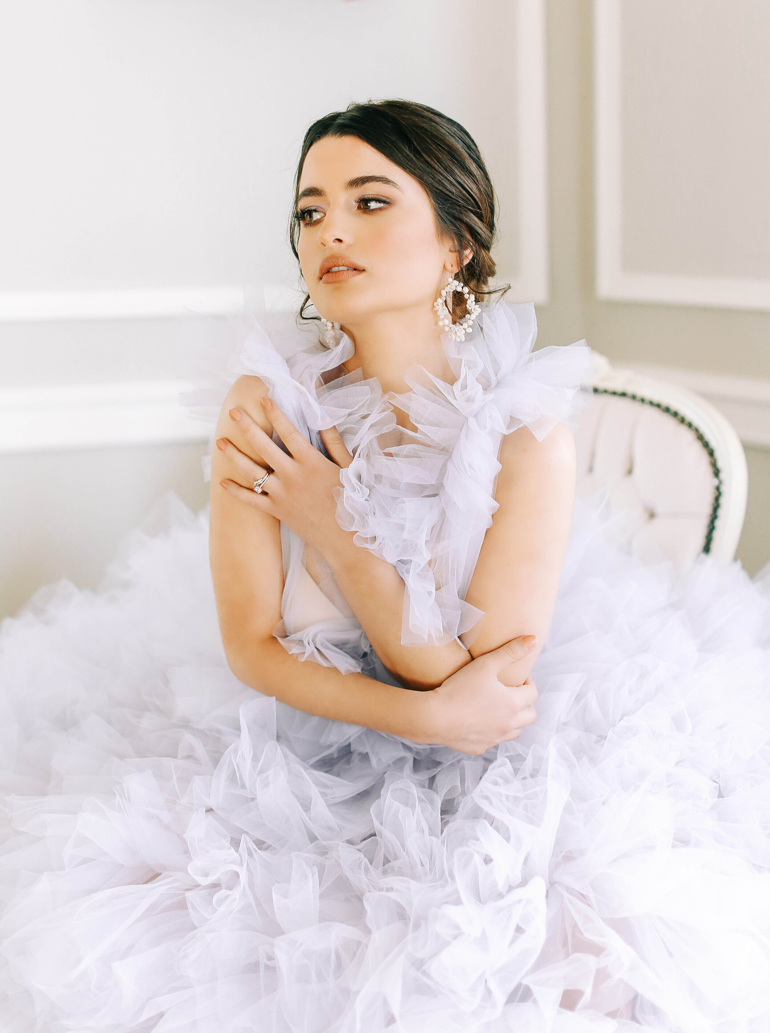
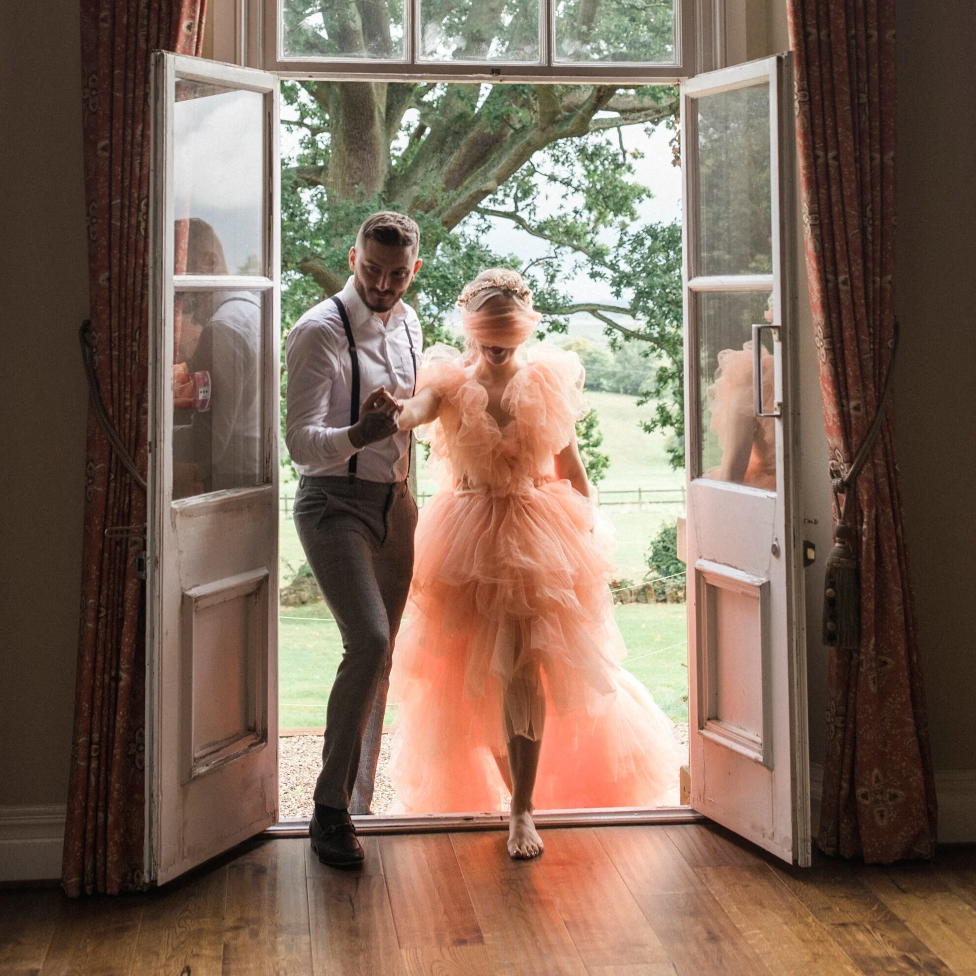
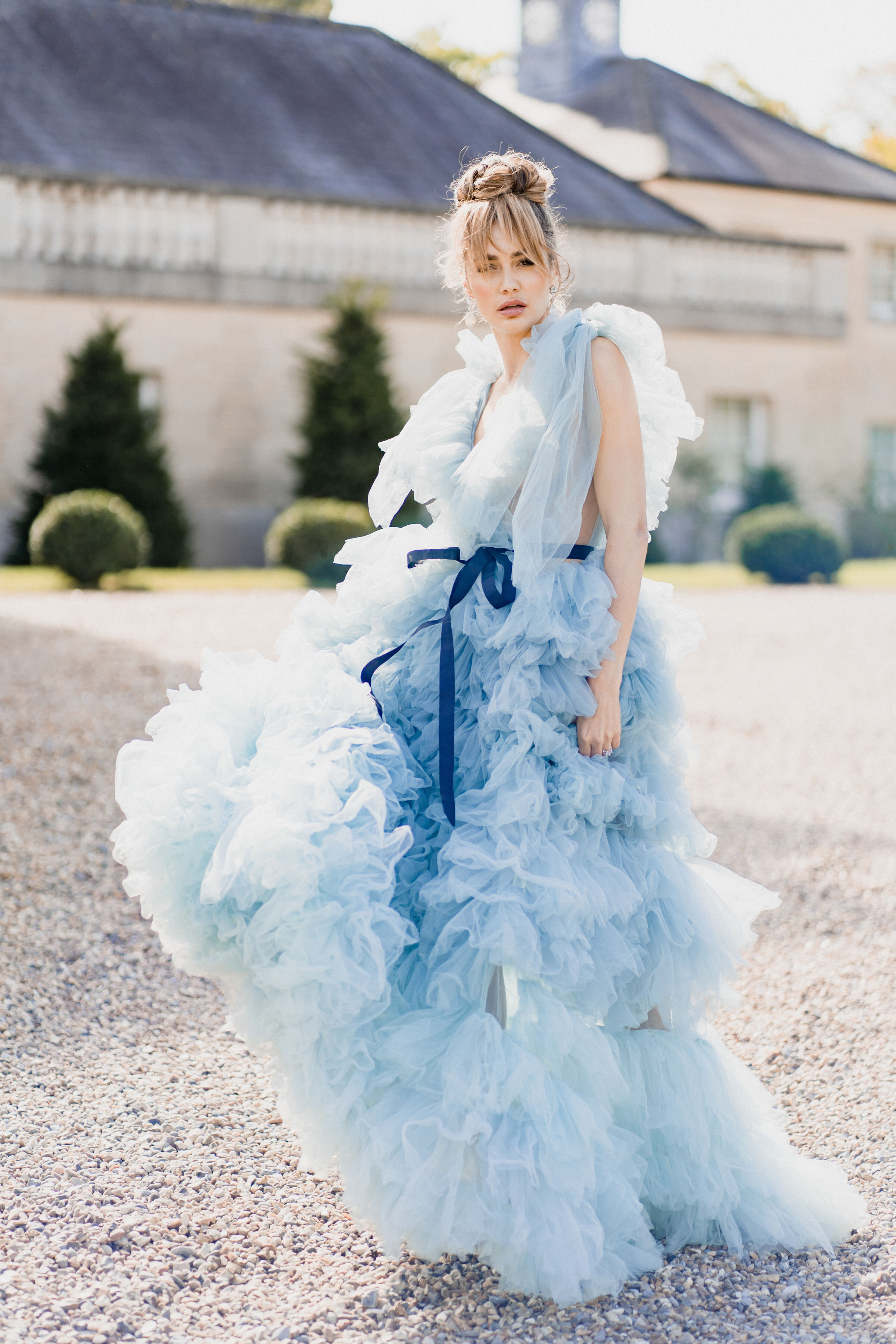
The last outfit change of the day saw Chloe adorn a Monique L’Huillier ruffle dress. I had seen images of Chloe previously in this dress at an engagement shoot in Paris. That shoot was like something out of a magazine, I should have known then that the wedding was going to be next level! If you love the dress and are interested in seeing more, or of course for Paris inspiration for your engagement session please do look at either @luxus_events_ instgram feed or website, or the couple’s photographer for that shoot @maddy.christina.photo. The ruffle dress suits this environment perfectly, again conjuring thoughts of princess-like scenes. This is a couple who truly wanted a fairytale wedding and achieved it!
The reception room in candlelight later that evening honestly reminds me of a film set. It really is magical and such a romantic space. This truly is one of the most stunning tablescapes I have seen and had the pleasure of playing an ever so tiny part in. Melinda’s design and the collaboration between the suppliers and materials involved is exceptional and the roses and florals are some of the most beautiful and decadent, bloomighaus really wowing with this wedding!
W E D D I N G S U P P L I E R S I N V O L V E D
Ceremony Venue - Exeter College, Oxford @exetercollegeox
Reception Venue - Somerley House @somerleyweddings_events
Planning, Design & Styling - Melinda @luxus_events_
Photography/Videography - @jacob_and_pauline
Florals - @bloominghaus
Bespoke Bridal Gown - @sallybeancouture
Ruffle Dress - @moniquelhuillier
Bridal shoes - @jimmychoo
Bridal Jewellery - @davidmorrisjeweller
Ceremony hair & make up - @hairandmakeupbygabrielle
Evening reception hair & make up - @marie.bogaert
Tiaras - @edenluxebridal
Stationery - @peoniesandpaperclips.uk
Cake - @byyevig
catering - @kalmkitchenltd
Next day event catering - @gingercateringcompany
Tableware - @duchesbutler
Entertainment - @blackrabbitprojects
Harpist - @soraya_say
Magician - @french_magician
Live Painter - @lissie_art
Live calligrapher - @delfont.ink
Production & Lighting - @eventdecorhire @carbyandco
Linen - @just_4_linen
Fireworks - @flashpointfireworks
E D I T O R I A L . 1 6
A V I N G T O N P A R K
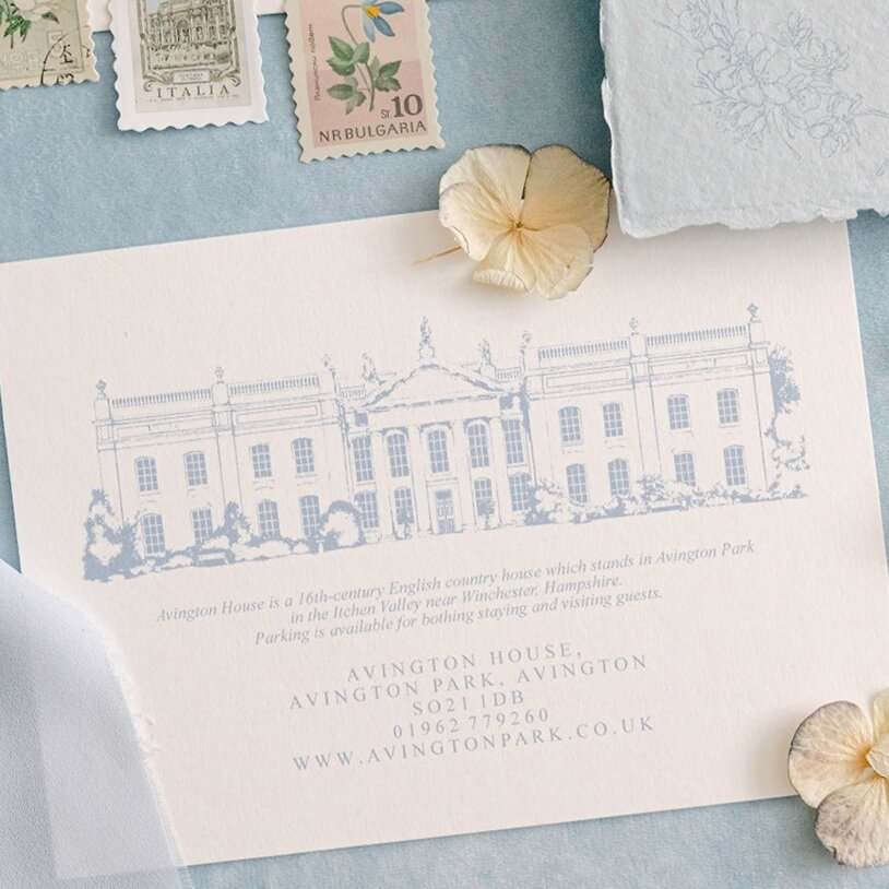
When Leah of @Leahmariephotography_ reached out to me regarding a collaboration between herself and Pippa of @The_w_collection I was thrilled to read the brief. Firstly it was to be set in the stunning Avington Park, which I couldn’t resist drawing. It has such beautiful ornate details and the symmetry and order of the building and landscape make the illustration a dream for print purposes. With a white and French blue colour scheme and a creative brief that states florals a definite inclusion, it was a pleasure to be involved…And of course how could I not mention there are HalfPenny London dresses!
The day, as any wedding day would, began with bridal prep. The bedroom at Avington Park echoing the colour scheme of the shoot perfectly, even complimenting the darker blues and the gold hues throughout. I always love how a colour so stereotypically perceived as male can prove this wrong and look undoubtedly feminine. The delicacy created by the tiny florals and the sheer bows echo the femininity of this gallery and a perfect example of the magic created when a design brief is so cohesive.
The stationery created for the suite was a culmination of a few projects being created in the studio at the time. The star of the show without a doubt the new mini die cut tags that could adorn not just the invitation suites, but also favours, and menus for example. I couldn’t wait for these to be featured in this editorial and am thrilled with the care that Leah took to capture them so beautifully. The possibilities for how these can be used are endless. This suite was very much created using the Anna’s Blossom collection (for more details please see here.) The delicate Gentle Hermione florals fit perfectly with this design brief as the vellum wrap and liner details. The tablecloth floral is so stunning in this shoot and also features in the cake design. If you love this idea please do allow your suppliers to communicate with each other because it may be that your stationery designer could use the floral too. That way a stunning cohesive vision can be created.
The cake is a stunning piece from the always amazing Anna Lewis @annalewiscakedesign Anna’s pieces are always flawless. The fact that the cake matched other decor elements of the wedding furniture and bar details really made it an additional feature. I really love this idea and hope it increases in popularity.
If bridal portraits are something you are currently researching or ‘pinning’ I hope you will love this assortment from this editorial. Leah has a lovely way of capturing the bride’s joy and the shots with a sense of movement really help convey the excitement and anticipation of the day. When having your bridal portraits taken, don’t be shy in asking for a variety of locations. The range of backgrounds and light will really help you to achieve a library of dreamy images to pic from.
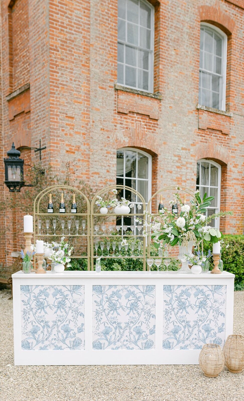
When I viewed the gallery I was instantly wowed by Leah and Pippa’s attention to detail and the way the blue and white theme was used to truly inspire future couples. I also love that two aspirational looks were shown. The first a formal table with decorative tablecloth and abundant floral details, and the second seems like a more intimate gathering arrangement. Set in the orangerie this paired down version creates a more relaxed environment and is perfect for bridal showers, the wedding breakfast for a bride and her girls or even a less formal wedding vibe. Both inspired looks are finished with matching cocktail hour furniture and bar, This is a set up that your guests are sure to remember.
A V I N G T O N P A R K E D I T O R I A L T E A M
Co-Planner & Photographer - @leahmariephotography_
Co-Planner & Styling - @thewstudiostyle
Venue - Avington Park @Avingtonp
Bridal Dresses - @halfpennylondon
Shoes - @bellabelleshoes
Jewellery - @kiriandbelle
Florist - @blueskyflowers
Videographer - @Jacob_and_Pauline
Make up artist - @sylwiakunyszmua
Hair stylist - @id_makeup_hair_beauty
Stationery - @Peoniesandpaperclips.uk
Cake Designer - @Annalewiscakedesign
Furniture & Bar - @the _w_collection
Tableware - @neptunechichester
Napkins - @theknottednapkinco
Cocktails - @thedrunkenjockeys
Models - @anabeardsworth @kelly_whiteside @sophiathorogood @claudiaostlers @kieraashley_
B R A N D S H O O T . 2
Here’s a probably obvious secret, (if you follow my social media that is) the reason you rarely see my face is I hate having my photo taken. I am one of those ladies that sees images of others and thinks “oh how I would love a pic of me, or of me and the hubby, or me and the littles like that” - but whenever someone reaches for their phone or camera I feel my entire body stiffen. My hands never know where to be or what to do and I end up looking quite miserable to be honest. Maybe this is why I have always been a fan of natural shots. People captured doing what they love, caught in the moment and completely unaware of the lens pointed towards them. That being said when I had the opportunity to be captured by Inna of @Andyourstory it was a day I fully embraced and completely let Inna direct me however she thought best. Why did I have such confidence and excitement? Well my pieces have been captured by Inna a few times now, there are some stunning flatlays that appear across the website; but more than that I began ‘pinning’ Inna’s images before we ever made contact. Her portraits are phenomenal.
I felt very fancy travelling to London for my night in a posh hotel. The room had gorgeous light and lots of ornate details to fit perfectly. Taking with me my finest, to help me feel comfortable, confident and to tell the little voice in my head “you got this!!” In the morning I spent what felt like hours doing my hair and make up, this is a luxury I rarely have at home with the children, work and life in general. So the day already felt special and as if I was preparing for going out somewhere. When Inna arrived she had me feeling calm and assured. She went through breathing tips and correct angles for the camera. No longer feeling like the Hunchback of Notre Dame, but instead a slightly elegant woman I really trusted in the process and completely suppressed my nerves, as having this opportunity again was unlikely, I wanted to make the most of it, and leave with no “shoulda, coulda, woulda’s!!’
Enough time wasting….How did the shoot go? Well I can honestly say instead of a gallery of images hitting my inbox where I only like a couple - Inna had managed the impossible and provided me with lots of images to pick from! A brand shoot is hard because it’s not so much about just having an image that doesn’t make you cringe, it’s about carrying forward your brand aesthetic. Does that image of you match with the products you produce, your style and the nature of your business? I felt proud to put these images alongside my work, and to show the face behind the scenes producing all these paper pretties.
Inna & I then went on to St Paul’s Cathedral where the architectural details on the columns, doorways and stairs are pretty special. With another outfit change, far more appropriate for the outdoors, and in the centre of London, the nerves were escalating at this point I must admit. Smiling for a photographer in private is one hurdle to overcome, doing the same in public with an audience is something else altogether. But here’s the thing; in the modern world we live in I think people are so used to seeing selfies, Tik Toks, Instagram lives/reels, etc being taken, that other than an initial glance to see what’s going on people don’t seem to care, they quickly get back to whatever was absorbing there concentration beforehand. Don’t get me wrong if I was in my undies, or a celebrity was behind me it would have been different I’m sure, but this little lady liked that after a second of people wondering, they just ignored me! - (both assuring and depressing at the same time - but that’s a whole other kind of post ha!!) These images make me feel like a grown up…That sounds like a weird thing to say, but they are more demure. See what you think…
Huge thanks yet again to the lovely Inna of @andyourstory www.andyourstory.com honestly these are images that I am so proud to have sat alongside my work and also, a couple of frame worthy ones for the home. If brand shoots are an element of your business that fills you with dread I cannot recommend Inna enough. Or logistically if not possible I would stress choose a photographer whose work you adore and jump both feet first in to the process. Trust in them in the way you would like your clients to trust in you. The results I’m sure will be worth it!!
R E A L W E D D I N G - R U B Y & S A M
F I N C A S E R E N A , M A L L O R C A
Ruby & Sam married in the vineyards of Finca Serena, Mallorca. Surrounded by family, friends and the most idyllic views of Olive groves. Hence the Olive illustration within the set and the creation of a new Peonies & Paperclips collection. I will be forever thankful that Ruby & Sam found me to design and produce their pieces and also that Ruby loved the idea of a full colour illustration of an olive branch which led to a key element of the suite. I worked with Ruby over a two year period from the Save the Dates through to wedding day stationery pieces. The weddings that I get to do that with are always so special to me as the relationship created over that time surpasses a mere supplier and the excitement to see a wedding planned for that length of time is real! I cannot wait to see the day come together. And this one was truly beautiful!! I am thrilled to be able to share some images of this stunning day with you - if your aesthetic is for a Mediterranean feel you will want to save this journal entry I promise!
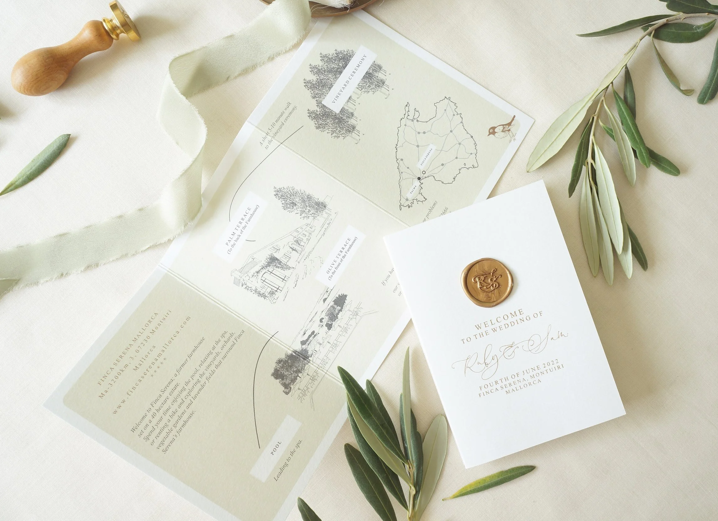
Like many couples that marry abroad Ruby & Sam had events planned over a three day period - The welcome dinner, the wedding and then a pool party the next day. The itinerary and further details, along with a welcome note from the happy couple were collated into this little tri-fold welcome card which I designed also to include a map on the reverse. They were waiting for each guest in their rooms, a sweet little reminder of events to have to hand and a cute keepsake of the entire event.
This first set of images are from the Welcome dinner the night before, it looks idyllic not only because of the setting, but the wardrobe choices!! They are just wow!! It makes me want a re-do and then numerous outfit changes throughout. Ruby’s stunning welcome dinner dress is by @christienicole_bridal finished with the cutest shoes by @loefflerrandall and jewellery by @mejuri. Sam looking very handsome in @massimodutti. Photographer of the wedding events the very talented @mariahibbsphotography. I’m certain any guest at this ‘night before’ must have had extra excitement for the wedding day after seeing how beautiful this lovely couple looked.
I hope that this first impression of the wedding was an echo of the excitement each guest would have had when receiving Ruby & Sam’s wedding stationery pieces. After all the Save the Dates, or your wedding invitations are the first glimpse of what your guests have in store. The suite created exudes Mediterranean vibes, warm summer evenings and dreamy landscapes. The handmade paper and silk ribbons used throughout add texture and a tactile element to the set and the gold hot foil pressed details on each piece convey luxury and elegance. This is an event not to be missed!
Beautiful flatlay of some of the suite content captured by @DavidCPhotography.
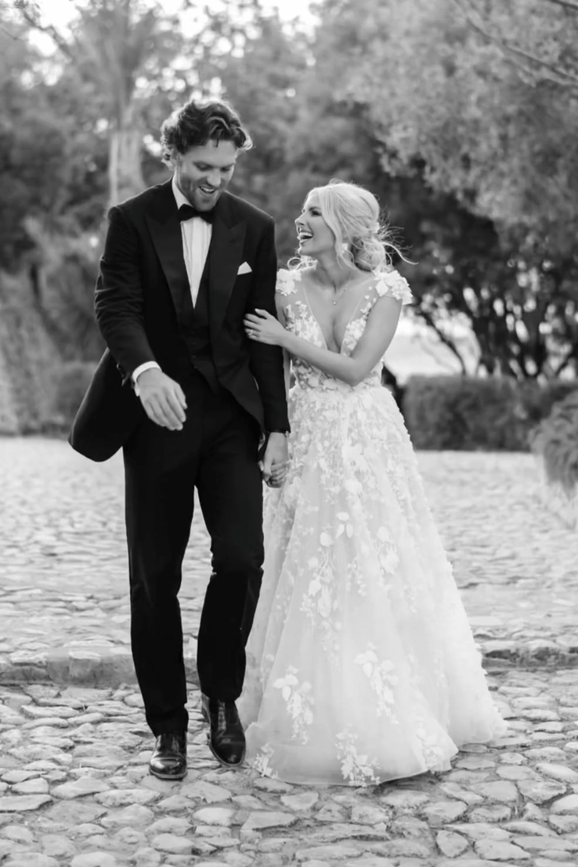
Ruby’s gorgeous dress is a Berta design from @theweddingclubofficial, worn with accessories from @megantheresecouture. Keeping with the white palette, Ruby’s bridesmaids also wore white, with matching dresses from @chichiclothing. As you can see in this absolutely stunning image taken by @mariahibbsphotography the overall look is so elegant and timeless. I honestly think this is my favourite ever image of a Bride with her ladies. By carrying the colour palette all the way through the attire, decor and stationery the outcome is such a classic one, proving time and time again that less is more.
For Ruby & Sam’s wedding stationery the same materials were carried through all the paper pretties. The Save The Dates were handmade paper sheets with cotton envelopes and the gold hot foil pressed details really shone. Paired with a bespoke initial wax seal for an elegant finishing embellishment. The Invitation suite not only saw a change in scale for the invitation card, but also the inclusion of the venue illustration and a blind embossed border. This meant that when the save the dates and the invitation cards were placed together, although both using the same papers, foil and text, the outcomes were different and complimented each other beautifully. The invitation card was paired with a further information sheet, one of which had different coloured foil pressed content, the other was a hand painted watercolour wash, digitally printed and then finished with a gold hot foil pressed header. Again side by side the two cards really sat well together. The RSVP was to be handmade paper but to add a touch of interest I hand dyed each sheet, not only to introduce more green in a delicate way but also to echo the watercolour wash of the information card. When layered and bound by the the full colour digital print vellum wrap, the sage green silk ribbon and old world charm - hand poured bespoke wax seal the finished bundles are stunning! A joy for any guest to receive. Images of stationery below captured by Peonies & Paperclips. For more details on this collection and to see how others have used it please see here.
With so many stunning images to pick from I could have shown so much more, but it isn’t my story to fully tell is it! It’s both Ruby & Sam’s and if you would like further details and information please do view Ruby’s YouTube channel, or of course her Instagram @rubyholley where Ruby is such a sweetheart and has collated a highlight folder with all the common questions and answers. My hope is that you will use this as inspiration and produce your own take on either a Mediterranean based wedding, or of course the elegant colour palette. My constant wish for my couples is that your day is filled with as much love and happiness as these images…
The sheer joy of the day radiates through every smile in these images. Whether it’s the Bride, Groom, bridesmaids or other guests, this was a wedding full of love and thoughtful touches. The colour scheme of white, pale sage green and gold can be seen in many ways, the wedding reception table decor, the florals and foliage and also the outfits worn by the wedding party and nearest and dearest. I may be bias because this was also my own wedding’s colour scheme, but truthfully it really is such a classic and timeless look that will be just as elegant when the grandchildren view these images as it is now.
E D I T O R I A L . 1 5
K E L M A R S H H A L L
When this gallery hit my inbox I was genuinely thrilled!! Quite often with editorials the look isn’t completely cohesive, or certain pieces just miss the mark, even the stationery in all honestly! But this team seemed to have a very clear vision and that is reflective of Katie of The Events Designers. Her concept, planning and styling showed each suppliers work in the best light and this was all perfectly captured by Sophie of Sophie May Photo.’
The shoot took place in the gorgeous Kelmarsh Hall. It’s ornate decor details and colours used throughout perfectly suited this truly feminine palette.
The stationery was produced with an old world charm in mind, lots of hand drawn details not just in the wedding invitation suite, but also for the menu pieces at the wedding table settings. Delicate hand drawn ornate features were then also blind debossed on pillowy hand made paper, producing a very tactile set.
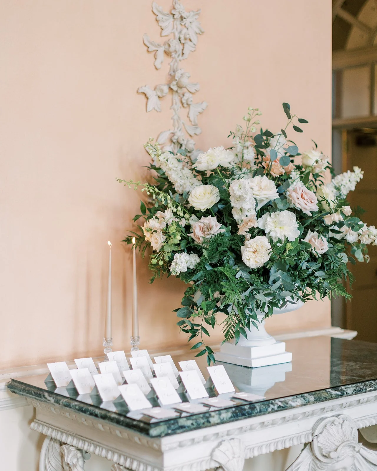
The handmade paper look was continually used for a cohesive aesthetic. Even the escort table featured mini standing, handmade paper tags with each guest name hand lettered and finished with a white wreath design wax seal.
White on whites produces a really classic and subtle style, it’s reminiscent of the details within the venue, the shadows they cast and the delicate impression from a distance.
K E L M A R S H H A L L E D I T O R I A L T E A M
Creative Direction & Photography - @Sophiemayphoto
Planner & Designer - @Theeventsdesigners
Videographer - @Benjaminslingsbyvideography
Venue - @Kelmarsh Hall
Florist - @Flourishandgrace
Makeup Artist - @Themakeuplabb
Hair Stylist - @Doll_creative
Couture Designer - @Felisitigreis
Ruffle Dress - @Millia.london
Cake - @Sadiemaycakes
Chairs, Bar & Lounge - @Wedhead_london
Tableware - @wrenark_
Stationery - @Peoniesandpaperclips.uk
Models - @Marlenemarieuk
Accessories & Jewellery - @Megantheresecouture
Veil - @Rebeccaannedesigns
Napkins - @Theembroiderednapkincompany
Embroidered silk - @Mariamanuscript
Silk Ribbon - @Thebotanicaldyer
Linen & Fabrics - @Iron_swan_and_co
Car - @Performanceweddingcars
Shoes - @Bellabelleshoes
E D I T O R I A L . 1 4
M O N I Q U E L ‘ H U I L L I E R
This studio based shoot has such a refined fashion editorial aesthetic. Captured by Claire Graham Photography.
I love working with Claire as her attention to detail shines through. When so much of my own work concentrates on details it’s amazing to find a photographer that focuses on them and does the pieces justice.
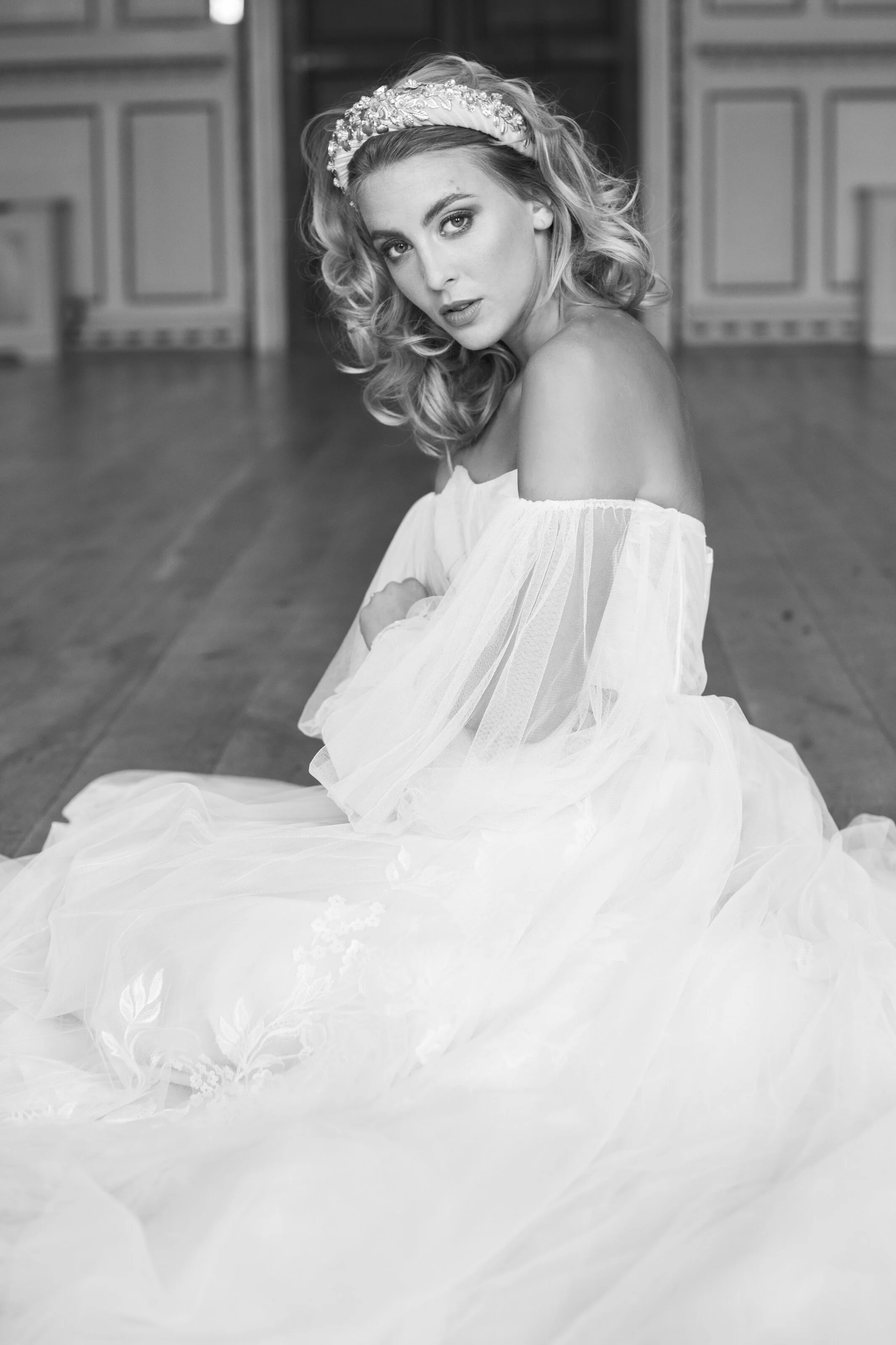
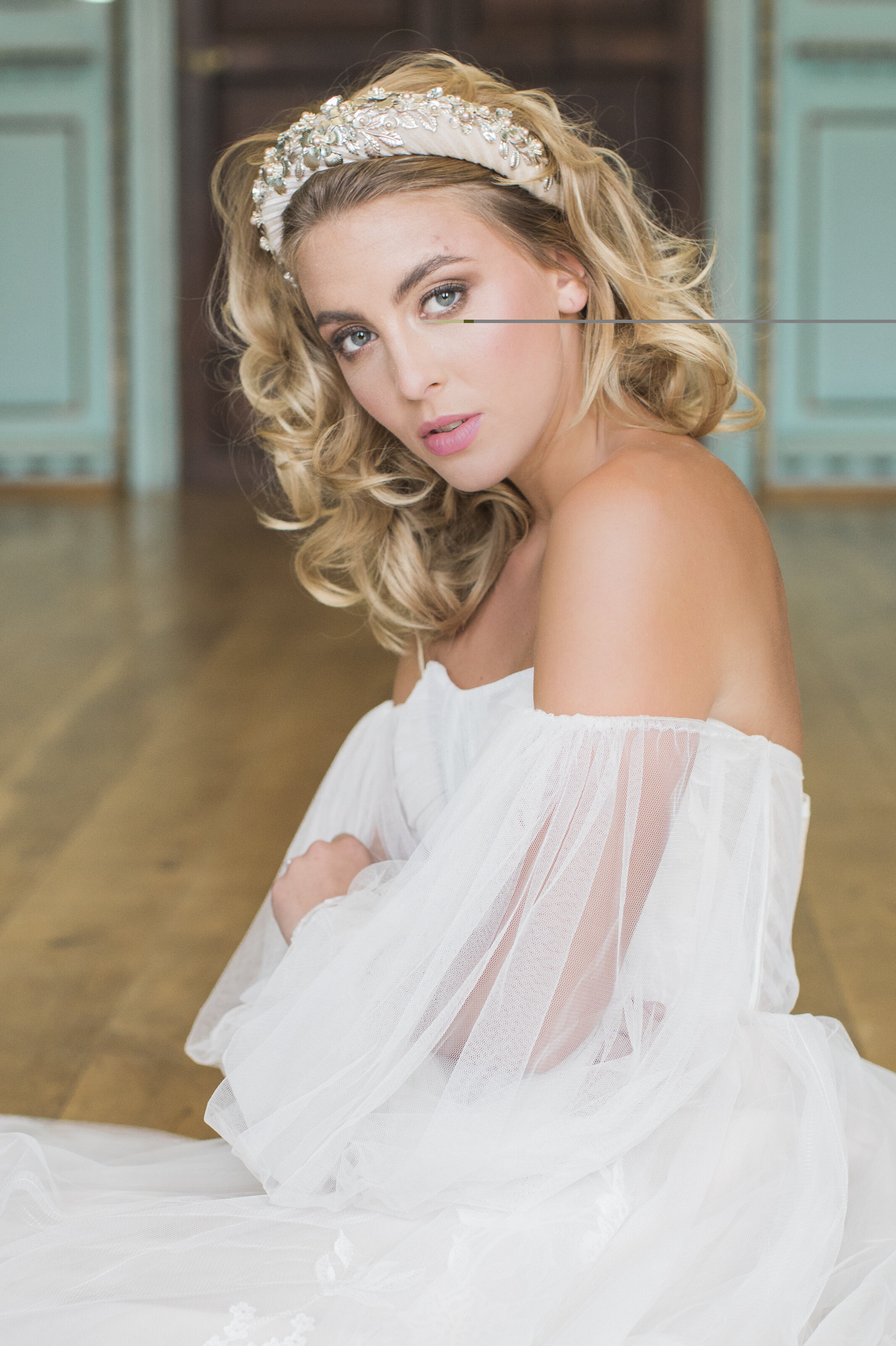
The key elements are stunning Monique Lhuillier dresses with pillowy sleeves, and ethereal touches throughout. These dress are all about the tactile finishes and the resulting silhouette.
So what style of pieces would an understated Monique Lhuillier bride pick for her day?
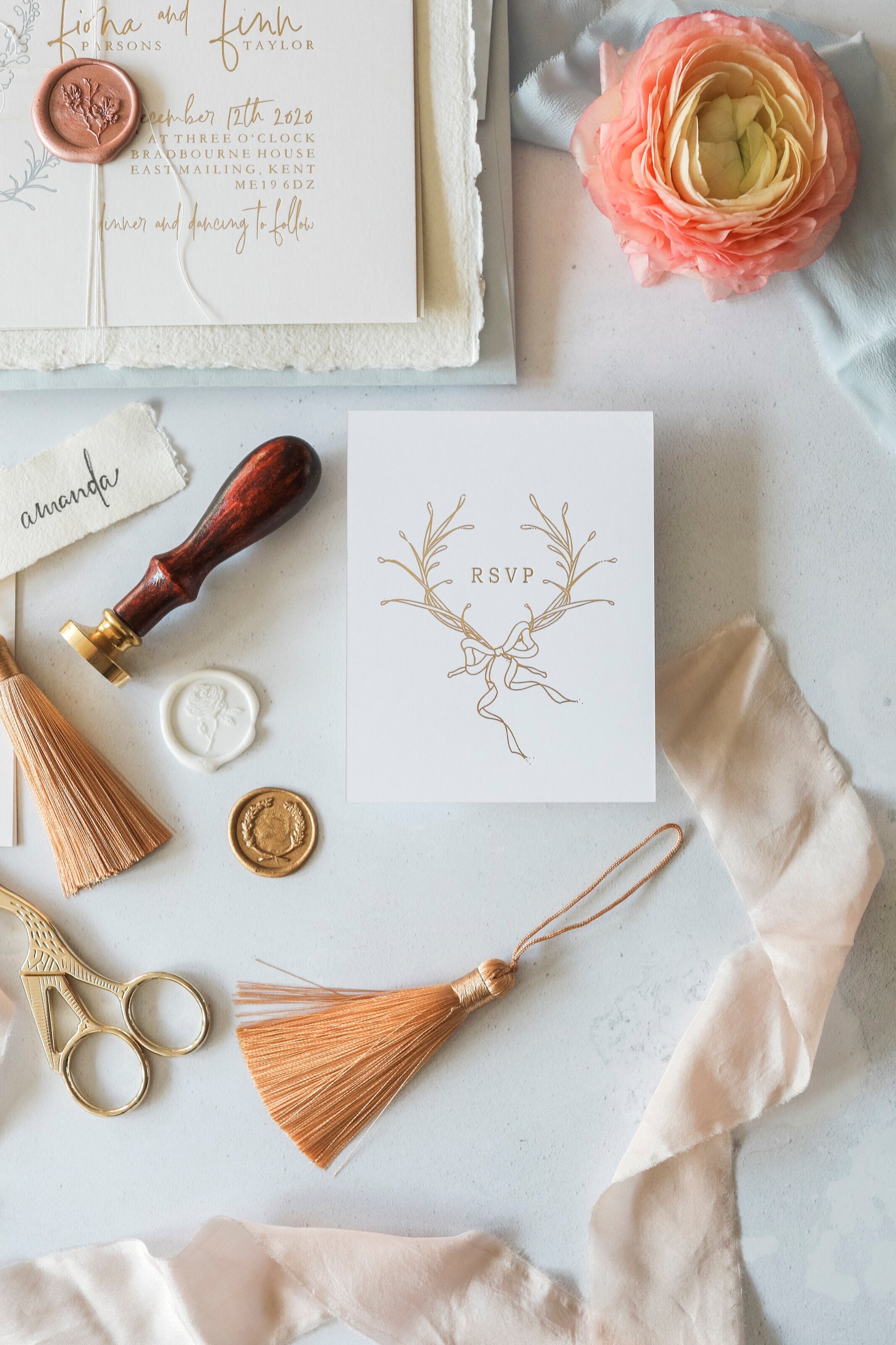
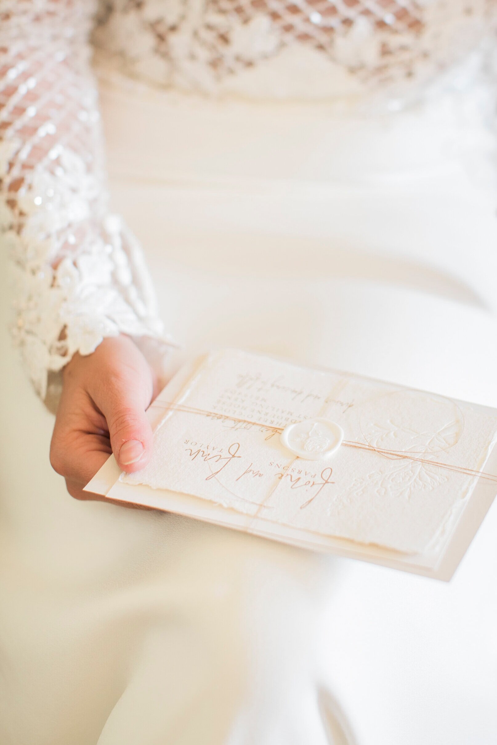
I’d like to think classic invitations that suit the classic elegance of the dress, timeless with hand made paper and a gold wax seal; tied with simple white twine, matching the barely there sleeves perfectly. This bride isn’t about design screaming things at you, there’s no need, the elegant fine art suite gives a perfect indication of the day. Finished with sumptuous tassels and wide hand dyed silk ribbon, these paper pretties are just as tactile as the dresses.
The pleats and gentle sway of the second dress are echoed on the wedding tables with further layering of fabrics. Even these Peonies and Paperclips fabric menus feature not only print but also delicate embroidery.
The transparent, textured glassware also reflects the ethereal look, again this shows the attention to detail how each element has been chosen with purpose and that is exactly what your wedding table should show. Do not feel the need for generic, or venue based supplies, feel free to practice with set ups and see which gives you the best feeling of pretty with purpose!
E D I T O R I A L . 1 3
B O T L E Y S M A N S I O N
I’m very proud to be able to share with you this gorgeous collaboration from a fantastic team. The vision of Amie, of Amie Jackson Weddings and captured so perfectly by the very talented Claire Graham Photography.
Another wedding at the gorgeous Botleys Mansion - a firm Peonies & Paperclips favourite venue!
For the wedding stationery I chose to concentrate on a white and gold palette with accent tones used to complement Amie’s vision.
Handmade paper became the chosen material for pieces throughout - not just the wedding invitation suite, but also for hand written love letters and as name place settings.
Peonies featured within the bouquet, table scape and venue floral installations and so the addition of a bespoke peony illustration sat beautifully alongside the other stationery details - any excuse to draw more peonies!!
The beautiful florals were curated and installed by the lovely Clare of Clementine Floral Design. I always love working with Clare’s designs, she has such a delicate, feminine aesthetic. The bouquet in this editorial truly wowing with some breathtaking peonies! It certainly deserved it’s moment in the spotlight, being captured alongside some stunning bridal portraits.
The ornate features of Botleys Mansion lend themselves to a variety of wedding looks. Not just because of the ornate details, but also because of the colours used throughout. Amie chose to concentrate on the beautiful aqua room and use this along with blush accents, in the hope of evoking romantic memories of summer hues.
For my part I paired hand made paper place cards, hand lettering and sumptuous blush tassels. These were displayed on top of fabric menus with hand embroidered peonies in pale pink and green. Pretty and practical!
The wedding dresses featured throughout were created by the truly talented Cynthia Grafton-Holt Couture.
Each dress was a showstopper, but I have to say my favourite was the last dress used for the couple’s exit and my goodness the lace and embroidery details are so beautiful - enjoy!!
I’m thrilled to be able to share with you the story in more detail through the eyes of Keeley Wedding Films.
B O T L E Y S M A N S I O N E D I T O R I A L T E A M
Planning, Design & Styling - @amiejacksonweddings
Photographer - @Clairegrahamphotography
Videographer - @Keeleyweddingfilms
Venue - @Botleysmansion
Floral Design - @Clementinemoon-floraldesign
Stationery - @Peoniesandpaperclips.uk
Cake & Biscuit Design - @Monikakossweets
Wedding Dress Designer - @Cynthiagraftonholt
Hair & Makeup Artist - @Charlismithhairandmakeup
Bridal Accessories - @botiasaccessories
Ring Designer - @rosie_clayden
Bridal Shoes - @Emmylondonofficial
Bridal Shoes - @Paradox_london
Linen - @Just4linen
Furniture & Crockery - @allens_hire
Grooms Attire - @Duckersstyle
Car Hire - @Ultimate_classic_car_
Couple - @Asweetromance @Tomcoulstonofficial
Assistant - @Celebratinglovebylucia
E D I T O R I A L . 1 2
MANDARIN ORIENTAL HYDE PARK
This glamorous London based wedding editorial was curated by Daphne Mercier Events and brought to life by a huge team of suppliers.
The glamour of the hotel celebrated throughout the story.
“The Mandarin Oriental Hyde Park was the perfect backdrop for my vision as it brought a timeless luxury element to the shoot and provided a variety of elegant indoor and outdoor spaces to work with.
The stunning ballroom, opening onto one of London’s royal parks can of course host large parties, however it is also a great location to host more intimate celebrations this summer such as this wedding breakfast for 18 guests” - Daphne Mercier.
So much of the Mandarin Oriental features grand, ornate, traditionally stunning architectural details. But the hotel still has a very modern feel throughout. The rooms are so tastefully decorated to be contemporary, luxurious and intimate. They make the perfect setting for wedding preparation images as seen in these stunning portraits by David C Photography.
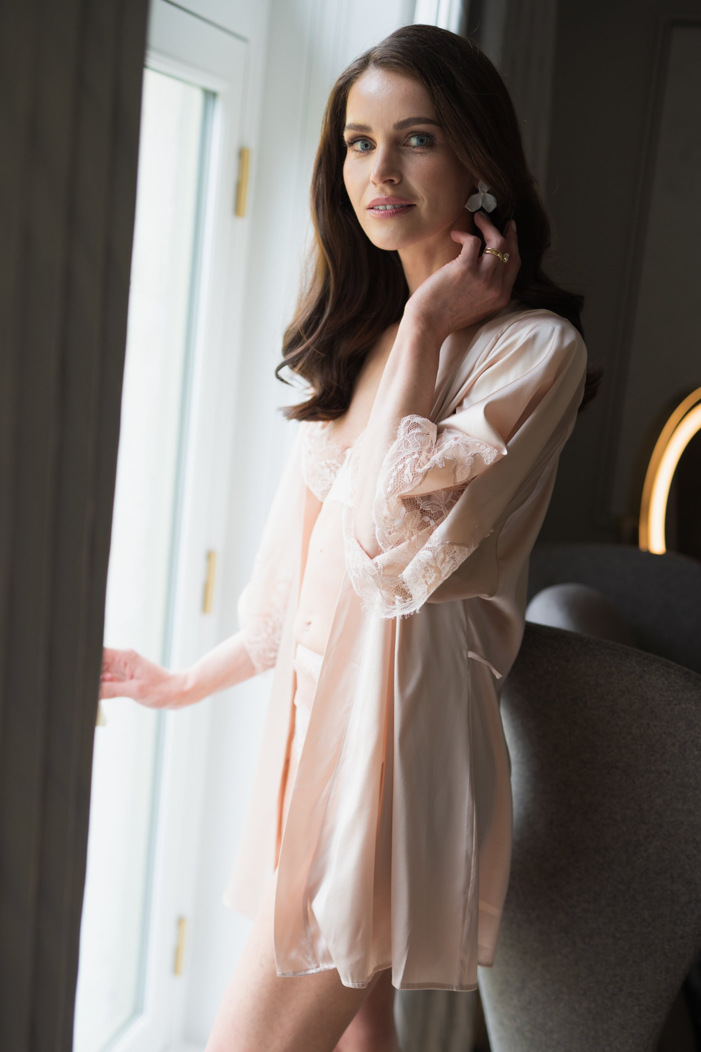
Our stunning bride wears sumptuous Fleur of England lingerie while she prepares for her bridal look. The delicate lace and ethereal silk make these the perfect, light adornments to relax in. These beautiful boudoir images are a lovely way to capture the bride’s anticipation on the day and they make the most beautiful keepsakes for your future spouse.
The bridal accessories used echo a delicate and modern look.
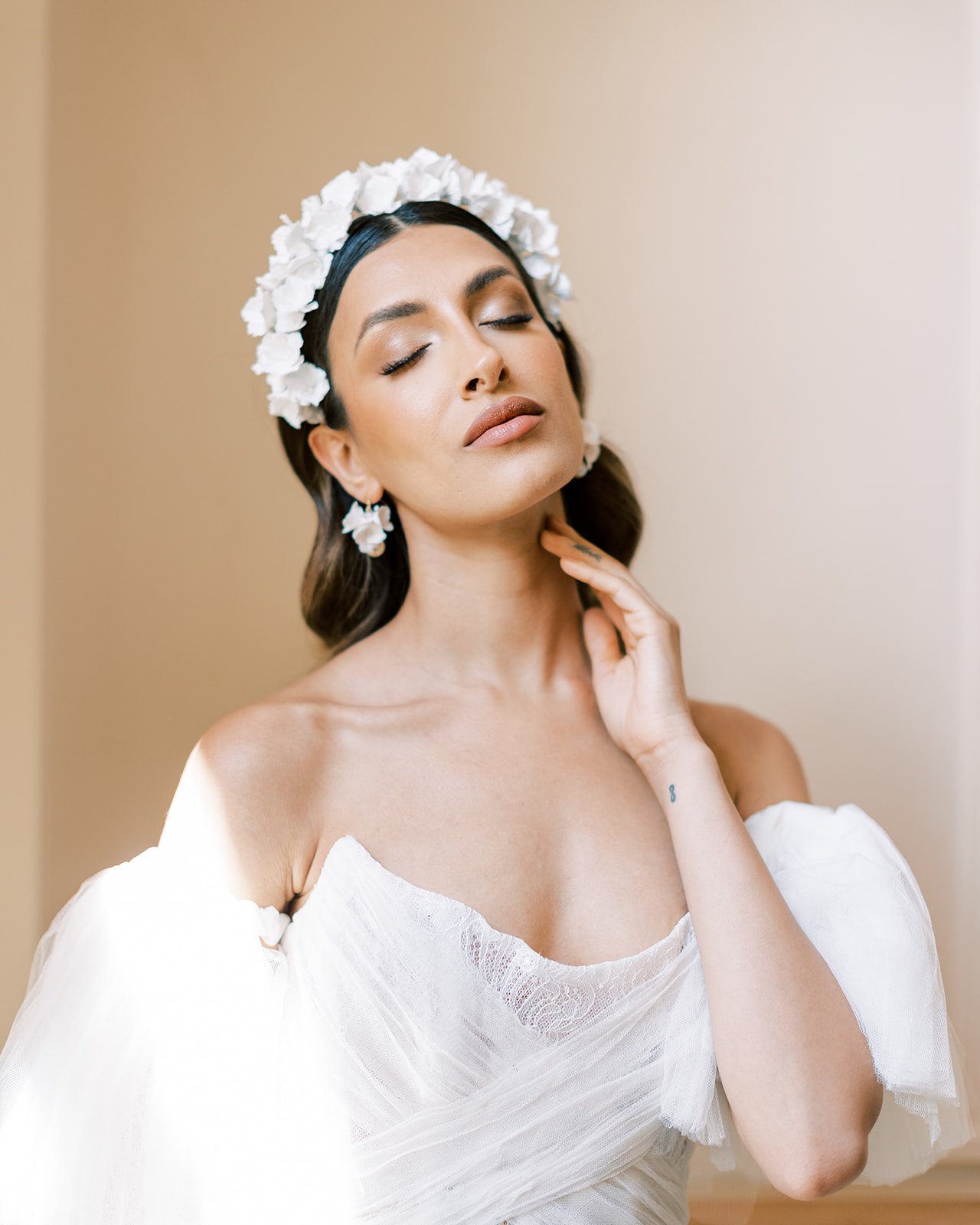
The hand made clay floral headband and earrings created by Viviembellishbridal are a true labour of love.
Each and every petal hand sculpted for unique texture and joined with a glass bead in the centre of the flower. The various shapes and sizes are then arranged until aesthetically pleasing. True fine art heirloom pieces!
The jewellery throughout is courtesy of Lily Arkwright. These timeless, gorgeous diamond pieces are the rings of dreams, and good for the soul too when you know they are produced by an ethically sourced, UK based company.
If your accessory of choice is the perfect pair of shoes you will not be disappointed!! Each bridal look shown throughout was paired with stunning matching ‘I do’ Jimmy Choo’s. Strappy YVETTE metallic sandals, the perfect ROMY crystal adorned heels, bejewelled beauties THRYA and dainty VIOLA sandals with tassels; they are all swoon worthy!
How’s a girl to choose just one favourite?!
For the stationery pieces I wanted to give a contemporary but soft feel to the set.
The venue illustration was to be a definite inclusion, an epic piece which deserved it’s own card to show the illustration in it’s entirety and then printed in digital gold foil on acetate, for a contemporary, but planet friendly alternative to acrylic!
Florals are a large part of the scheme with coffee roses used throughout I felt my Gentle Hermione Collection a great fit, but this time featured with a bespoke coloured illustration to give a gentle nod to the fine art and furnishings used throughout the hotel’s decor.
The main body of the save the dates and invitations are minimal using a blind debossed rose illustration and larger text details, these paired with gold hot foil pressed text on beautifully tactile cotton paper are a classic finish, ensuring the overall effect is kept understated.
Finishing embellishments such as tassels, wax seals, twine and torn deckle edges all add to the tactile trappings of the suite.
Maybe it’s naughty of me to play favourites, but I simply cannot help it!
The second Berta, (Muse by Berta, from The Wedding Club) gown shown in our editorial is just stunning! It has me feeling all the envious feels! The nude mesh and the delicate lace overlays are so feminine.
Talented photography team David C Photography seem to agree completely - “we wanted to create images that were truly luxurious and resonated with the modern fashion-conscious couple. We feel that the bridal gowns revealed are beautiful and work to perfection for modern glamorous brides.”
The bouquet by Mary Jane Vaughan coordinates with this particular dress beautifully, the soft pastels of the florals all sit with the nude mesh tones and when the look is captured amongst the venue’s white walls and classic features this is a modern and yet timeless look to be proud of!
This is not the first time I have had the privilege of being in the same editorial team as David C Photography. So I knew the images would be gorgeous! That being said there were still images that stopped me in my gallery scrolling tracks and these confetti images are definitely an example.
The second in particular is genuinely a favourite, a definite one to be framed if I was this bride! And out come all those envious thoughts again, as now I need a wedding do-over with copious amounts of confetti from Your Confetti in an attempt to capture something similar!!
The Groom’s attire was kept classic with two suits from Moss Bro’s.
The ceremony suit in a textured charcoal and the reception look in a sleek, contemporary navy, each with the very important matching bow tie!
Not to be out done the Groom’s shoes are also from Jimmy Choo.
SAWN and FOXLEY can be seen throughout the images, a very contemporary look with patent leather and two front decorative tassels.
The wedding breakfast has been styled to opulent perfection!
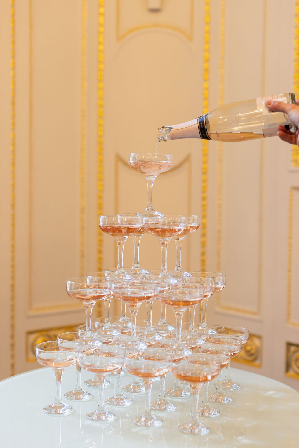
The days of old world glamour instantly come to mind when you see the champagne tower images. The champagne coupes filled and stacked perfectly is so very, very inviting and sure to wow the guests!!
Here the venue’s beauty is a jaw dropping experience for guests walking in to view the “exquisite dining table in the magnificent ballroom showcasing rich 24-carat gilding and breathtaking chandeliers.”
“I chose unique warm colours to compliment the decor, adding touches of gold, refection and transparency to elevate the design. The furniture pieces provided by Options Great Hire tied everything together…..The tableware in subtle hues of cafe latte with the Sicily dinner plate complimented by a taupe glass presentation plate, the Romance side plate and a smoked coloured water tumbler. As expected, the Trianon cutlery set and Marquis glassware reflected the gold touches of the Ballroom mouldings beautifully. Playing with volumes, reflections, transparency, and having different heights on the dining table without impacting guests’ conversations was important to me. This is why I believe that Mary Jane Vaughan’s floral design in conjunction with the crystal candelabras added the right dose of drama and grandeur without compromising on logistics and guests’ experience.” - Daphne Mercier Events
“The colour palette with the warm caramel and coffee colours, with a touch of gold and coral was an inspired and stylish choice. We were able to create it with coral charm peonies, vanda orchids, cappuccino and sahara roses, to which we added lightness with white phalaenopsis orchids and bowl of cream peonies. We were also thrilled to showcase our crystal candelabra in such a magnificent ballroom. It all came together brilliantly with the tableware and furniture.” - Mary Jane Vaughan.
As always there is so much to see from this shoot, and to so many I feel I have not even mentioned you or done your participation justice and for that I apologise profusely!!
Truthfully the hardest part of journal posts is choosing from the hundreds of gorgeous images and trying to keep the post succinct. (Also trying to ensure I do not overload/break the website ha!) Please remember these are my favourite aspects and from my perspective, other suppliers will I’m sure, on their websites show different aspects in more depth. So if any of the content has you intrigued, please do find the suppliers from their social handles below.
Happy to help with further details if needed too! Just let me know how I can help!
A very special thank you to Daphne Mercier Events for asking me to be a member of such a talented team!!
M A N D A R I N O R I E N T A L H Y D E P A R K
E d i t o r i a l s h o o t t e a m
P l a n n i n g , D e s i g n a n d S t y l i n g - @ d a p h n e m e r c i e r e v e n t s
P h o t o g r a p h y - @ d a v i d c p h o t o g r a p h y
V e n u e - @ m o _ h y d e p a r k
F l o r i s t r y - @ m a r y j a n e v a u g h a n
C a k e - @ c a k e s b y k r i s h a n t h i
F u r n i t u r e a n d T a b l e w a r e - @ o p t i o n s g r e a t h i r e
V i d e o g r a p h y - @ d e n e e m o t i o n
E v e n t P a i n t i n g - @ s t e p h a n i e p a i n t s t h i n g s
D r e s s e s D e s i g n e r - @ b e r t a @ m u s e b y b e r t a
D r e s s e s R e t a i l e r - @ t h e w e d d i n g c l u b
S h o e s - @ j i m m y c h o o
S u i t s R e t a i l e r - @ m o s s b r o s
J e w e l l e r y - @ l i l y a r k w r i g h t u k
A c c e s s o r i e s - @ v i v i e m b e l l i s h b r i d a l
L i n g e r i e - @ f l e u r o f e n g l a n d
H a i r - @ g i n t a r e _ h a i r s t y l i s t
M a k e u p - @ a u s r a . r u k
M a n i c u r e - @ d r y b y l o n d o n
M o d e l B r i d e - @ m a r t i n a . s u k u p o v a . d a v i d s o n
M o d e l G r o o m - @ d a n i e l k a k o u l i d i s
F a v o u r s - @ c o c o _ p e o n y _
S t a t i o n e r y - @ p e o n i e s a n d p a p e r c l i p s . u k
C o n f e t t i - @ y o u r c o n f e t t i
R i n g B o x e s - @ b i j o u b o x e s 1
R i b b o n s - @ c f l e u r s d e s i g n
N a p k i n R i n g s - @ j 9 c r a f t s
D J a n d S a x o p h o n i s t - @ b l a n k c a n v a s e n t e r t a i n m e n t
E D I T O R I A L . 1 1
W O T T O N H O U S E
C H E L S E A W H I T E P H O T O G R A P H Y W O R K S H O P
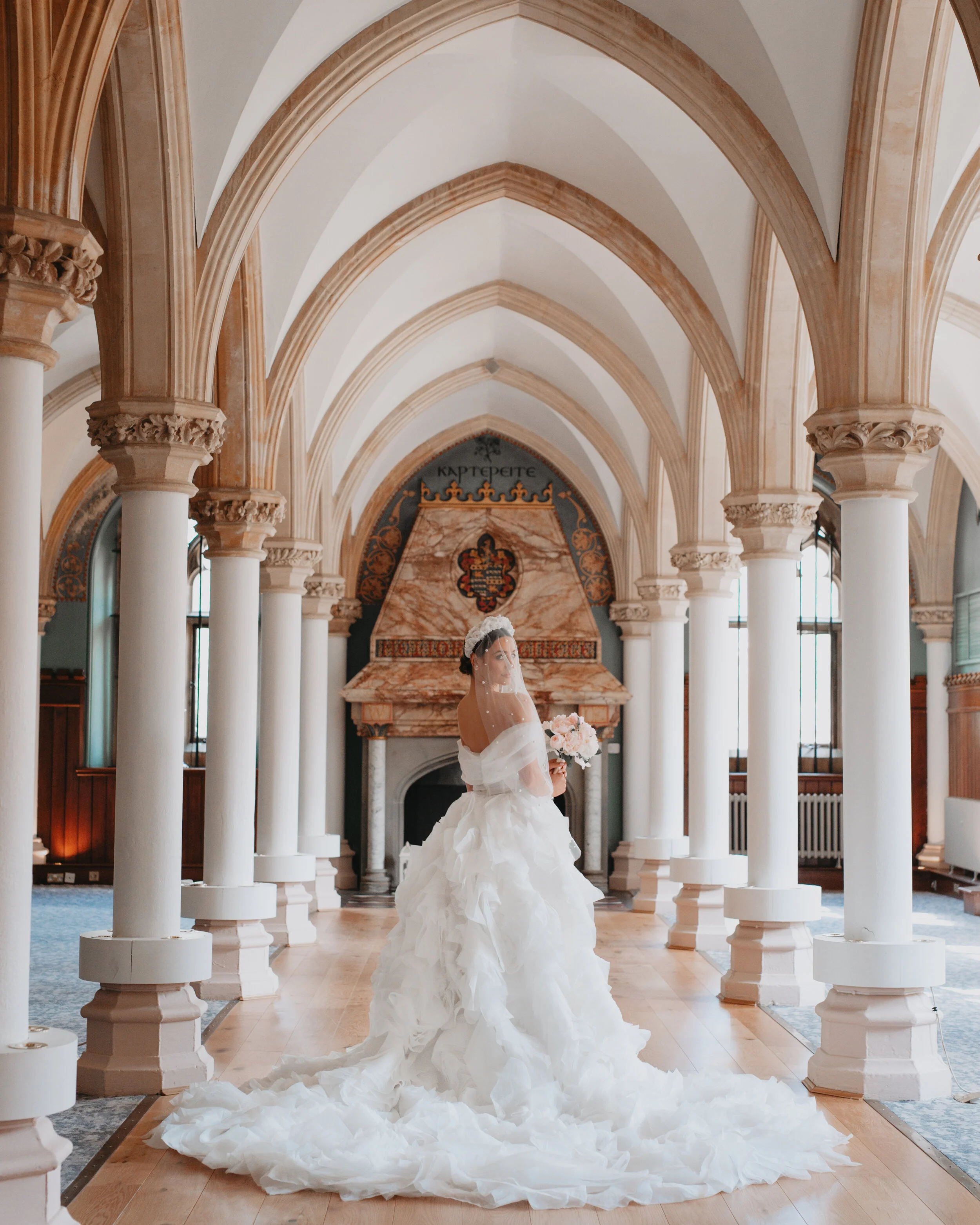
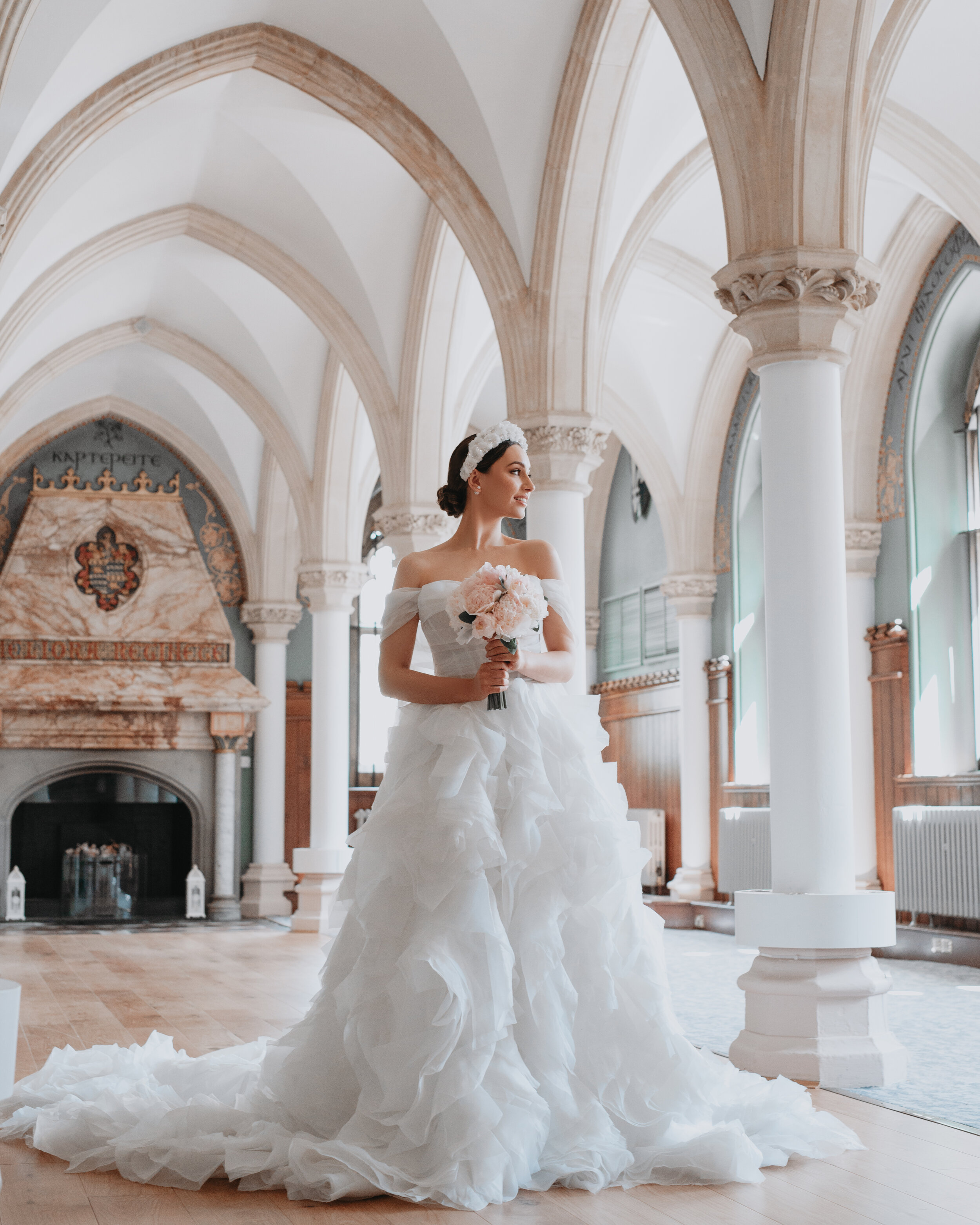
This truly elegant gallery came from a stunning photography workshop hosted by Chelsea White Photography. With planning, styling and design by Melinda of Luxus Events, I knew this would be stunning! Having worked with Melinda before I know her creative talents curating a shoot produce beautiful stories!
“Our vision for this workshop was to create a fairy tale romance complimented with romantic Milla Nova gowns to get you inspired. A wedding dress full of ruffles is one of our favourite classic looks; it’s ultra feminine, stylish and dramatic” - Melinda, Luxus Events
All the beautiful details captured in beautiful flat lays! “These play an important role in telling your love story and capturing elements of your wedding day. Flat lay photographs are great keepsakes, these photos will be passed down through generations along with the stories behind those details” - Melinda
The pieces a bride chooses to wear on her most special day are probably the most reflective of her taste and mindset. It is sad to think these things can so easily be forgotten when they are the result of months, if not years of planning, shopping and coordinating.
Dainty shoes such as these by Bella Belle Shoes, floral accents and bridal accessories by Botias Accessories definitely deserve a flat lay moment!! This bridal look is so very classically formal, the large layered silhouette of the skirt and it’s train, and the dreamy veil all create a truly timeless look.
“Dramatic elegance is oozing out of every single wedding dress in the new Milla Nova In The Name Of Love Collection. This stylish, dreamy wedding gown crafted from layers upon layers of pleated tulle brings fierce feminine aesthetic and utterly gorgeous style. No doubt it will leave your guest speechless.” - Melinda
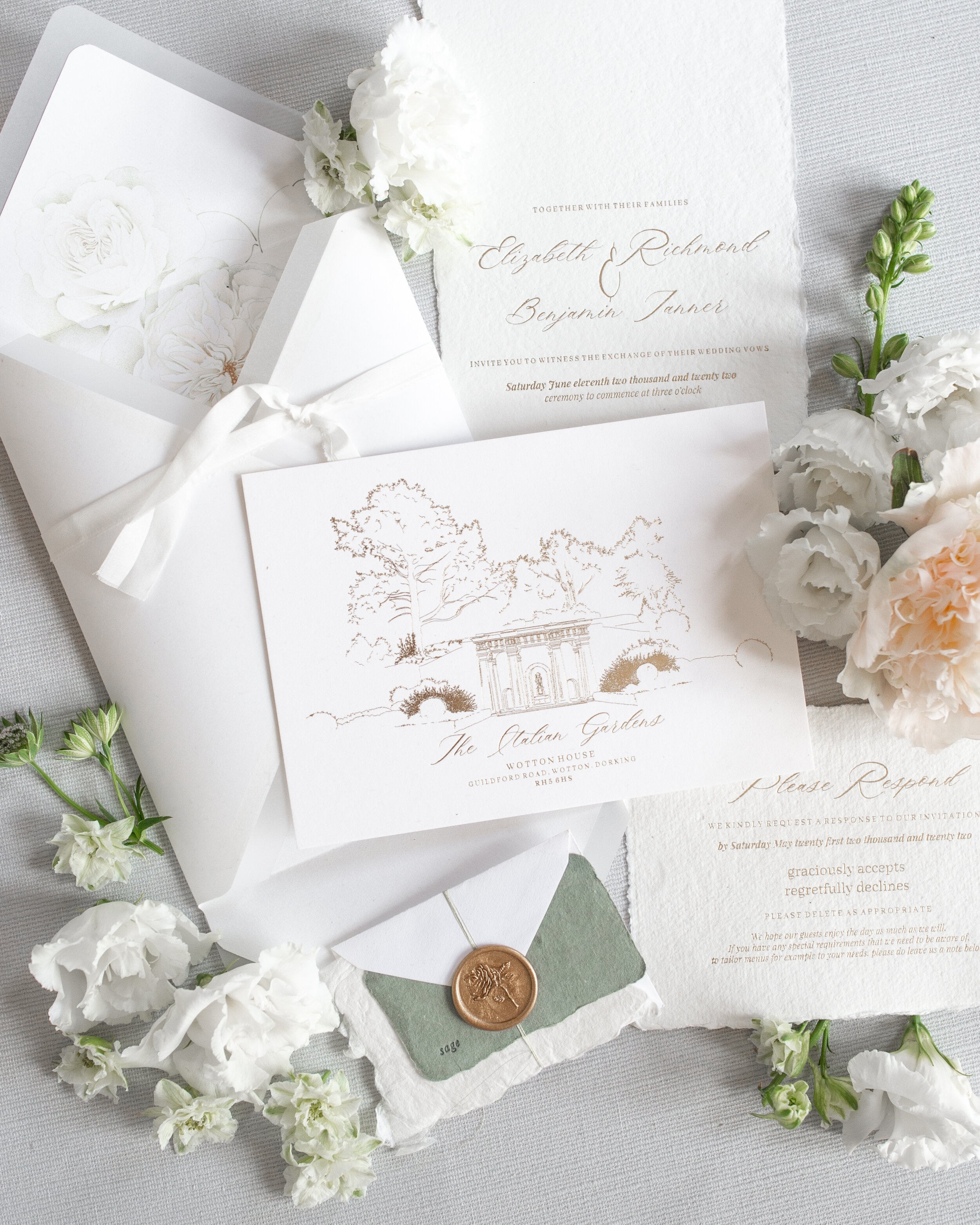
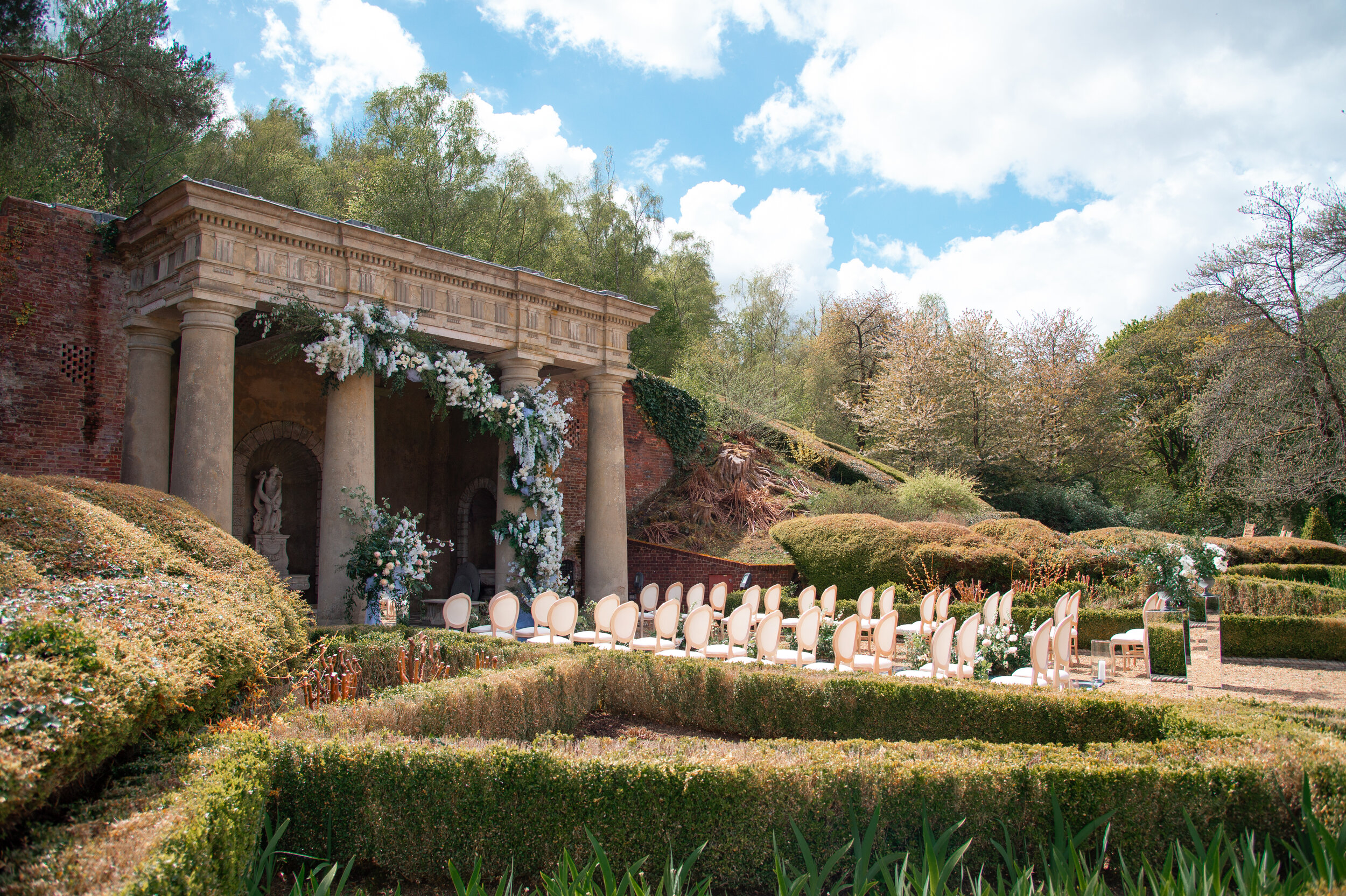
The stunning architectural details of Wotton House are breath taking backdrops in these images. When designing the wedding stationery suite it was the Italian gardens that was to be the key venue feature, celebrating the ceremony surroundings. The suite was to have a classic aesthetic, with soft white hand made paper as the base and gold hot foil pressed details reflecting from it’s surface. Delicate Peonies & Paperclips floral inclusions such as the rose envelopment liner help add to a classic feel and echo the wedding flowers in a subtle way without detracting from the overall minimal outcome.
The Italian gardens were framed in gorgeous florals by Early Hours Ltd. With trailing florals wrapping around the epic pillars. Arriving as a guest to this ceremony decor would feel truly magical.
The groom is not to be forgotten during the preparations of the wedding day - masculine flat lays are definitely a thing too as proved here! They too have debated over options for their outfits and accessories and had sentimental pieces included, these all deserving of their own five minutes of fame!
The classic groom style here from TuxLux London and Duke Dexter Bespoke
“When designing the ceremony and reception set-ups for this beautiful wedding workshop we wanted to highlight the key features of the breath taking Wotton House, such as it’s mesmerising gardens with a real Italian influence. The fairy tale like secret garden offers the perfect setting for an elegant outdoor reception for both intimate and larger numbers. We turned this space into a ‘Chandelier Garden’ to add a wow factor to the scenery.” - Melinda (Luxus Events)
For this stunning table scape Melinda and I spoke about longer in length indulgent menus. With so much to feature on the tables I knew I wanted to keep the design very simple and minimal, I loved the idea of using vellum. The almost see through effect and the layering to the eye these creates. Each place setting has it’s very own scroll menu. Not only are these practical to be rolled up and out of the way whilst eating, but they are also very chic keepsakes of the day. They can be finished with coordinating ribbon, or sealed with twine and a wax seal; they are great little pieces easily adapted to any scheme.
There were a few bridal looks showcased at this workshop and a huge variety of talented suppliers involved, creating far more than I have shown here, in fact probably enough looks for a few journal posts!! These were just my favourites - so if I have you intrigued please do be sure to look at the other suppliers in the team and the images they showcase, it will continue to be this elegant fairy tale vibe - you wont be disappointed!
E D I T O R I A L S H O O T T E A M
Photography- @Chelseawhitephotog
Planning, Design & Styling - @Luxus_events_
Venue - @Wotton_house_hotel
Videography - @jakeburgessfilms
Florals - @Earlyhoursltd
Dresses - @Theweddingclubofficial
Suits - @Tuxtuxlondon
Men’s shoes - @Dukedexter @Dukedexterbespoke
Bridal Shoes - @Bellabelleshoes
Accessories - @Botiasaccessories
Stationery - @Peoniesandpaperclips.uk
Cake - @Uniquecakesbyyevnig
Models - @abi__uk @abbierichards @callumcichon @laurentrent_ @oliverandrosi
MUA - @Laurahulbertcreative
Hair - @Treats4hair
Furniture & Tableware - @Optionsgreathire
Linen - @Just_4_linen
Chandeliers - @Crescent_moon_events
Styling mats - @Oliveandoakmat
Harpist - @Soraya_says
E D I T O R I A L . 1 0
H A L E P A R K
The very talented Charlotte Wise Photography captured this stunning editorial - let me tell you a secret - she did such an amazing job that I could actually share with you hundreds of images!! In fact choosing the ones to show case has been the hardest part of this post. So if this look inspires you please do go seek out the other suppliers involved and see their favourite images from this editorial - hopefully between us all we may be able to do Charlotte’s talent justice!
Inspired by Parisian details, and a wysteria colour palette, this editorial proves you can create a dreamy French aesthetic in the English countryside.
Set in Hale Park , a stunning wedding venue that sits on the top of a hill in a quiet, hidden corner of the New Forest. It’s stunning architectural details and landscaped gardens are as stunning as any French chateau.
Our story begins with these gorgeous couple images, where the star of the show has to be the pale lilac ruffle dress by Millia.London. These colours completely depictive of the wisteria inspiration.
The stunning make up by Laura Carroll Make Up Artistry and hair by Samantha Stevenson Hair on bride Leyla Ucarx are definitely deserved of attention and are obvious in these beautiful bridal portraits!
The bridal accessories from Rachel Sokhal Bridal are stunning throughout this shoot! The jewellery and the hair accessories help elevate our bride’s modern look. I love that the details and feminine touches are truly celebrated in these images! The palette is unashamedly girlie and this is especially portrayed through the delicate blush tones of the beautiful roses from Blush & Bloom Floral Design.
Lucy Ann Events and Charlotte Wise Photography have used gorgeous heirloom pieces that fit the theme perfectly. Ornate gold trays, mirrors and decorative pieces echo the Parisian feel.
For the stationery I choose to use hand drawn elements throughout, decorative architectural sketches - all inspired from Versailles details. The hand made paper and gold hot foil pressed text creates a classic suite with small floral accents in addition, that are delicate but not detracting from the classic aesthetic.
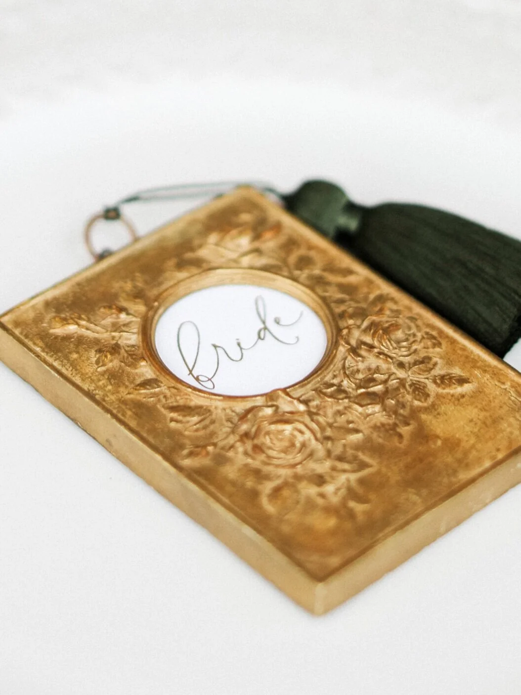
My favourite pieces were the antique frames I used as place names. These floral discs were each gold hot foil pressed with guest names and then threaded with a blush tassel. They truly are so very beautiful and can so easily be adapted to suit any palette/design. It was such a pleasure to see them with these beautiful tones!
The second bridal look features a blush Aurelia Rose London gown. It’s fabric detail seems to be replicated in the artistry of this amazing cake by Hayley Elizabeth Cake Design! Both such a perfect pairing and very elegant!
The billowing sleeves of this dress get me every time! Such a dreamy feel for the bride and as photogenic as can be - a princess dress if ever there was one!!
H A L E P A R K
Editorial shoot team
Photography - @Charlottewisephotography
Planner & stylist - @Lucyannevents
Floral Design - @blushandbloom.floraldesign
Venue - @haleparkweddings
Models - @tomfowlie95 @leyla_ucarx
Bridalwear - @millia.london & @aureliaroselondon
Menswear - @charlestyrwhitt
Accessories - @rachelsokhalbridal
Stationery - @peoniesandpaperclips.uk
MUA - @lauracarrollmakeupartistry
Hair - @samantha.stevenson.hair
Cake - @hayleyelizabethcakedesign
Furniture hire - @academyfurniturehire
Chandeliers - @crescent_moon_events
Candle holders - @luxemywedding
Ribbon - @silkandpurl
E D I T O R I A L . 9
S K Y G A R D E N S L O N D O N
M O D E R N , C H I C L O N D O N W E D D I N G I N S P I R A T I O N
The ‘Fine Art Wedding’ trend is typically associated with country estate weddings, dreamy coastal settings, or even stunning Tuscan elopements etc; but that doesn’t mean it cannot be achieved in a modern city centre environment!
Fine Art is about highlighting the bespoke artistry of each supplier, and the journey taken to create each element of your day and this editorial is a true celebration of fine art design celebrated in the modern central London venue Sky Gardens.
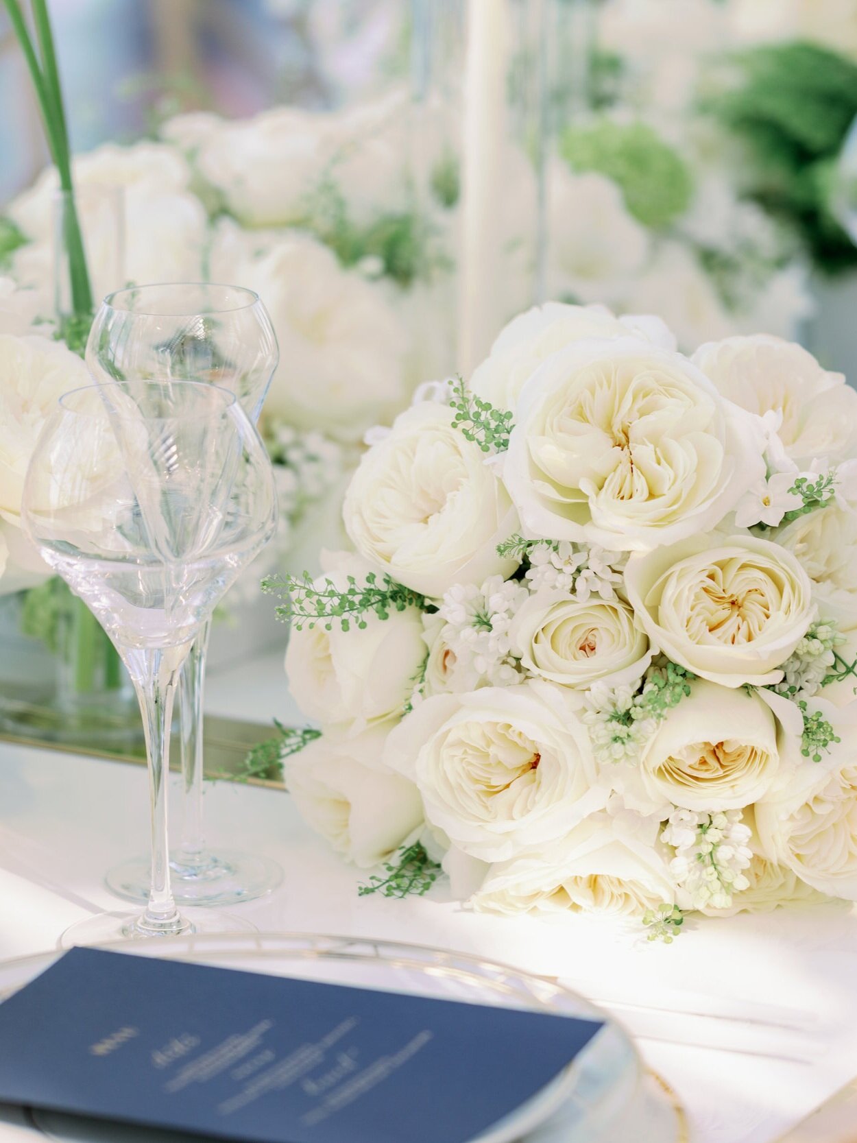
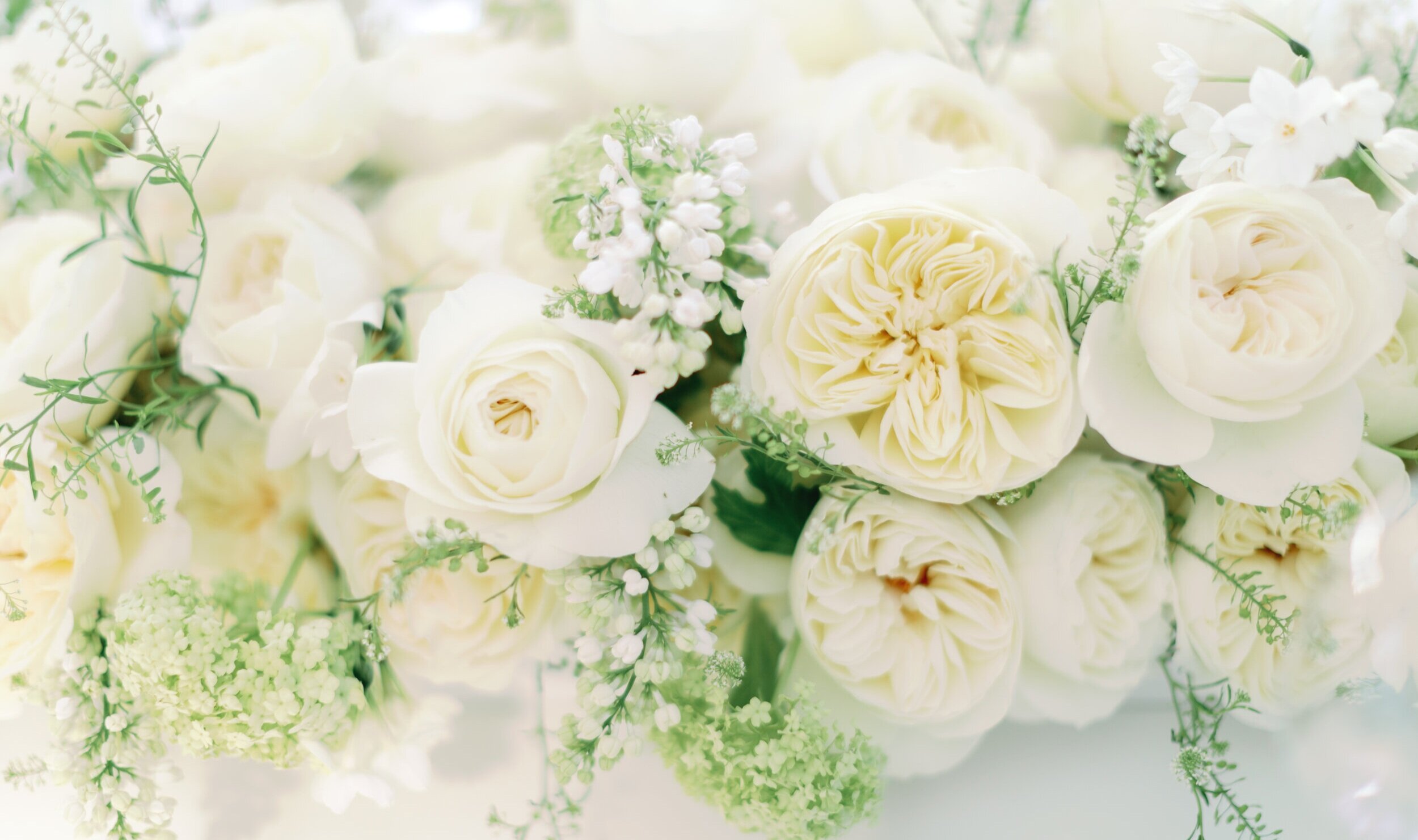
This editorial was the second that I have been fortunate to work on for David Austin Wedding Roses. The iconic wedding rose leading this story is the gorgeous Leonora rose. A rose abundant with petals, but so very understated. Clusters of these open white blooms produce such an elegant bouquet and when mixed with it’s smaller buds that show glimpses of blush and yellow, large floral installations create depth and interest in very subtle ways.
Mary Jane Vaughan Designs showed the Leonora roses at their absolute best in pieces ranging from a tight, abundant bouquet, long table centre arrangements for the sensational tablescape and large opulent urns that are certainly the most attention seeking element of this decor design - in totally the right way!!
The details in this editorial are careful and considered. Minimal pieces that are reflective of a bride with elegant understated taste. This bride loves pieces that have been made with great love, time and attention to detail, the quality speaks for itself.
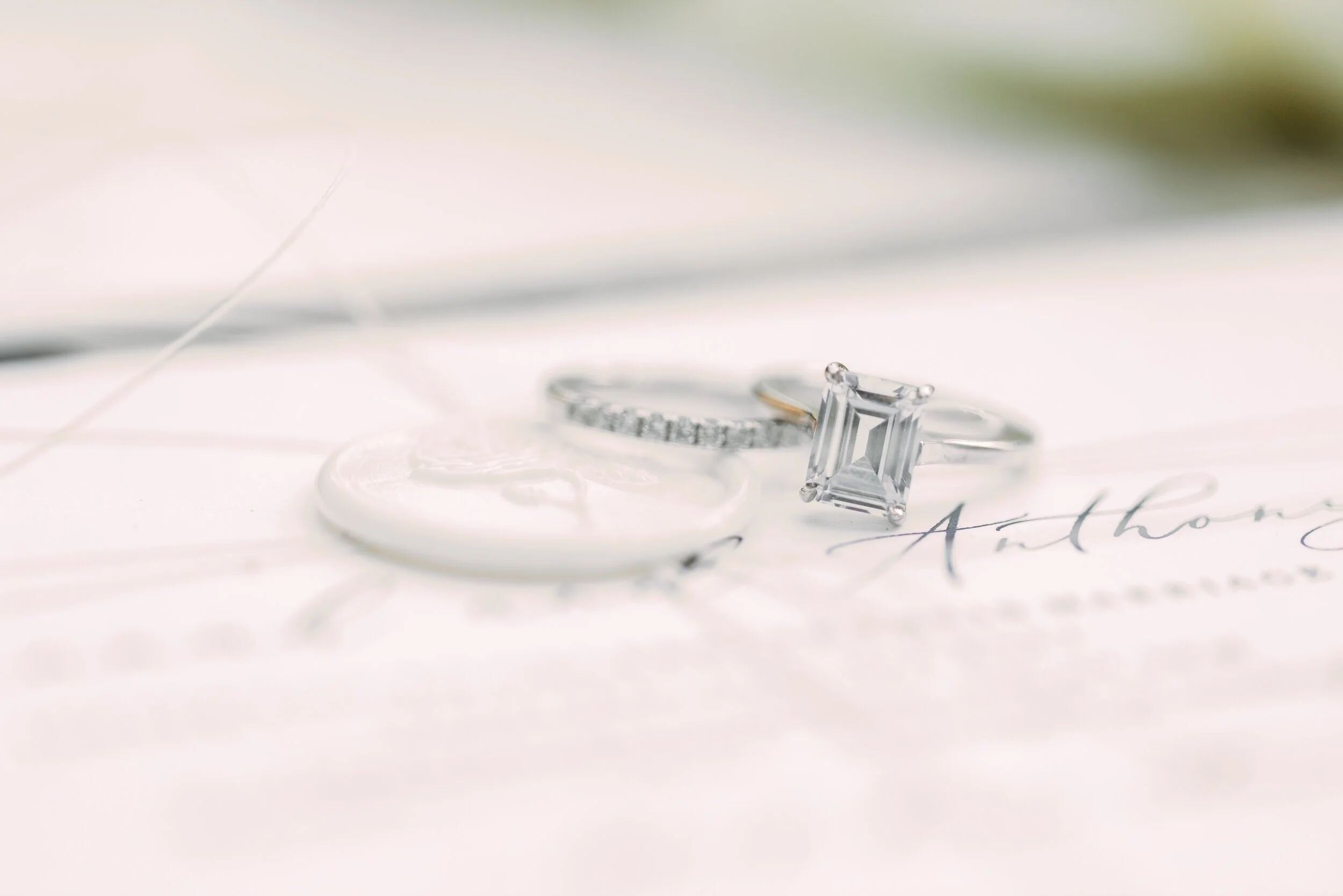
This is not a story with everything known to weddings chucked in for good measure! Instead a beautiful example of how less can definitely be more! A stunning example of this is the bridal jewellery by Nevill Argyle The two rings stack beautifully and each has a timeless design, creating a classic combination any bride would love to wear!
With so many areas of London known for their architectural details, as backdrops for portraits, this city spoils you! Whether neutral pillars and stonework, or monochromatic statues and bridge details there is a look for all tastes here.
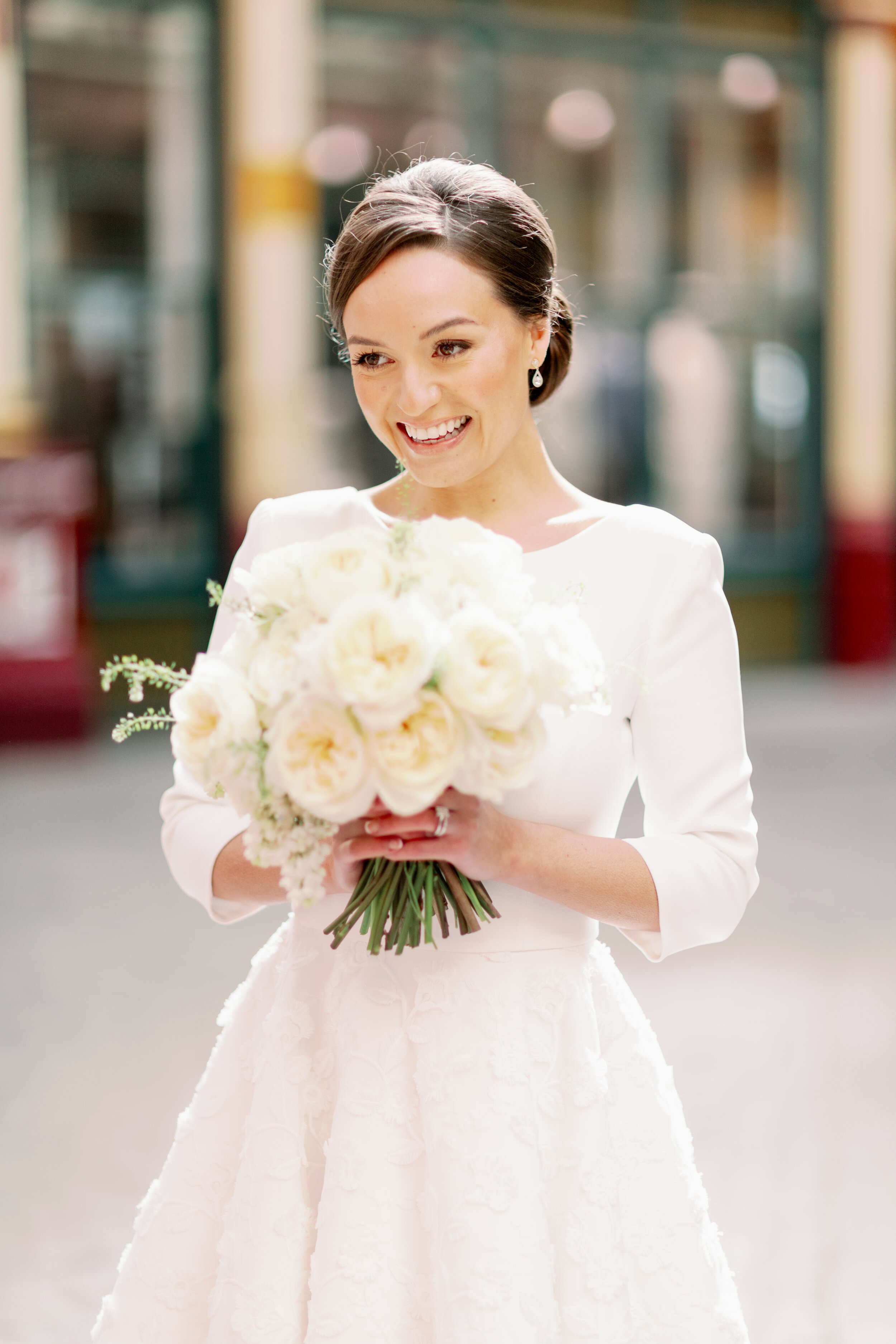
Leadenhall Market, just a few minutes walk from Sky Gardens, is the backdrop for these modern bridal portraits, captured by Camilla J Hards Photography. I just love the pop of red these images bring to the editorial, with the main colours of red white and blue very evident in this gallery it’s a very fitting scheme to celebrate a fine art English heritage feel.
I just love this Suzanne Neville dress - so sleek and fitted at the top, the drama is all in the skirt! High at the front gives a modern, cheeky feel to our bridal look and yet the train at the back creates such an elegant, chic silhouette. It truly is a modern beauty for any fine art bride. The skirt has great movement in images and the stunning brocade detail of the fabric has a tactile, luxurious feel.
The high skirt allows the shoes to be a key seen finishing touch. For brides that are all about the shoes this dress was made for you!! Look how beautifully it displays the beautiful satin bow heels from Emmy London.
When designing the stationery for this look it was vital to keep the feel of the suite minimal, light and modern. The star was definitely the illustrated venue card within the suite. I refuse to use ‘stock images’ in my work, so I spent days drawing famous London landmarks that would create the skyline feature. Some artistic license regarding scale etc was definitely used to produce an aesthetically pleasing result; but I was so pleased to produce a piece that features London so obviously and yet so elegantly.
The stationery was to match the wedding palette of blue and white. Each piece hot foil pressed with a midnight blue pigment foil, on 100% cotton paper. It’s a tactile beauty that guests will love. Further interest was added with a Leonora Rose illustration printed in to the envelope, and finishing touches such as twine, wax seals and silk ribbon all add to the look without detracting from the design.
Any metallic finishes were in gold and this was echoed with the hot foiled address on the envelope’s reverse flap. Vellum was also introduced, echoing the transparent feel of the venue with all those windows overlooking London. It’s a suite full of so many little details that as a whole compliment each other.
The blue and gold stationery combination was carried through to the wedding table decor. Each place setting presented with a midnight blue menu with gold hot foil pressed text and name cards with blind embossed borders.
There is something so very classic about a dark blue and gold pairing, when the table also features a decadent abundance of gorgeous white roses this is a timeless tablescape bound to wow!!
Which leads me to the show stopping part of the shoot! The wedding reception at Sky Gardens - overlooking an idyllic London skyline. The Sky Garden is already a greenery oasis in the middle of concrete land, but when you add hundreds of stunning Leonora roses to the scene it is next level stunning!
S K Y G A R D E N S
Editorial shoot team
Produced for - David Austin Wedding Roses @davidaustinweddingroses
Photography - @camillajhardsphotography
Floral Design - @maryjanevaughan
Creative Direction - @kellysparkeswp
Bridal Gown - @suzanneneville
Hair & MUA - @botiashairandmakeup
Wedding Stationery - @peoniesandpaperclips.uk
Bridal Shoes - @emmylondonofficial
Wedding Jewellery - @nevillargylejewellery
Events rentals - @optionsgreathire
Bride - @alanawallaceofficial
F E A T U R E D W I T H
E D I T O R I A L . 8
C A M E H O U S E W E D D I N G I N S P I R A T I O N
When the vision for this editorial landed in my email it immediately conjured up such a classic, elegant, fine art story. A concept by Amy ‘thetimelessstylist’ to produce imagery celebrating the iconic David Austin Wedding Roses.
To me the actual outcome produced two stunning stories and I want to highlight to you the one that tugged at my heart strings the most….
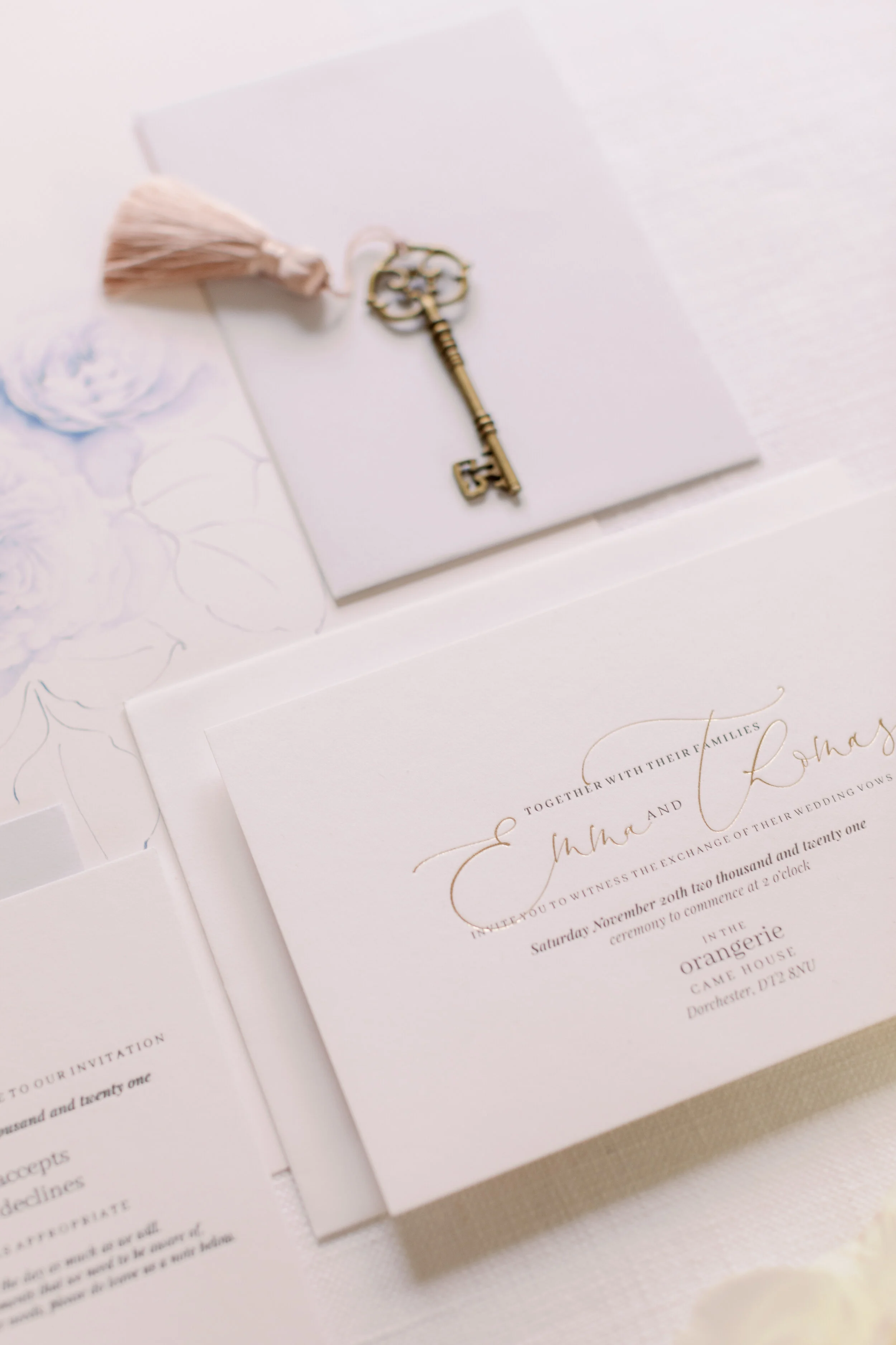
Let me share with you the truly intimate images of a bride before her wedding! Captured so beautifully by Imogen of Imogen Xiana Photography. These light, ethereal images show so much more than pretty imagery; the precious details and more importantly the raw emotion has been immortalised in these precious stills, each one it’s own mini fine art print.
Each and every detail shown so beautifully in such a classic way. Not just the pieces chosen by the bride just as these gorgeous pieces by Rachel Sokhal Bridal, but the stunning details of the venue.
CAME House is a beautiful historic building based in Dorset, England. Its neutral tones help the stunning architectural details shine naturally. The bridal suite is such an elegant space, it’s large windows flood the room with natural light and highlight the exquisite antique details within the room’s decor.
Here in this bridal suite we see our bride to be for the first time. Her excitement and elation is obvious to see and I simply adore these images of sheer joy!!
I’m actually jealous and it makes me want to go back and do it all again! Some of us are too full of nerves, or the room (those in it) don’t always allow us to fully open up. Maybe a beautiful consequence of the past year’s micro weddings is that we have simply seen what the couple deem to be important! The things they cannot be without, the feelings and love between them and not the stress of pleasing everyone else.
These images show some nerves there’s no denying - the tender rubbing of the hands is something we can all identify with when nervous, but how lovely to just be able to be excited! To be childlike with it, to enjoy every moment!
The absolute star of the editorial has to be the gorgeous David Austin Wedding Roses used throughout.
Amy deliberately kept the styling minimal, a vision of understated luxury and pared back elegance allowing the true beauty of the roses to headline. The floral design created by Joanne Truby Floral Design with assistance from Clementine Moon Floral Design included Keira, Leonora and Purity roses.
The bouquet designs show these showstopper roses mixed with white ranunculus, white lilacs, anemone, green hellebore and beautiful trailing foliage.
The roses were to be the absolute stars of the stationery suite too, but not in the usual way - The wedding suite was minimal and classic. Soft white, recycled cotton paper stock was the canvas for the palest of grey and luxury pressed gold text. The neutral tones were mixed in ever such a subtle way, adding more depth than simply all white only, but still keeping a very minimal outcome.
Detailed rose illustrations can be seen alongside the suite. The all blue piece a bespoke illustration showing in greater detail the Leonora roses. Inclusions like this are such a special keepsake of your day and such a beautiful, subtle every day reminder when framed and proudly displayed in your home.
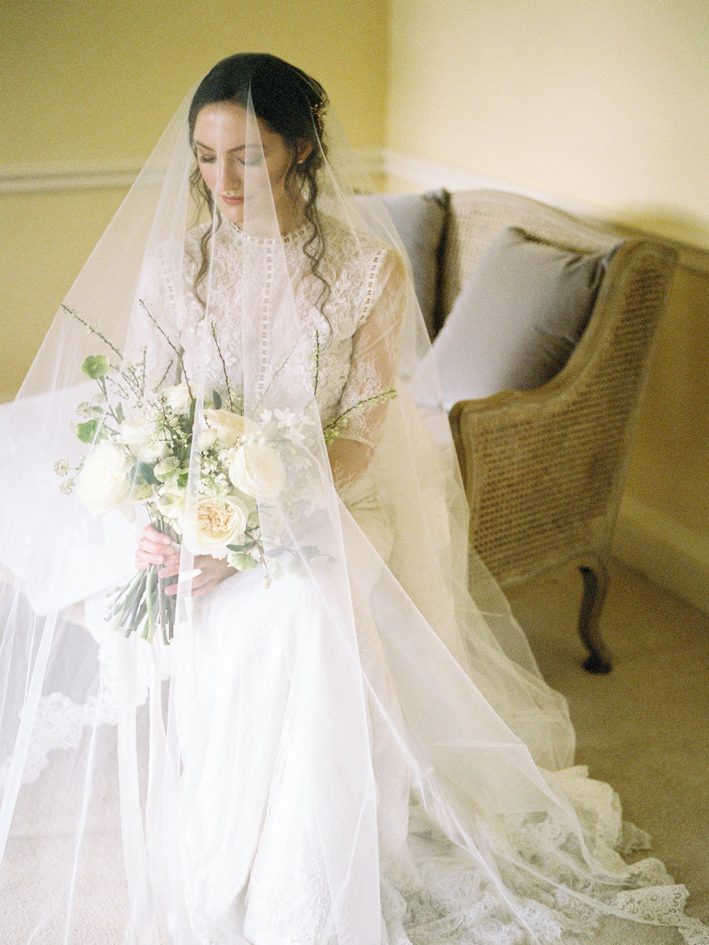
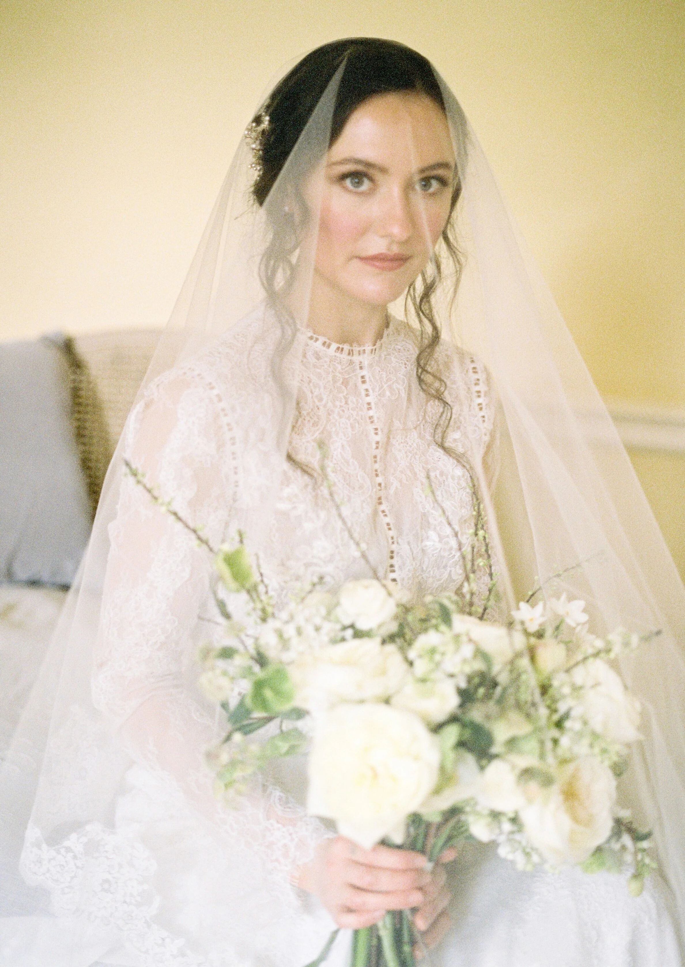
The bridal gowns provided by Morgan Davies Bridal are both so soft and feminine, but each in their own way. This second gown by Anna Georgina is more demure. A refined elegance with stunning lace details. The high neck and those all lace fitted sleeves showing the intricate lace details beautifully. The tight fitting body and that delicate lace train gives such a classic silhouette - A truly timeless fine art bride look.
If any bride is ever deliberating ‘a veil, or no veil?’… I urge them to look at the artistry of these next portraits for proof of a definite yes, do it!! This stunning veil by Ami Elisah Bridal. There is something so traditional, so classic and expected about a veil on a bride and whilst it doesn’t symbolise what it used to, it still remains a beautiful accessory. Maybe it’s the Marmite of bridal fashion, but for those that have dreamt of their Princess moment since childhood and a veil has been part of that I say embrace it confidently, with all the pride you would have as a child!
I find the movement in a veil mesmerising! I love layering sheer fabrics and in my case papers, to see glimpses of what is below softer, unfocused and it’s this effect that is almost magical!
C A M E H O U S E
Editorial shoot team
Produced for - David Austin Wedding Roses - @davidaustinweddingorses
Concept, Planning and Styling - @thetimelessstylist
Photography - @imogenxiana
Floral Design - @Joannetrubyfloraldesign
Floral Assistance - @clementinemoon_floraldesign
Bridal Gown One - Stephanie Allin by @morgan_davies_bridal
Bridal Gown Two - Anna Georgina by @morgan_davies_bridal
Hair and Make Up - @hollieadanby_makeup
Stationery - @Peoniesandpaperclips.uk
Bridal Accessories - @Rachelsokhalbridal
Bridal Veil -@amielisahbridal
Napkins - @theembroiderednapkincompany
E D I T O R I A L . 7
B O U R T O N H A L L
- P A R T T H R E E -
A T R U L Y ‘ M I C R O ‘ W E D D I N G
The concluding part to our couple Jessica & William’s love story during the covid pandemic.
(See Editorials 5 & 6 for first parts to our story)
When faced with the idea of waiting another year for restrictions to weddings and events to be lifted, and then also the reality of sooo many weddings all competing for dates and venues the following year. Our couple encouraged by the loved ones, chose to not wait, but instead embrace the new micro wedding idea.
I am so thrilled to share with you this greenery inspired wedding. It’s such a timeless look.
This beautiful micro wedding takes place at Bourton Hall. A stunning manor house in Warwickshire, England. Surrounded by picture perfect gardens, woodlands and parkland; the views from the mansion are idyllic! The bridal suite here is truly stunning. Full of light and so many luxurious touches it’s a gorgeous suite to prepare for such a special day!
The accessories in this wedding are something else! Gorgeous crystal hair accessories created by Miss Clemmie Accessories, another bespoke ring by Rosie Clayden, a dreamy veil by Megan Therese Couture and these beautiful shoes by Rachel Simpson shoes. There is almost a nod to the 1920’s, so if you have an Art Deco theme in mind this could be great inspiration for you!
There’s no denying the showstopper of the bridal look is this green ombre dress by Millia.London. The ombre creates a new dimension to those ruffles with even more range of tones now shown through all those layers and shadows. It’s so soft, but don’t be fooled this is a dress for a bride with confidence - the see through effect very obvious; so actually this is maybe the perfect dress for a micro wedding!!
William looks every part the true gentleman in a traditional black tuxedo. This is such a classic look, but the suit shows modern touches with its black leather pocket and lapel trim. Worn with classic brogues, this is a timeless groom look.
The couple portraits captured by Natalie D Photography, are gorgeous and really show the sass and fun our couple share and of course all the loved up feels!
Having fun with the veil by Megan Therese Couture resulted in some truly stunning shots, the veil adding a completely different look and feel to the surroundings, almost more romantic if that’s possible and certainly more intimate.
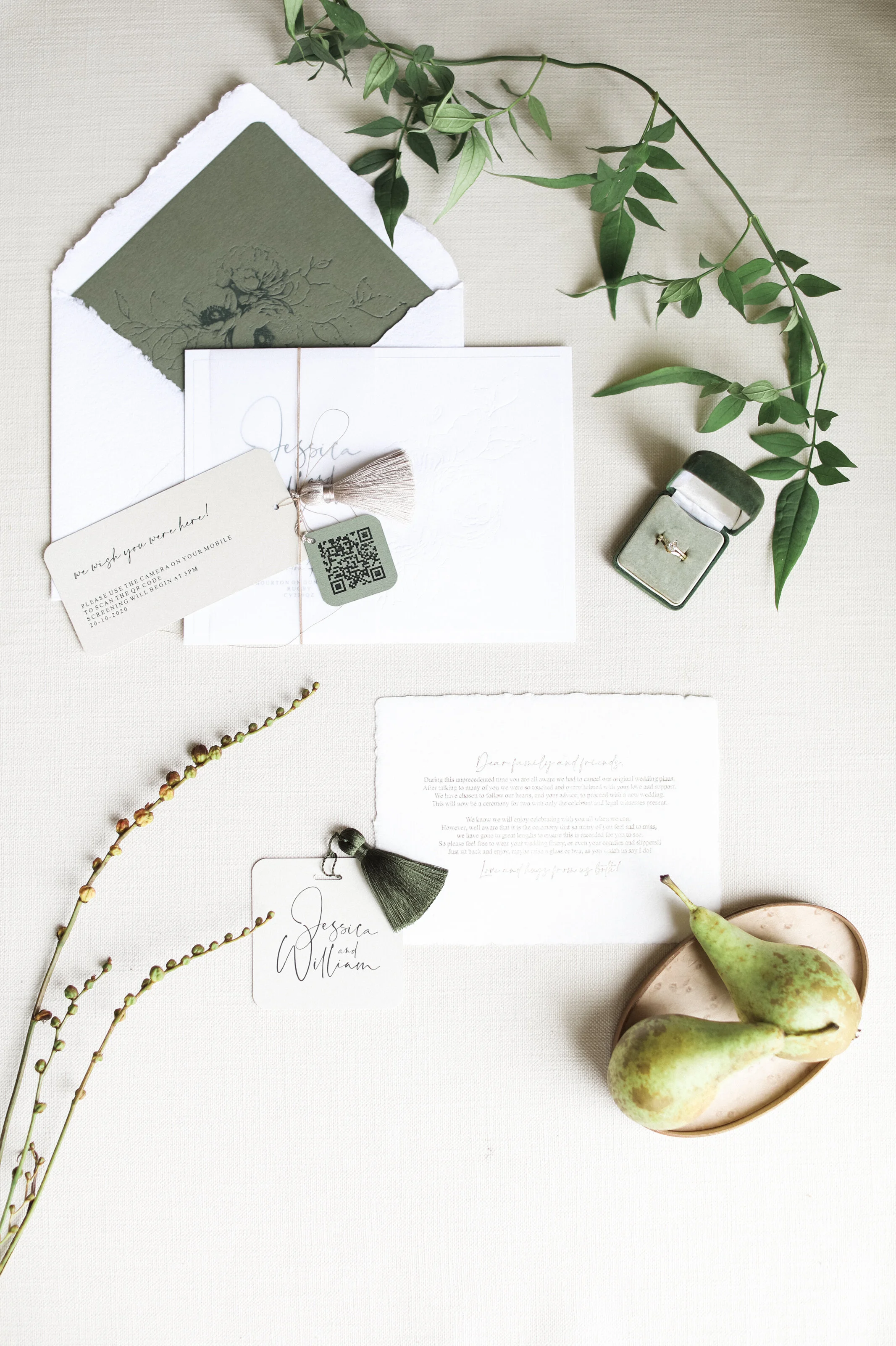
Like so many couples during this time, Jess and William were still adamant that their families were to be involved as much as they could be. Each invitation included a special note acknowledging the new requirements and alternative arrangements. A private screening of the nuptials could be viewed by scanning the QR code and following the instructions. This was such an elegant way of presenting this and hopefully made the guests feel considered and included,
The stationery included blind debossed flowers on soft white cotton paper. Handmade paper was also a feature with the main invitation details and a special quotation hot foil pressed in gold.
Green is shown through the remaining stationery pieces with green hot foil pressed text, envelope liner, tassels and mini tags. These luxurious touches echo the palette of the wedding without over powering the design.
The stunning floral installation created by Kate Wren Flowers was amazing!
A completely impromptu design that saw the florals trail up and wind around the stunning pillars. They didn’t detract in any way from the architectural beauty of these pillars, but instead added to it. The two pillars seen behind the dining table were treated differently and the different heights created an organic look. They really were such a beautiful back drop to our story.
Floral installations can compliment the unique features of different venues like this, and do not have to be restrained to vases etc. I honestly think this helps celebrate the venue’s features more!
Our micro wedding showed a lower, elegant table setting just for two; where the newly weds could just enjoy each others company in a more relaxed way. Relaxed can still be completely gorgeous - here we used statement chairs available from Wedhead London and stunning tableware from Duchess & Butler.
Special heirloom photo frames from family members were repurposed and used as place settings, a beautiful nod to loved ones unable to be there on the day!
It’s definitely romantic to share a grazing table with your partner - but when it comes to desserts, I’m a bit of a ‘Joey’ and I don’t share ha!!
This inspired the idea of mini cakes. Our Bride and Groom able to have their favourite flavours without compromise. These were beautiful mini works of art created by Tracey of Cotton and Crumbs. Those roses are so stunning and far too pretty to eat!
I had bespoke ‘bride’ and ‘groom’ discs engraved for each cake and adorned this with a different colour tassel and Tracey attached these to each cake - it worked so beautifully!! Who wouldn’t want their own personalised mini cake?!!
We were so fortunate to have Russell Kent Nicholls capture the entire story for us. The video is like a mini movie and honestly I could cry tears of joy every time I see it! I hope you love it as much as we do and find the work of such a talented team great inspiration for your own wedding day!
B O U R T O N H A L L P T . 3
Editorial shoot team
Concept, Planning and Stationery - @Peoniesandpaperclips.uk
Planning and Styling - @vanillaroseweddings
Photography - @NatalieDPhotography
Videography - @Russellkentnicholls
Real life couple - @w.j.couple
Dress - @Millia.london
Florals - @Katewrenflowers
MUA - @Sjm_beauty_mua
Hair - @Elegance_hair_design
Bridal Hair accessories @Miss_clemmie_accessories
Furniture Hire - @Wedhead_london
Tableware - @Duchessbutler
Cake - @Cottonandcrumbs
Bridal shoes - @rachelsimpsonshoes
Veil - @MeganThereseCouture
Ring - @Rosie_Clayden
F E A T U R E D W I T H
E D I T O R I A L . 6
B O U R T O N H A L L
- P A R T T W O -
A N I N T I M A T E A U T U M N A L P R O P O S A L
This is our story continuing from E D I T O R I A L . 5 in this second part our lovely gent Will has spent the time separated from Jess due to covid, planning a very special proposal.
Travel restrictions didn’t allow a grand gesture, a trip to a well known location and the proposal being the highlight of the trip! Instead here we see a beautifully intimate proposal dinner planned! Including so many little touches that are their favourites and evoke memories of their past together. Covid doesn’t get to stop this engagement! It may not be the stereotypical proposal story, but it will still have you crying all the happy tears…don’t believe me - watch the amazing video at the end!!
Quite aptly it was an overcast Autumn day when the team and I gathered to bring to life this story. The darker light, requiring the candles to be lit; the browns, oranges and peaches used all throughout the floral arrangements and the gold accents in the tableware all meant despite the weather, the room conveyed nothing but warmth!
Our table is adorned with the couple’s favourite foods, styled perfectly by Jeni of Vanilla Rose Weddings. This is a couple that love a sharing platter, whilst snuggled watching tv of an evening and the ability to graze rather than over indulge. Each course similar in its execution and all able to be shared in between kisses!
The stars of this table have to be the stunning floral arrangements created by Emma of Emma Cox Brocante Flowers. Each vessel full to bursting with autumnal foliage, florals and berries. The combination of dried florals mixed with fresh creates such a lovely depth to the tones of these arrangements and each has such a natural, organic shape to it. They really are picture perfect!
Whilst planning this part of the shoot as a stationer it proved quite complex, because what could I contribute that was new and fresh and realistic! Yes this is an editorial intended to inspire, but above all else I kept at the very core - is this realistic? Is it authentic to our story and couple? To show you a range of engagement cards didn’t appeal to me - the key was to concentrate on the table and that’s when I knew these bespoke menus were the answer!
Each menu printed, hand dyed with tea to achieve the perfect colour and then adorned with a hand sewn floral. This floral in gold thread matching with the colour scheme perfectly. I love the idea of these being treasured pieces to our couple. There is no denying in a few years time coming across these in a keepsake box would bring the memories from this proposal flooding back!!
They are captured so beautifully by Natalie of Natalie D Photography, these being some of my very favourite images of the day!
With the scene set it’s time for the grand reveal.
Our nervous, but excited Will leads Jess in to the room where she is finally able to see what Will has been up to and the romantic surprises keep coming!
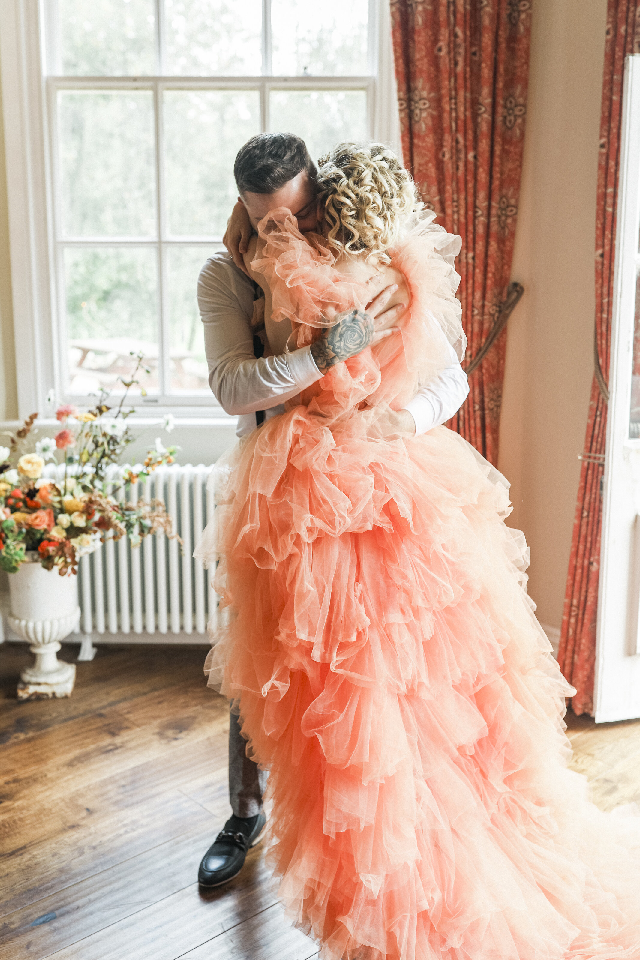
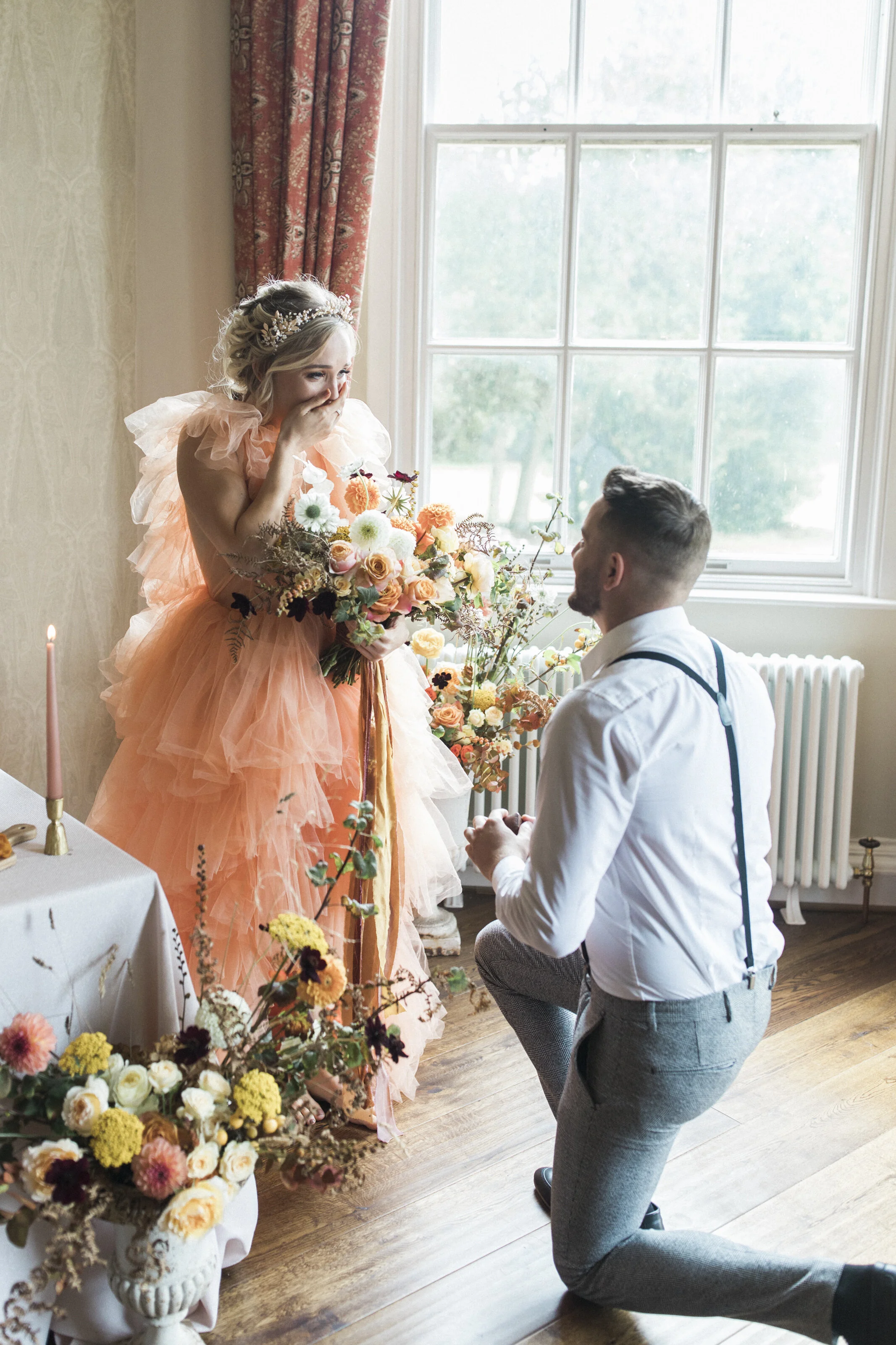
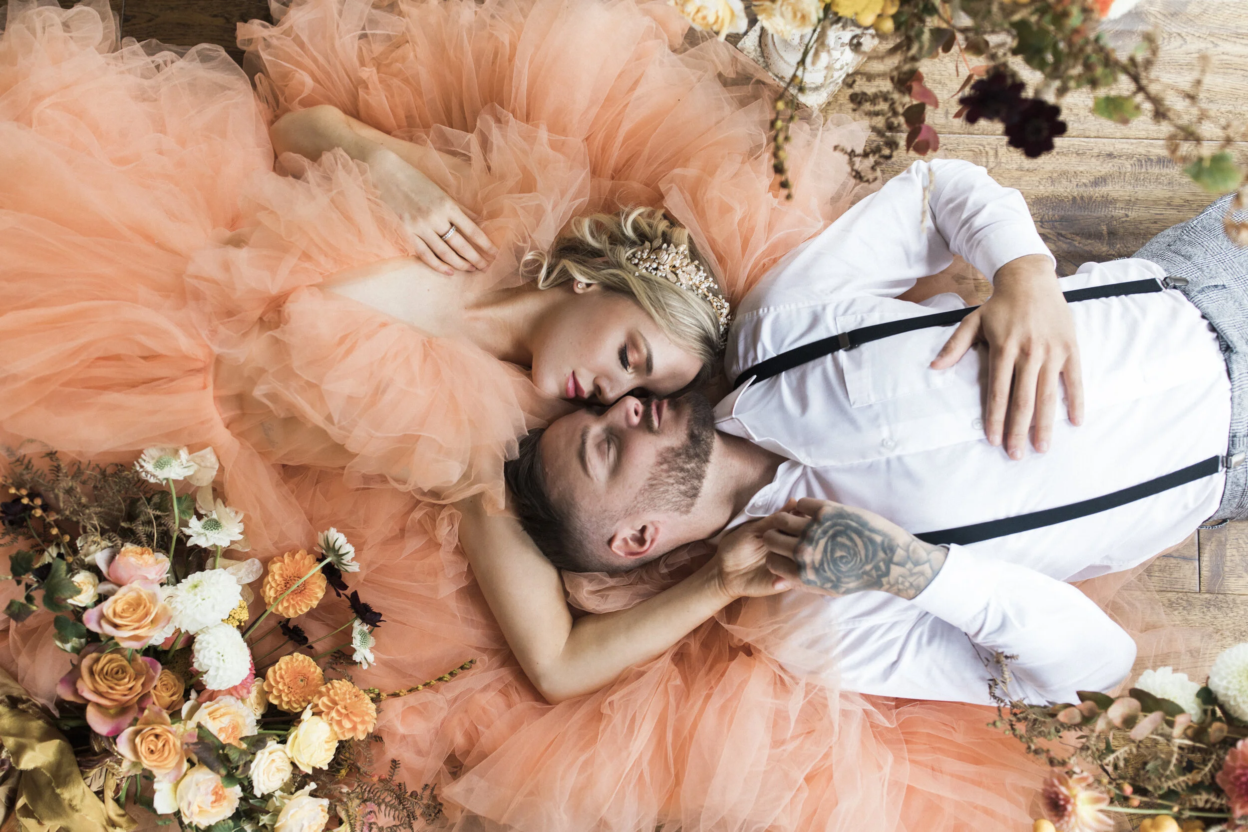
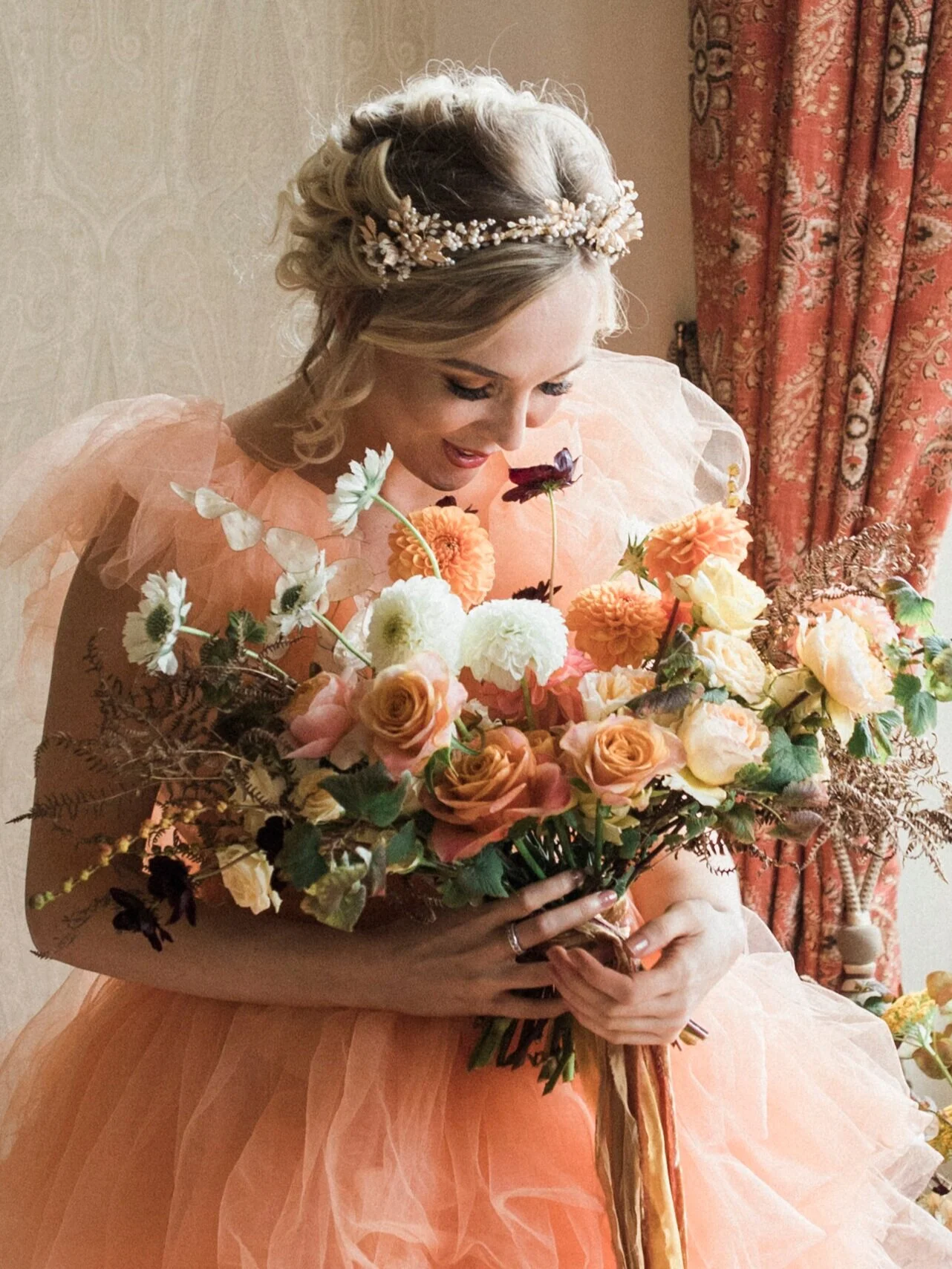
The stunning gown Jess wears is by Millia.London and is such a show stopper! not just making an impact with it’s orange colour but all those ruffles!!
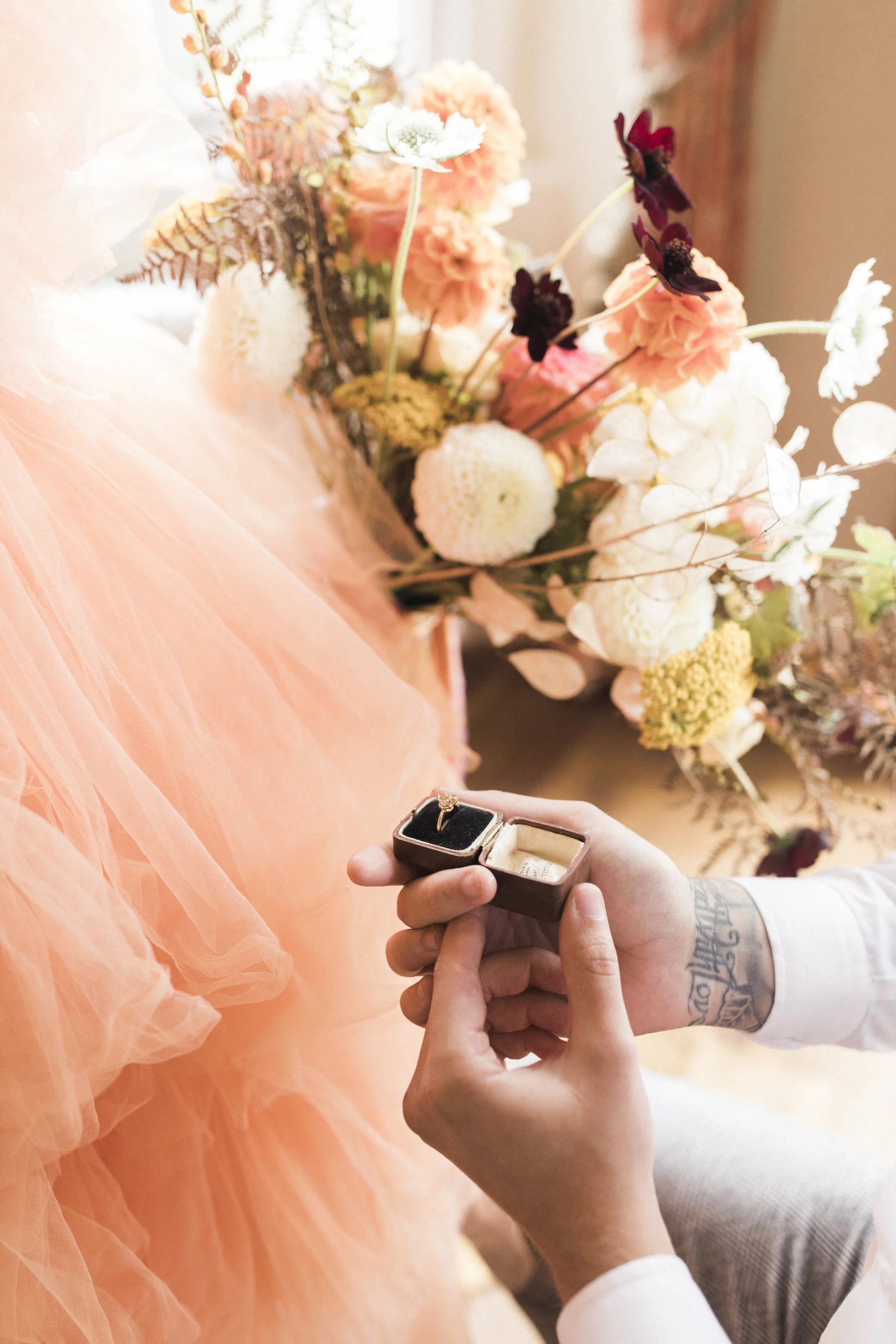
For so many this would all be such a dream, a decadent table, so many flowers and the romance of the candlelight! For Jess her princess moment escalates even further with a beautiful bouquet and then the man she loves down on one knee proposing! There wasn’t a dry eye in the room at this point - it was magical!! Like we were truly watching a film and that comes from the love our real couple share! To imagine with them and live this moment with them was truly something special!!
We would describe Jess as a modern, natural bride. She loves nature and is more relaxed in style than the traditional bride. She is most comfortable barefoot, she is feminine but with a cheeky edge. With this in mind it was very important the ring wasn’t a traditional diamond. It needed to be the one, the ring that showed Jess’s personality and to show in that reveal, that moment that Will gets that and her completely! This coloured gemstone trio from Rosie Clayden was absolutely perfect! So dainty and yet modern, Rosie’s bespoke makes really are beautiful!
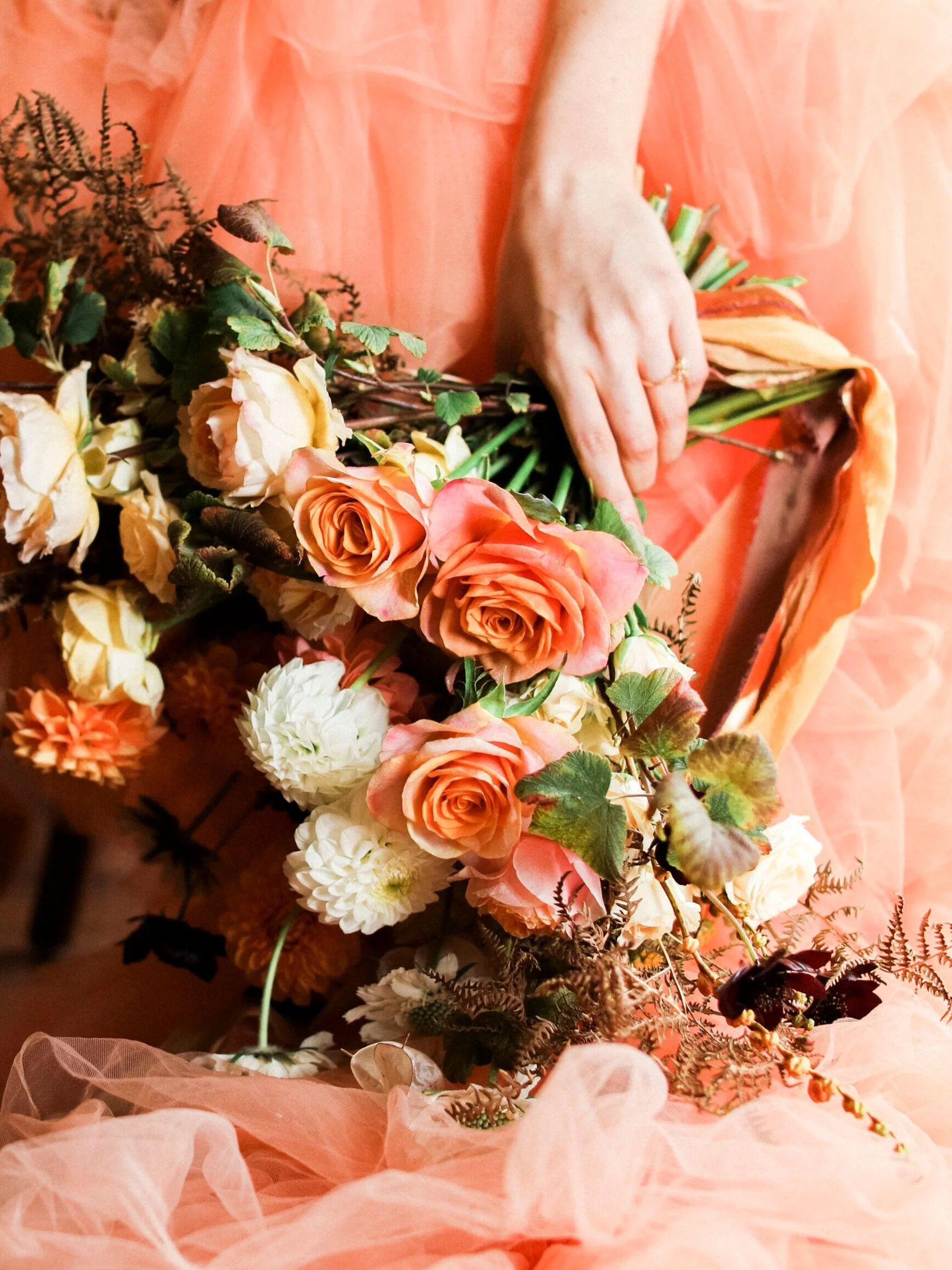
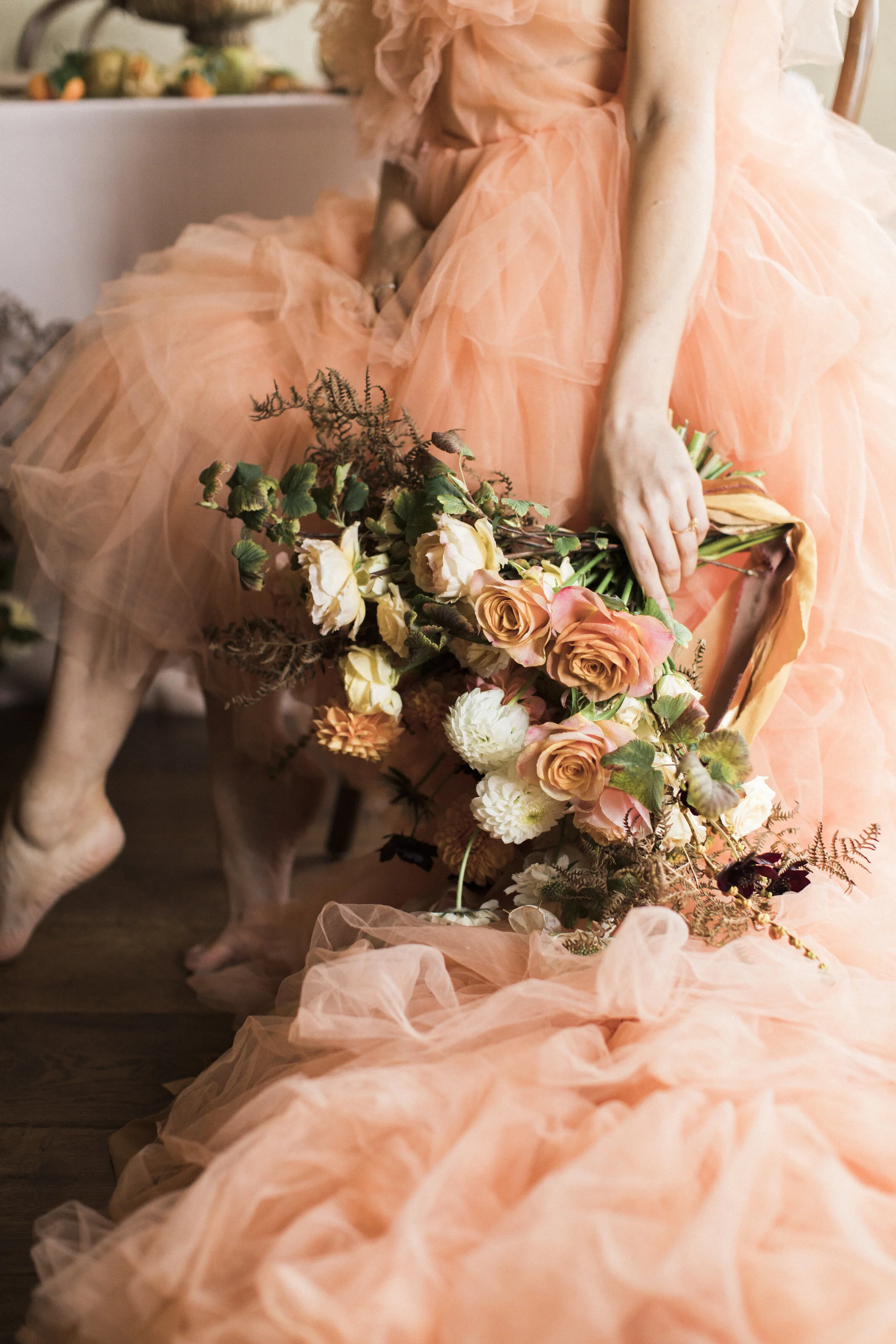
This stunning Millia.London gown and all its ruffles just wow! When combined with the beautiful autumnal bouquet by Emma Cox Brocante this bridal look is so very feminine, and very reflective of the season. The curls in the up-do compliment the soft look and the gorgeous head piece by Clare Lloyd Accessories is just the perfect finishing touch!
For a bride wanting a bold. colourful look this would be sensational! Sure to be unique and unforgettable!
It was an absolute pleasure and so beyond my expectations when Russell Kent Nicholls agreed to join our team as videographer. I hadn’t considered this aspect of the story initially. When Russell sent through the video of our day I actually cried, all the happy and proud tears! This was the three part story of our couple portrayed perfectly! It was more than I imagined and yet everything I could have wished for all at the same time! Our own mini love story production! It’s such a pleasure to be able to share this with you, and I cannot thank Russell and the team enough for creating this story with me!!
Enjoy this preview of what’s to come in part three and I hope it fills you with all the romantic feels!
B O U R T O N H A L L P T . 2
Editorial shoot team
Concept, Planning & Bespoke makes - @Peoniesandpaperclips.uk
Planning & Styling - @vanillaroseweddings
Photography - @nataliedphotography
Videography - @russellkentnicholls
Real life couple - @w.j.couple
Dress - @millia.london
Florals - @emmacoxbrocante
MUA - @sjm_beauty_mua
Hair - @elegance_hair_design
Bridal Headpiece - @clarelloydaccessories
Furniture hire - @wedhead_london
Tableware - @duchessbutler
Linen - @just_4_linen
Ring - @rosie_clayden
F E A T U R E D W I T H
E D I T O R I A L . 5
B O U R T O N H A L L
- P A R T O N E -
C E L E B R A T I N G T H E F I N E A R T O F L E T T E R W R I T I N G
After participating in styled shoots over the years I began to wonder if I could do one myself!
I had a very definite story I wanted to tell and was completely surprised and thrilled when so many suppliers agreed to come on this journey with me! I can confirm being an organiser is a new level of stress - this has considerably increased my respect and admiration for those that do these frequently!! I felt I could have slept for a week afterwards! But a huge part of that was probably due to the sheer ambition of the shoot! In one day the fantastic team and I brought to life a three part love story; full of stunning unique details and I hope created lots of inspiration for future couples.
When covid caused a nationwide lock down, like so many our couple who lived separately due to work, found themselves apart for months. This confirmed for our gent Will that he definitely couldn’t take being away from Jess for long. He spent their time apart planning…their reunion, and something else very special!
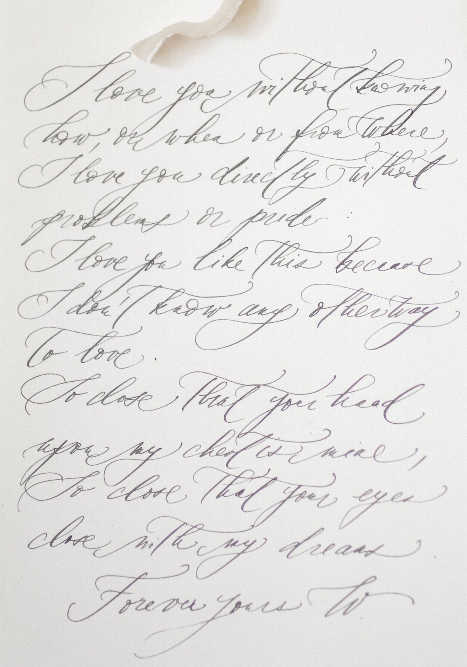
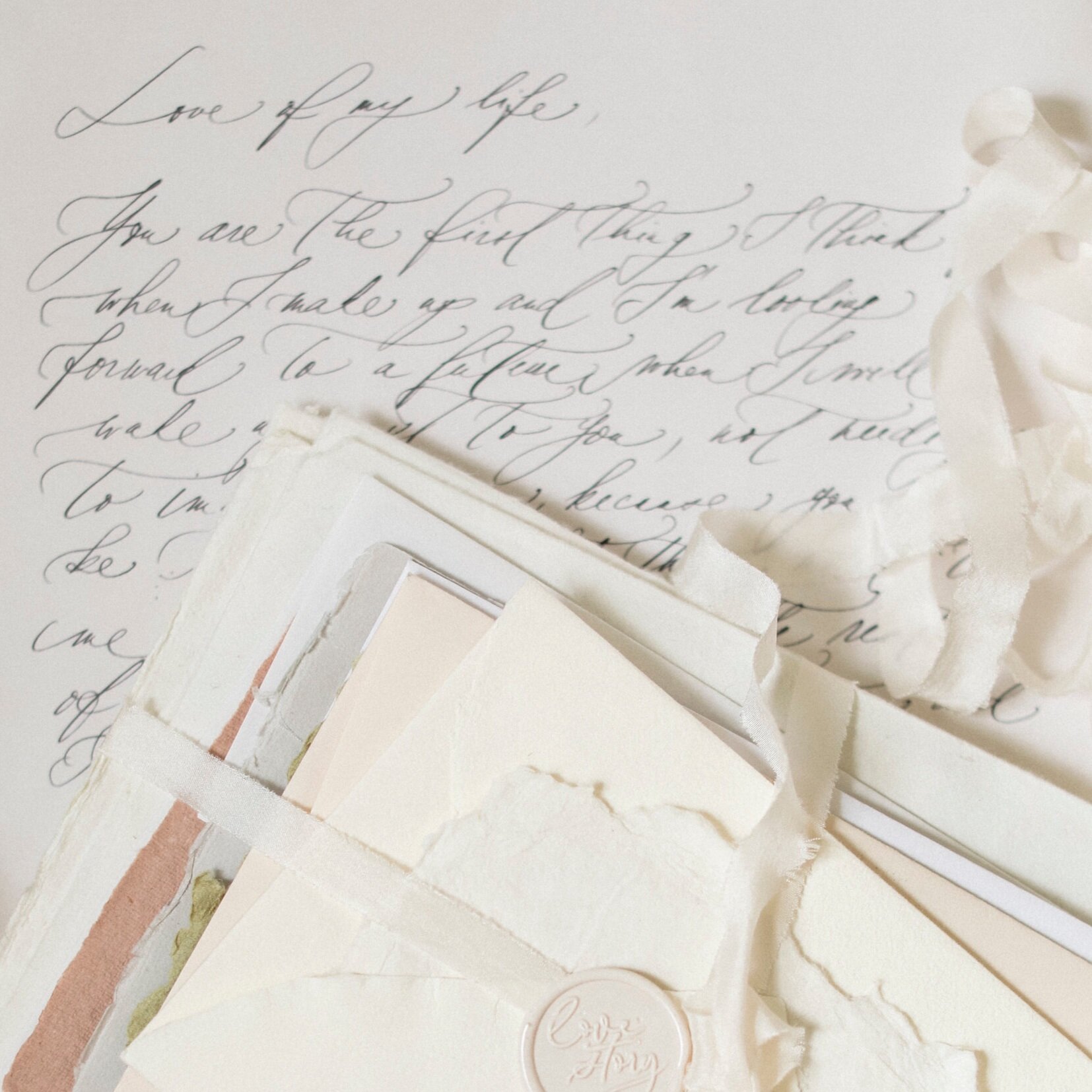
Throughout the weeks apart Will commissioned love letters, or lyrics of favourite songs to be hand written by Lenka Calligraphy. Lenka’s calligraphy style is so elegant and captivating! Maybe because we are used to text messages and emails now, the traditional art of letter writing seems to mean so much more. To have not just a love letter, but ones so beautifully presented arrive on your doorstep can mean so much!
When our couple are able to reunite, A special keepsake box holds this meaningful correspondence and the two are able to laugh and reminisce over these heartfelt notes.
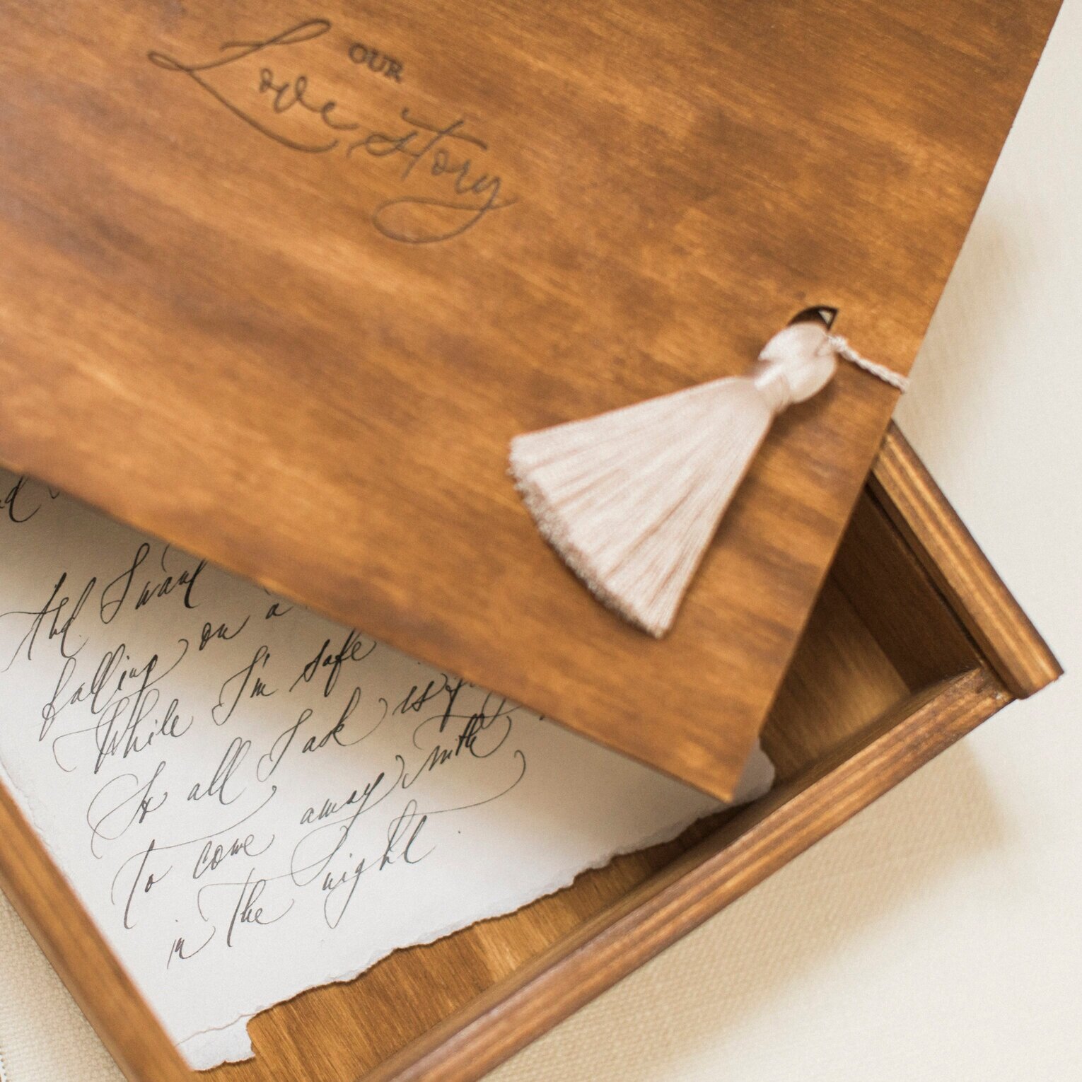
The hand calligraphy letters are bound with a Peonies & Paperclips ‘love story’ wax seal stamp and trailing silk ribbon, they fit perfectly in the bespoke wooden keepsake ‘love story’ box. Turning a negative time in to one full of beautiful messages to be treasured.
The idea behind this first part is to capture our couple happily reunited and able to enjoy quality time together again. Will has organised a special weekend away. Bourton Hall is our chosen venue here, it’s bridal suite is one of dreams!! With stunning windows, the light throughout this suite is quite magical!
This image (above) Is one of my absolute favourites from this part by Natalie D Photography.
It perfectly shows Lenka’s stunning calligraphy and the tenderness between our couple. The way Will watches Jess whilst she reads the letter is just so beautiful - such a perfect capture!!
The natural moments are always my favourites.
These last two images of our couple also tug at my heart strings because let’s be honest this is a happy long awaited reunion and there would be so many smiles - the sheer joy and genuine looks of love in these just gives me all the romantic feels! Whilst this section comes to an end and Will has to make his excuses for a further surprise (no spoilers here but that’s part two!) Jess is gifted a bespoke blanket featuring a meaningful quotation. This draped over Jess giving glimpses of the stunning lace on the Shell Belle Couture long chemise whilst she enjoys those stunning countryside views.
I really enjoyed making this blanket! The quote was hand lettered using a special fabric pen, so it is washable and will last forever. It’s so beautifully soft and the finishing touches of a tassel at each corner just adds a luxurious feel. I think these would be such a gorgeous gift for an engaged couple, and for anniversaries. To have a special quote that resonates for you as a couple, on a bespoke blanket to snuggle on the sofa with each evening is just the sweetest!
B O U R T O N H A L L - P T . 1 -
Editorial shoot team
Concept, Planning & Bespoke makes - @Peoniesandpaperclips.uk
Planning & Styling - @vanillaroseweddings
Photography - @Nataliedphotography
Videographer - @russellkentnicholls
Real life couple - @w.j.couple
Hand calligraphy love letters - @Lenkacalligraphy
MUA - @sjm_beauty_mua
Hair - @elegance_hair_design
Chemise - @shellbellecouture
F E A T U R E D W I T H
E D I T O R I A L . 4
OLD WORLD GLAMOUR WEDDING INSPIRATION
I try not to play favourites, but when I saw the gallery of images from this shoot I was genuinely thrilled! Stationery flatlays can be a challenge and capturing the details on a wedding suite to the same standard as other wedding details isn’t something stationers take for granted! So imagine my surprise when my pieces were styled and captured so beautifully in three different colourways and with each palette really complimenting each look. This level of care, respect and consideration for my pieces from Melinda of Luxus Events and captures by David C Photography truly mean so much! The entire editorial showing each suppliers work in great detail and producing such a glamourous look! An example of collaborations at their best and a shoot I am so proud to be a part of!
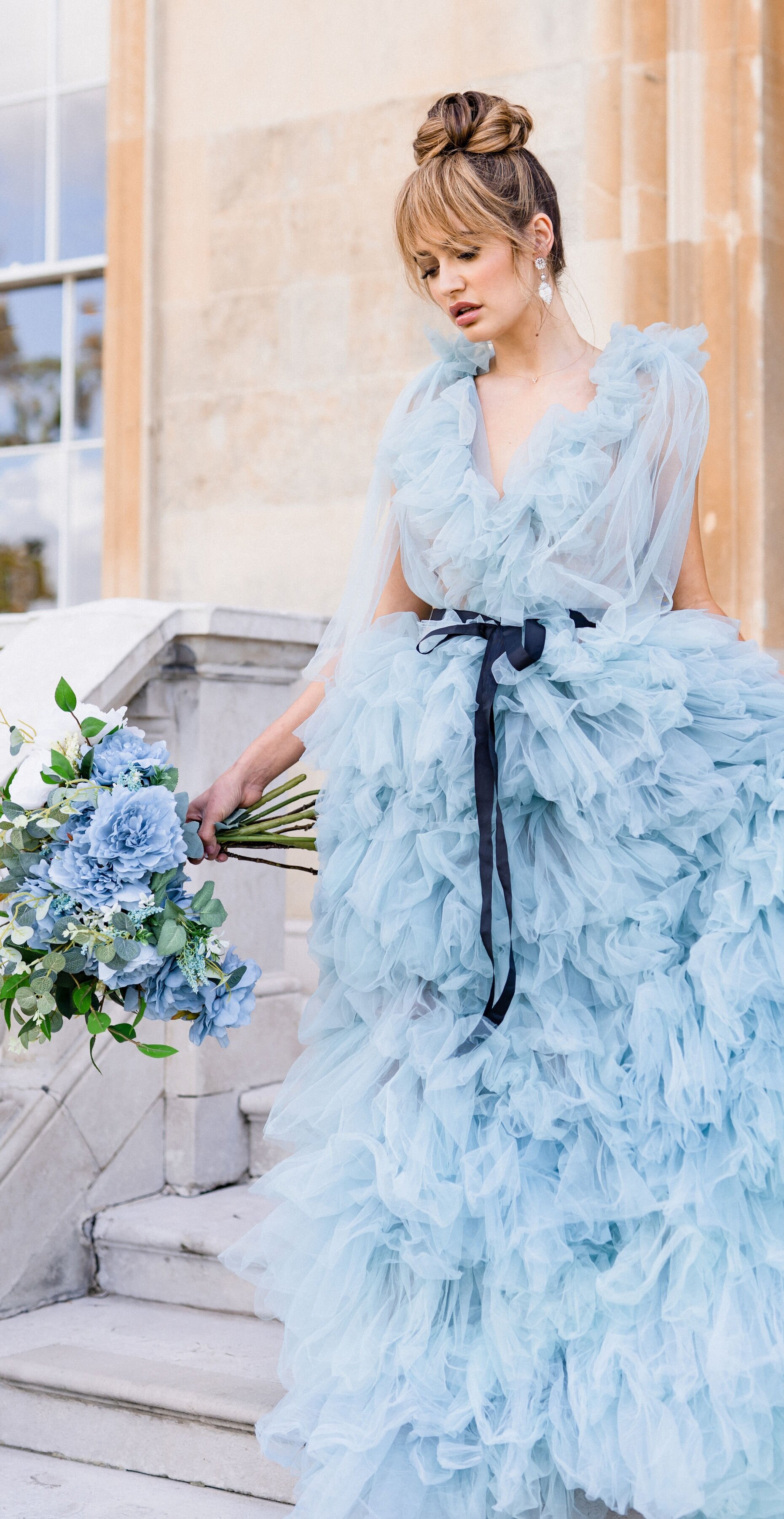
The stunning gowns by Millia.London are such showstoppers! Those ruffles are not just dramatic, the movement in the dresses is mesmerising! This soft cornflower blue is beautiful with the layers producing different depths of tone throughout it’s a photographer’s dream! It’s thin layers are not for the shy, with the chance of too much exposure during movement, but for the bold modern bride these dresses will not disappoint with the wow factor on your day!
The beautiful bridal jewellery from the London Victorian Ring Co’ fits this glamorous bridal look perfectly. Isn’t that wedding ring so beautiful!!
The bridal shoes from Bella Belle echo the see through feel of the dress with the dotted mesh and add even more softness . This confident and daring look still has so much feminine delicacy to it.
The stationery is minimal in style but detailed in texture. Featuring handmade paper with gold hot foil stamped details and a matching hand made envelope with a fine art floral liner.
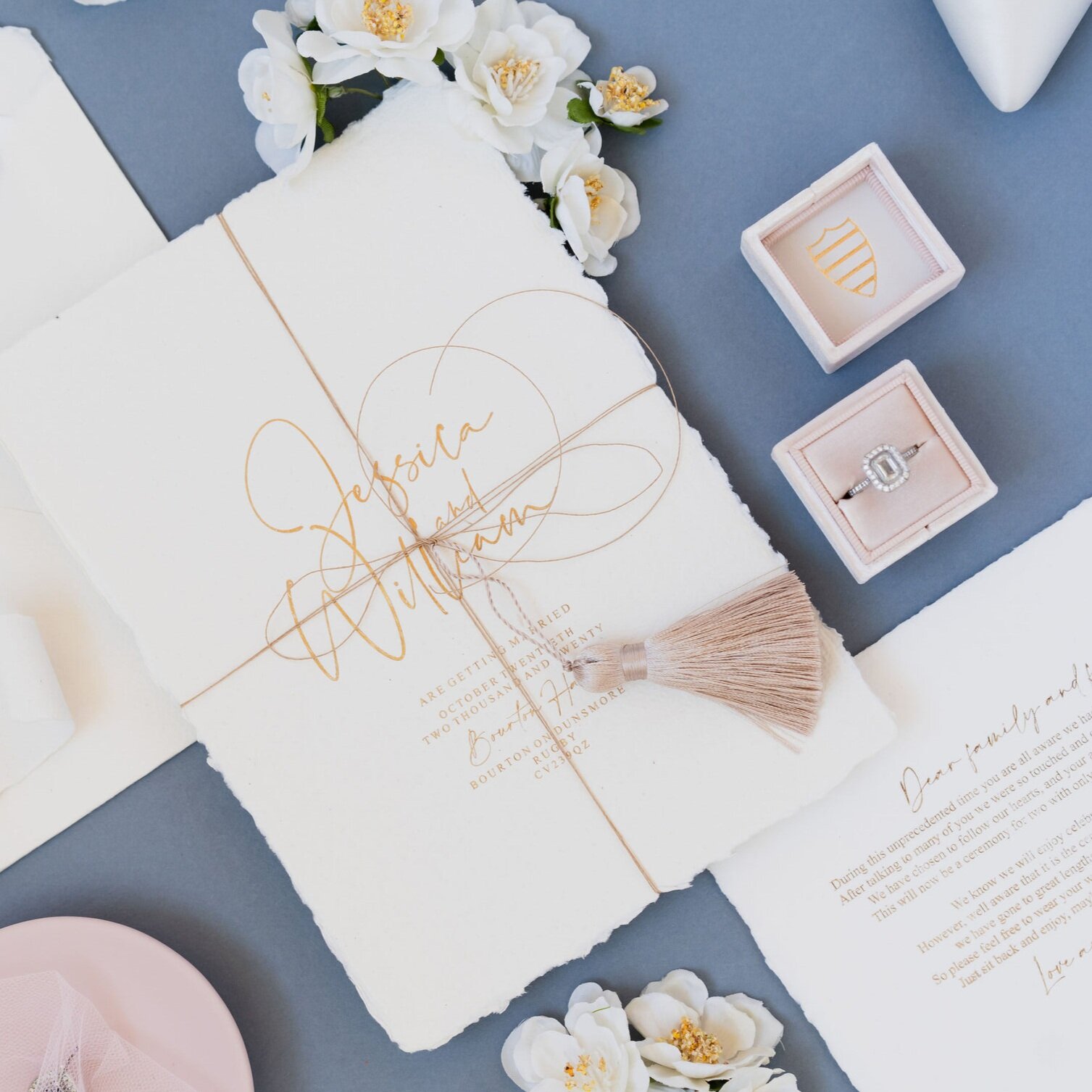
The invitation set is presented tied with twine and a blush tassel, which can easily be changed to suit any colour scheme! Add a handlettered name tag to each suite and the outcome would be elevated further! I love the combination of cornflower blue and blush used here by Melinda of Luxus Events. She has styled the set perfectly with the bride’s special keepsakes.
The simple inclusion of the darker satin ribbon tied around the waist is styling genius! It helps create a fresh, confident feel to the look. The strong fringe and sleek, high up-do compliments this look perfectly.
This image showing all those confident, sassy bride feels! This combination demanding of everyone’s attention!
Botleys Mansion is the venue for this old world glamour shoot and is the perfect backdrop to this story. That staircase for example is just amazing and easily envokes thoughts of a bride and groom descending that stunning staircase in a ‘just married’ haze. I wonder how many stunning dresses with their sweeping trains have glided down these stairs in an almost Cinderella-esque moment.
The next part of the shoot has all the soft girlie feels. With a pale blush and white colour palette and featuring pops of gold for that truly luxurious finish. The neutral toned walls and marble decor details of Botley’s Mansion enhance the glamorous feel and key furniture pieces have produced these truly aspirational images!
The tablescape created by the team is so romantic. Those faux floral beauties by Bloomsfair create huge clouds of blush ruffles. The glassware in various heights and crystal vases used throughout would look sensational reflecting candlelight at this intimate wedding table. When this is all placed on a mirrored table the effect is stunning!! Twice the ‘wow’!!
This second look is so very different to the first. With the bride’s hair down, delicately curled and finished with a beaded headband by Victoria Percival Accessories. The dress is left plain and those soft white ruffles match so beautifully with the pale blush ruffles of the bouquet florals.
This is a softer, more traditionally demure bridal look, and yet the daring nature of the dress still shows this bride has a modern edge!
The stationery for this look includes all the floral touches which match the pale blush and white tones. This time the white twine and blush wax seals are shown, and are simple ways to add a feminine look to a minimal wedding stationery suite.
Our story finishes with a monochromatic palette. Again gold additions help to portray a luxurious feel. I imagine the part of the wedding day after the meal, where small groups gather in more intimate, relaxed seating and enjoy a cocktail…or two. The point where the candles are lit and the evening sets in with a darker, romantic tone to the surroundings. Can you picture it? If not I’m sure these images will paint a beautiful picture for you.
The last set of stationery images shows a version of the suite with blind debossed florals and a bespoke gold hot foil pressed tag for each suite. Elegant touches that scream luxury!
This all white set on the black background, styled with white florals and the addition of the gold tray has become one of my firm favourites! I honestly am so thrilled with how these sets have been used in various combinations, and styled so beautifully by Melinda of Luxus Events and how David C Photography has captured every detail!
B O T L E Y S M A N S I O N
Editorial shoot team
Concept, Planning and Design - @luxus_events_
Photography - @davidcphotography
Florals - @bloomsfair @bloomsartlondon
Dresses - @millia.london
Bridal Accessories - @victoriapercival_accessories
Bridal shoes - @bellabelleshoes
Stationery - @Peoniesandpaperclips.uk
Rings - @london_victorian_ring_co
Model - @abi__uk
Cake - @uniquecakesbyyevnig
Make up - @eosborne_makeup @onerepresents
Hair - @treats4hair
Tableware & Furniture - @optionsgreathire @options_gb
Linen - @just_4_linen
E D I T O R I A L . 3
D E L I C A T E S P R I N G F L O R A L I N S P I R A T I O N
This editorial has all the pretty blushes and soft apricot tones to show you a truly soft, feminine look.
The concept, planning and design by Natasha - Wildflower Wedding Planner and Emma - Passion Flowers By Emma Spowage, has created such a romantic, delicate look. The gorgeous images by Nikki (Nikki Watkins Photo & Lab) celebrating every tiny detail from the amazing suppliers involved and the stunning 14th Century venue Butley Priory was the perfect setting.
By having the soft white as the main colour throughout. (The white walls of the venue, the huge windows and stunning natural light they allow, the white bridal wear and table dressing) the blushes and apricots become beautiful accent touches. Little pops of warmth that catch the eye and draw you in to fully appreciate the details.
The beautiful floral arrangements and bouquet created by Emma of Passion Flowers By Emma Spowage really steal the show! The combination of flowers used show quite a range of pinks and when alongside the apricot tones give all the warm spring feels! I love the inclusion of white florals too and the naturally trailing foliage.
When in soft focus the effect is quite ethereal and delicate
The details at Butley Priory are so classically beautiful.
I love the pure white walls alongside that stunning stone work and can we just take a moment to appreciate those stunning windows! Descending down these stairs on your wedding day would be such a special and gorgeous moment and I’m so pleased Nikki showed it here.
The modern sleek fitting dress features gorgeous beading at the bodice and matching beadwork that trails up the dress from it’s floor length skirt too. With a sexy deep v neckline and a tight low back, the dress fits closely draped to the body resulting in a very elegant silhouette and the finishing touch has to be those gorgeous see through bellowing sleeves, such a classic design from Edmondson Bridal Couture
The finishing touches to this elegant look are the stunning bridal accessories from Hermione Harbutt and delicate jewellery pieces by Lily Ark Wright. These pieces sit with the embroidery and beading of the dress so beautifully and the headdress gives a gorgeous wow factor.
For the wedding stationery pieces I kept to the very pale feminine palette. Making the pale blush the star of the show through a delicate floral print, and the finishing embellishments such as the blush tassels and wax seals. The soft, tactile textures of the handmade paper and the soft white tones to the stationery really complimented to scheme of the day.
Styled beautifully by Natasha of Wildflower Wedding Planner
The tablescape is truly ethereal. Through the use of white textures, table ware and the clear glass it’s a very barely there effect. Even the white tapered candles seem magical, you would only notice them once lit, and how stunning this tablescape would look under the romantic candlelight! The flowers and the warm tones from the gold elements elevate it to such a romantic look! To sit and dine here would be a beautiful experience!
I’m going to leave it there now and share the sweetest treat of all from this shoot - the stunning cake created by monanniecakes. The detail is amazing, echoing details of the dress. I love how the flowers have been used on the cake too and those little patisseries for each guest are just too pretty to eat!!
B U T L E Y P R I O R Y
Editorial shoot team -
Concept, Planning and styling - @wildflowerweddingplanner
Concept and floral design - @passionflowersbyemmaspowage
Photography & Film - @nikkiwatkinsphotoandfilm
Stationery - @PeoniesandPaperclips
Bridal dress and veil - @edmondsonbridalcouture
Hair accessories and jewellery - @hermioneharbutt
Bridal shoes - @di_hassall
Tableware - @helenmillot_decor
Linen - @just4linen
Furniture & Props - @anthologyvintagehire
Rings and diamond earrings - @lilyarkwright
Hair - @charlismithhairmakeup via @botiashairandmakeup
cake design - @monanniecakes
Bouquet ribbon - @bertieandfred
Model - @sarahmaeva.c
F E A T U R E D W I T H
E D I T O R I A L . 2
P O W D E R B L U E W E D D I N G I N S P I R A T I O N
This soft delicate tone has always been one of my favourites to work with. While so many believe it to be a cold tone best suited to winter weddings, or kept to beach and elopement affairs, it can sit beautifully anywhere! For this beautiful manor house wedding we show how the tones work beautifully for any fine art bride with just a few key touches.
This shoot had two photographers present on the day and so I’m able to spoil you with so many stunning images!
I adore the stunning portraits of beautiful model Erin taken by Sara Cooper Photography
They are complimented perfectly by the atmospheric detail shots taken by Paulina Walsh Photography
The dreamy table scape was brought to life in the main banquet hall of Bourton Hall. A stunning manor house base in Warwickshire, England. Surrounded by gorgeous gardens, woodland and parkland, the views from this mansion are beautiful.
Softly draped chiffon and muslins add a delicate touch to this table setting. The gold accents in the cutlery, centrepieces and even the gold tones of the pear slices add warmth and interest and the pops of dark blue with the berries and bold blue with the glassware create a fresh, modern element. It’s all layered so beautifully by Thetwohummingbirds styling, the result is truly stunning!
The bridal portraits in this story have to be some of the most beautiful I’ve seen!!
The natural flawless make up and elegant hair achieved by Talie_Danielle pairs with fitted lace gown by Moonlight bridal from Rachel Ash Brides perfectly.
The Peonies & Paperclips Queen of Sweden collection was used for the wedding stationery.
In soft powder blue tones on a soft white cotton paper, paired with pale blues for additional elements.
This set involves printing with a pale pigment foil for the floral details and then a second print layer of gold foil, hot foil press used at it’s best!
B O U R T O N H A L L
Editorial shoot team -
Photography @saracooperphotography & @paulinawalshphtography
Styling @thetwohummingbirds
MUA @Talie_danielle
Florist @ravenanddrygrass
Gowns @rachelashbrides @moonlightbridal
Stationery @peoniesandpaperclips
Bridal accessories @aureusflos @thelucky6pence
Model @erinrachelfelicitysmith
Venue @bourtonhall @countryhouseweddings
Paulina Walsh Photography’s images and story from the day -
Featured with County Wedding Magazines in Your West Midlands February 2021 issue.
E D I T O R I A L . 1
W I N T E R W E D D I N G I N S P I R A T I O N
My first collaboration of 2020 came to be when the very lovely Natalie, of Natalie D Photography, approached me to produce some bespoke stationery to compliment her ideas.
I’m genuinely so thankful that she did! It was the start of our friendship - I adore Natalie!! She is beautiful inside and out and considering the short time we have known each other we often talk as if it’s been a friendship for years!! Not just lovely she is very talented! This story was Natalie’s concept and design and beautifully executed.
The shoot took place at Bradbourne house.
This gorgeous ‘country estate is set within 20 acres of beautiful parkland in the heart of Kent’. It’s stunning interior details and art collection providing the most perfect setting.
The tones involved, pale blues, lots of whites and very pale accents can sometimes feel cold; but with soft flowing dresses, bellowing sleeves and soft delicate florals the result was truly feminine and romantic!
With this design I wanted to produce a tactile suite. I hoped to show various textures and tones and give depth to each element. I combined hand made paper with cotton papers and used various print techniques such as gold foil, blind debossing and blind embossing.
The menus became an instant hit that they are now a permanent product!! The blind embossed detail has become such a favourite, whether paired with the exclusive menu wax seal, or another seal such as the ‘bride to be’ seal. This little detail is a beautiful addition to any stationery suite!
The table scape looks so very soft and feminine thanks to the soft silk drape on the table by Kate Cullen and of course those stunning florals by Kate Wren Flowers. The flowers not just kept to the centrepiece on the table, but also draped over the fireplace in the background.
The combination of soft blush roses and ranunculus with the trailing greenery gives such an elegant look.
The gold accents in the glassware, echoed by the gold touches on the stationery adds warmth and would look stunning in candlelight!
B R A D B O U R N E H O U S E
Editorial shoot team-
concept, planning & photography @nataliedphoto
MUA @ninagregorymakeup
Florist @katewrenflowers
Stationery @peoniesandpaperclips.uk
Model @tarakirsty
Bridalwear @harpersmithbridal
Bridal accessories @miss-clemmie-accessories
Tableware @hire-the-look
Hand dyed goods @katecullenstyle
Cake @emilysmixingbowl
Full shoot featured with -
