A N N A ‘ S B L O S S O M

anna’s blossom
Named after the sweetest Bride I have had the pleasure to work with. This collection is based around a set of delicate blossom illustrations, to be used in various ways; the most popular one as a monogram wreath detail.
Working with Anna & Andrew on a monogram design originally that was just not the one, as soon as Anna mentioned a May wedding I immediately thought of blossom and it turned out this was something that was so very special to them when they dated, walking through the blossom trees each Spring - Some designs are just meant to be!
If you are looking for a classic aesthetic, with a Spring feel this suite could be perfect for you.

anna & andrew
Dartmouth House, London
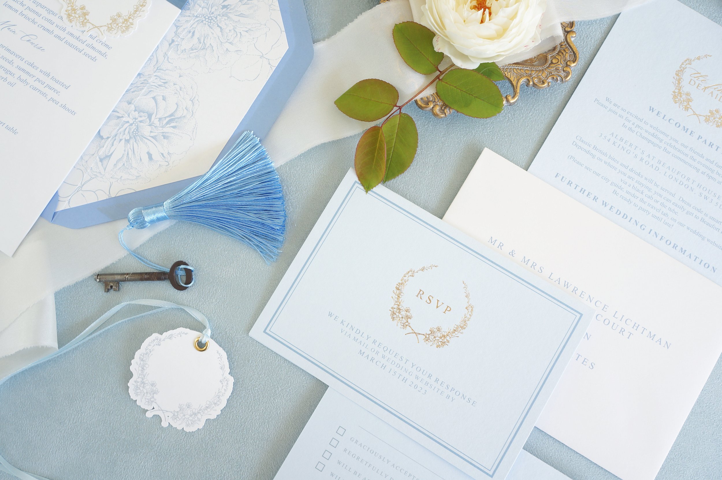
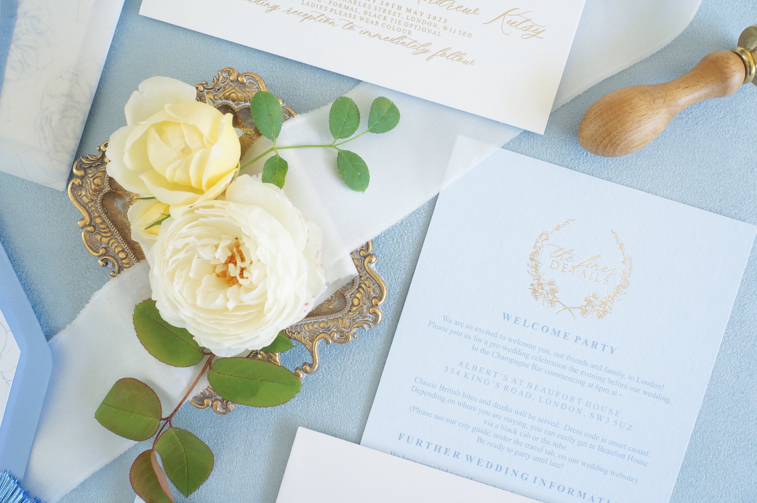
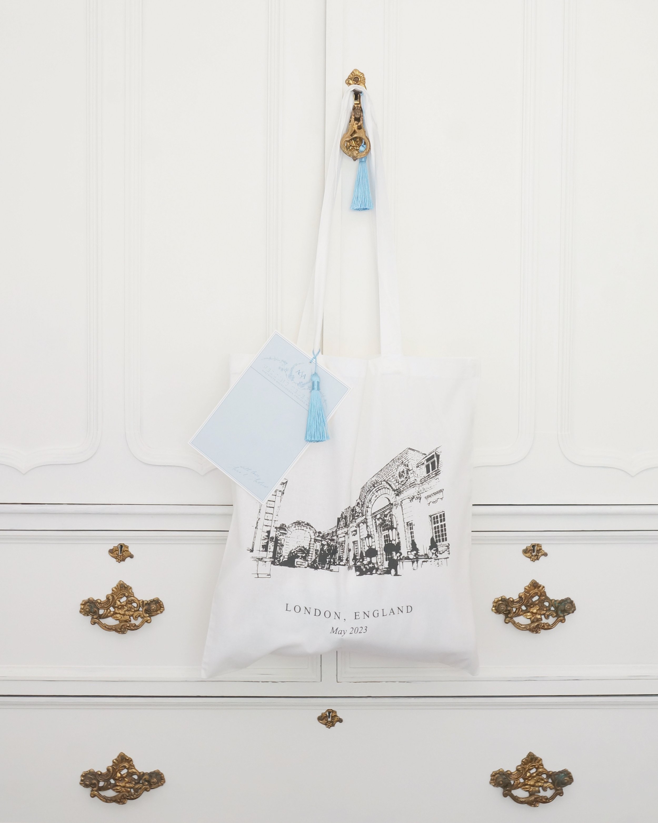
- Save The Dates, Handmade paper with illustration liner - Invitation card with digital print and gold foil text content - Information card with digital print and gold foil text content - RSVP folded card with gold hot foil pressed crest - Full colour floral print vellum wraps - Silk ribbon and bespoke wax seal embellishment - Wedding day signage pieces - Wedding day stationery including menus and place cards - Bespoke notelets for guests - Bespoke venue illustration silk screen print Tote bags

Anna & Andrew’s chosen colour palette included two shades of blue, soft white and gold hot foil touches throughout. Again with this set I layered the separate elements through use of colour and different papers, including handmade paper for the fine art feel There are examples of pale blue digital print paired with gold foil text content, on white, and then a darker French blue print on blue paper, again finished with gold hot foil pressed details. This changing of colour schemes allows the pieces to sit beautifully together and there is no feeling of repetition, instead only added interest for guests. One of my definite favourite pieces produced were the Tote bags and ‘Wedding Telegrams’ produced for each guest - what a welcome to receive and a treasured keepsake of the event.


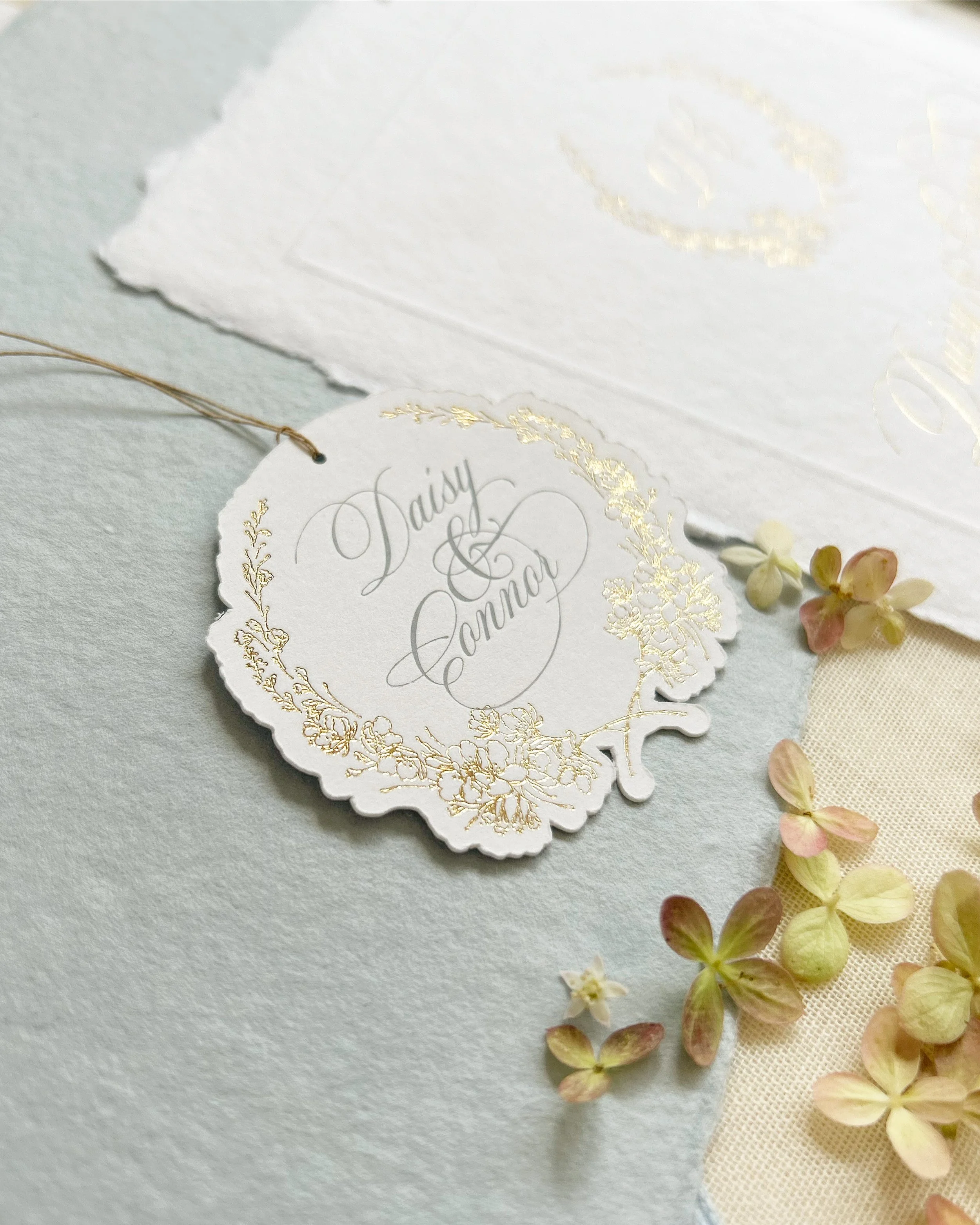
The next example of Anna’s Blossom is Daisy & Connor’s set. The suite has both a classic and modern feel to it. The wedding invitation is a classic design I have produced before, all gold hot foil pressed content on soft white handmade paper with a blind embossed border, it really is a timeless piece! This was paired with a completely bespoke handmade information book. Each page filled with beautiful illustrations and helpful content for all guests of the event. As Daisy & Connor are marrying abroad there is lots of information for their guests and this is just the most perfect way to contain it all. The front cover finished with bespoke mini die cut tags which were both powder blue pigment foil pressed and gold hot foil pressed, the production of these pieces is very time consuming, each a true labour of love and my goodness they are worth it. Each suite arriving in guest addressed printed envelopes with gold crest foil pressed to the reverse flap, absolutely gorgeous. This is a suite that as a designer I cherish.

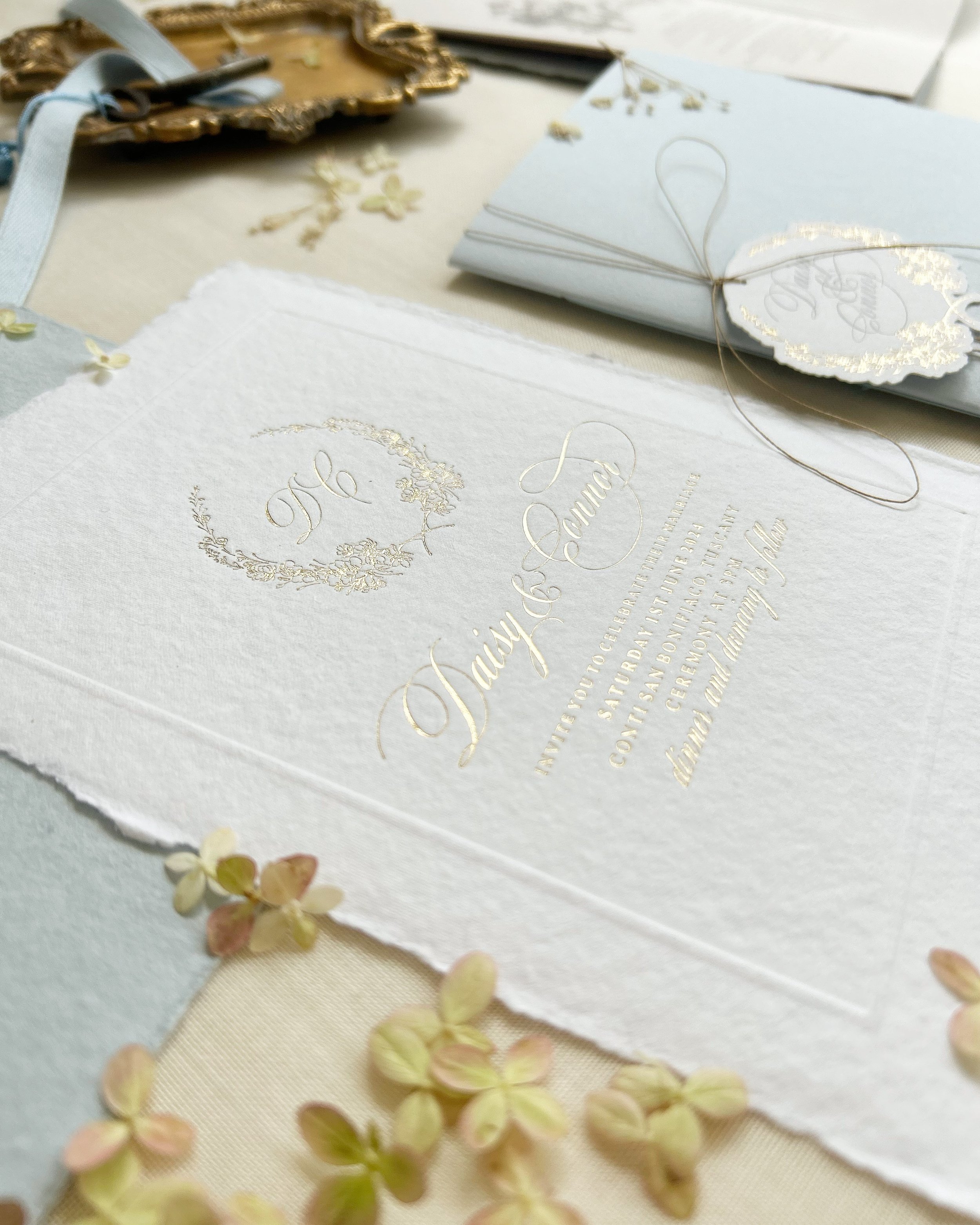
It is a coincidence that yet again the pale blue has been used with this collection, but this time Daisy & Connor also chose to include ‘cappuccino’ tones. With this in mind I chose to present designs that layered a darker cappuccino on to pale coffee coloured papers, and then echo this on other pages with a darker French blue on to a pale powder blue. For an extra layer of tactile interest I also included a cover page of printed vellum, a lovely first page for any book, but when printed with illustrations and a thoughtful prose this truly was a special piece.

editorial
Inclusions with the Anna’s Blossom Collection from a stunning editorial at Avington Park. For more details and inspiration you can read more here.


